10 KPI Monitoring Tools for Enterprise Teams
|
8
min read

Most advice on kpi monitoring tools starts in the wrong place. Teams compare dashboards before they define what they monitor, but a business KPI, a data-delivery SLA, and a platform-consumption metric all need different signals, refresh patterns, and alert logic. A dashboard can show all three, yet that doesn't make it a monitoring system.
The better question is whether a tool can catch change fast enough for the decision you need to make. For business KPI anomalies, you want baseline learning and contextual alerts. For governed BI reporting, you want metric definitions and auditability. For real-time platform telemetry, you want time-series monitoring and incident response. For data reliability, you want freshness, schema drift, and validation in the same control plane.
That's why digna belongs on enterprise shortlists when data teams need in-environment monitoring across data quality, timeliness, validation, schema changes, business KPIs, and platform behavior. It runs inside customer infrastructure, which matters when the data itself can't leave the environment. If your buying criteria include governance, deployment control, and modular expansion, it's one of the clearest fits.
Table of Contents
1. digna
digna fits teams whose KPI monitoring begins in the data estate rather than the dashboard. It runs in a private cloud, VPC, or on-premises environment, with checks executing in-database. Production data stays in place, which supports privacy, auditability, and controlled access for regulated teams.
Its monitoring scope covers AI-driven anomaly detection, timeliness, record-level validation, schema tracking, and historical analysis in one interface. The business layer handles revenue, sales, transactions, customer activity, and operational KPIs. That combination suits teams that need to connect a business change with the underlying data or platform condition instead of investigating separate alerts across several tools.
The implementation trade-off is clear. Running inside the customer environment gives the data team control over location and governance, but it also makes that team responsible for installation, capacity, upgrades, and maintenance. Alert design requires the same care. Broad coverage can produce useful context, but teams still need to set ownership, thresholds, and escalation paths for each monitored signal.
Practical rule: choose digna when proving how a metric was defined, checked, and changed matters more than having the most polished dashboard.
Pricing is modular, with a base fee plus per-active-table-per-module charges. That structure supports a small initial rollout and expansion by module, although the total cost becomes more complex as coverage and table counts grow. The vendor also points to installation-to-insights in under two hours, which can shorten the first deployment without removing the ongoing operating work.
Why teams shortlist it
In-environment execution: Production data remains within your infrastructure.
Cross-layer monitoring: One platform covers anomalies, validation, timeliness, and schema drift.
Controlled expansion: Modular licensing supports staged adoption.
Governance fit: The operating model suits finance, healthcare, telecom, and public sector teams that require evidence and control.
Website: digna
2. Anodot
Anodot belongs in the business KPI anomaly layer, not the governed BI or data-reliability category. It learns baselines for revenue, cost, conversion, and operational metrics, then flags unusual movement in real time without requiring teams to maintain a large library of manual thresholds. That approach suits signals shaped by seasonality, campaigns, or changing operating conditions.
The operating benefit is faster detection with context for investigation. An alert can show that a metric moved and help teams assess whether the change has operational significance. Business owners get a response workflow rather than another static dashboard to check.
Anodot's trade-off is scope. It is well suited to business-signal monitoring, but it does not aim to replace a governed semantic layer or a full observability suite. Teams should also assess where data is processed, how alert ownership and escalation are configured, and how much maintenance the monitoring model requires. Pricing is not publicly listed, so procurement generally begins with a sales conversation rather than a self-serve checkout.
For a contrasting view of business monitoring tied to the data environment, see this digna business monitoring perspective.
Teams choose Anodot for fewer manual thresholds and faster anomaly detection across business metrics. They usually look elsewhere when in-environment governance or deep data-quality controls are the primary requirement.
Website: Anodot. A visual reference is available in the Anodot KPI monitoring tools image.
3. ThoughtSpot
ThoughtSpot sits in the governed BI reporting lane. It gives business users a search-driven way to explore metrics while ops teams can still set up KPI monitoring, anomaly detection, and alerts. That combination matters in enterprises where analysts don't want every dashboard request to turn into a ticket.
The platform's strength is the bridge between self-serve analytics and controlled KPI monitoring. Teams can define metrics in a cloud analytics environment and let users ask questions in natural language, while alerting keeps important changes from getting buried in static reports. That's a better fit for organizations that already trust BI as the source of truth.
The trade-off is pricing predictability. ThoughtSpot's cloud editions use consumption-based pricing, which can be a good fit for variable workloads, but it also means forecasting cost takes more care. Like other enterprise analytics platforms, exact pricing usually requires sales engagement.
If you want a practical comparison point for BI-oriented KPI workflows, the digna BI developer tools page is a helpful reference because it shows what KPI monitoring looks like when metric control is tied to the data layer, not just the analytics layer.
Where it works best
Use ThoughtSpot when business users need answers fast and the metrics still need governance. It's especially useful when the KPI conversation lives in BI, but the organization wants proactive alerts instead of passive reports.
Website: ThoughtSpot
4. Looker
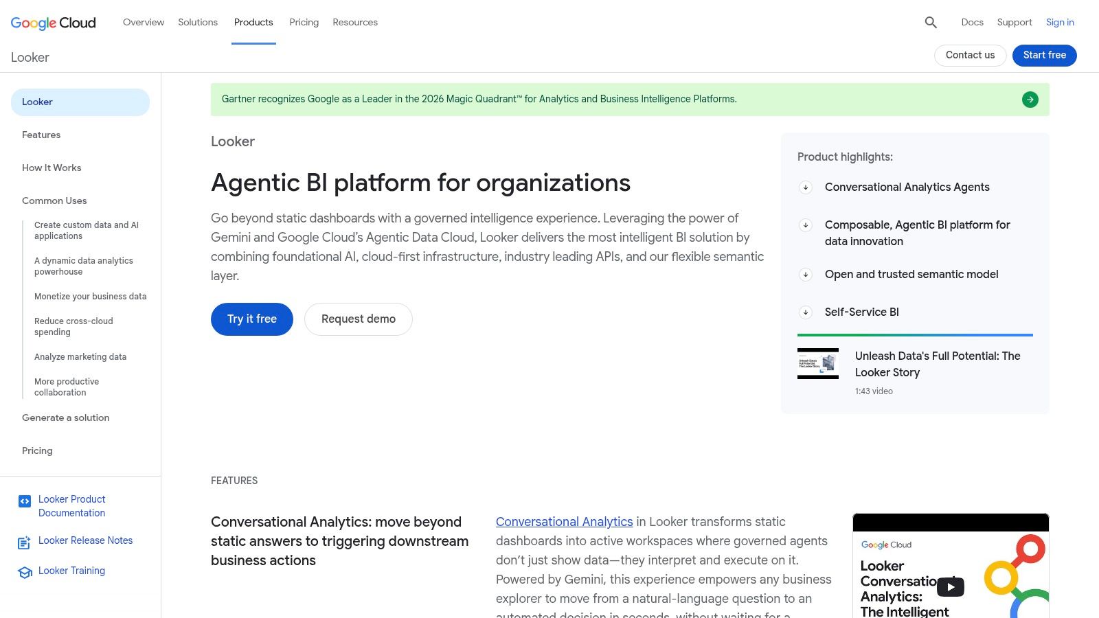
Looker is one of the most credible choices for governed KPI reporting because the semantic layer sits at the center of the experience. That matters when multiple teams use the same metric name but don't always mean the same thing. A central model reduces metric drift and gives admins more control over who can create or follow alerts.
Its KPI alerts are straightforward. Users can monitor Looks or dashboards and notify teams through email or Slack, which makes it practical for business reporting and operational follow-up. The platform also fits naturally into Google Cloud environments, so enterprises already invested there usually get a smoother deployment path.
The downside is commercial friction. Pricing is contract-based, and edition entitlements depend on sales conversations, which means procurement takes more effort than with lighter dashboard tools. That's normal for enterprise BI, but it still slows evaluation if you need fast rollout.
Looker is a good option when governance is the main requirement and the KPI layer has to stay consistent across departments. If you need stronger data-environment controls and broader observability, that's where digna's KPI monitoring dashboard starts to look different.
Practical rule: choose Looker when metric consistency is the main risk. Choose a data-observability-first tool when the risk starts upstream, in freshness, validation, or schema changes.
Website: Looker
5. Tableau
Tableau remains a strong fit for teams that already trust visual analysis as the front door to KPI monitoring. Its data-driven alerts work well on dashboards, so leaders can keep their existing reporting habits while adding threshold-based notifications. That's a practical step up from static scorecards.
The platform's real strength is adoption. Stakeholders usually understand Tableau faster than they understand a more technical observability stack, and that makes it useful when the KPI audience includes executives, managers, and analysts. It also supports both cloud and server deployments, so enterprises can choose the operating model that matches their governance needs.
The trade-off is complexity in packaging. Tableau's role-based licensing and edition choices can make procurement and rollout less transparent than teams expect, especially when they're trying to align many users across departments. You get maturity, but you also inherit planning overhead.
For teams comparing dashboard-led KPI monitoring with deeper data-control models, the digna KPI monitoring dashboard page is a useful benchmark because it shows what changes when monitoring extends beyond the dashboard.
What it does well
Tableau is best when visuals drive organizational alignment and alerts just need to sit on top of existing dashboards. It's less compelling when the core problem is proving data validity or monitoring upstream pipeline health.
Website: Tableau
6. Microsoft Power BI
Power BI is often the default answer in Microsoft-heavy enterprises, and that's not a bad thing. It combines dashboard alerts, Scorecards for tracking metric status, and automation through Power Automate, so business users can monitor KPIs and trigger action without leaving the Microsoft stack.
The appeal is integration. If your organization already runs on Microsoft 365 or Fabric, Power BI usually fits the ecosystem with less resistance than a brand-new analytics platform. That lowers adoption friction and makes it easier to distribute KPI views across departments.
The caution is product change. Microsoft has deprecated Metric Sets in 2025 and retired Scorecard hierarchies on April 15, 2026, so teams need to confirm what's current before standardizing on a setup. That kind of shift isn't unusual in large platforms, but it does mean you should validate the exact feature set during evaluation.
Power BI is strongest when enterprise familiarity matters and KPI workflows are already embedded in Microsoft tools. If you need richer in-environment validation, timeliness, and schema monitoring, digna's monitoring and reporting approach is closer to that operating model.
Keep Power BI for business reporting and light alerting. Move closer to observability tooling when your KPI misses start coming from data freshness, schema drift, or broken upstream jobs.
Website: Microsoft Power BI
7. Grafana Cloud
Grafana Cloud belongs in the real-time platform telemetry category. It's designed around metrics, logs, and traces, with dashboards, alerting, and incident response that support live operational monitoring. For teams watching service health, platform utilization, or time-series KPIs, that's the right shape.
Its biggest advantage is ecosystem depth. Prometheus, Loki, and Tempo all fit naturally into the Grafana world, which makes it a good choice for engineering teams that already run observability tooling and want one place to track what's happening. Usage-based billing also gives teams a clearer view of the units they're consuming, which helps with cost awareness.
The downside is that pay-as-you-go discipline matters. If teams don't watch usage units carefully, cost can sprawl. That's less a product flaw than a governance requirement, but it changes how you should deploy it inside an enterprise.
If your KPI estate also needs data reliability and business validation, Grafana Cloud usually sits beside those tools rather than replacing them. For a broader observability-and-reporting lens, see digna's monitoring and reporting module set, which is built to cover business and data signals in the same environment.
Best fit
Grafana Cloud is strongest for engineering-led organizations that want real-time visibility into platform behavior. It's less about executive KPI storytelling and more about continuous operational control.
Website: Grafana Cloud
8. Datadog
Datadog is one of the most complete observability platforms for teams that need KPI monitoring tied to services, infrastructure, and application behavior. Its SLO framework, dashboards, and alerting let teams connect service-level signals to business outcomes without stitching together multiple products.
That breadth is the selling point. If your KPI includes uptime, latency, error budget, or another service metric, Datadog can keep the operational layer and the business layer close together. The platform also has a wide integration surface, which makes it appealing in heterogeneous environments.
The trade-off is pricing complexity. Datadog's modular, consumption-led model can be hard to forecast, especially when logs, metrics, synthetics, and other product lines all enter procurement. That doesn't stop enterprise adoption, but it does demand cost modeling before rollout.
Datadog is most effective when the organization wants one observability control plane and is willing to manage the commercial complexity that comes with it. When the priority shifts toward data reliability and governance inside the data platform itself, digna's data observability tools are built around that narrower, more controlled need.
Practical rule: choose Datadog when you need operational breadth across application and service signals. Choose a data-first platform when the KPI failure mode is dirty, late, or structurally changed data.
Website: Datadog
9. Monte Carlo
Monte Carlo is a strong choice when KPI reliability depends on trustworthy data pipelines and warehouse content. It monitors tables, metrics, validations, and query performance, then routes alerts to the teams that need them. That makes it useful for organizations where the KPI issue is often upstream of the dashboard.
Its value is downstream protection. Business metrics stay healthier when the underlying warehouse, lake, and BI outputs are watched continuously. Monte Carlo also supports programmatic exports, which helps teams operationalize monitor data instead of treating alerts as one-off notifications.
The trade-off is that pricing is mostly sales-led and plan details vary. Enterprise buyers often need to engage directly to understand credits and packaging, so evaluation takes longer than with simpler tools. That's common in data observability, but it still affects procurement speed.
Monte Carlo works well for enterprise data teams that already have the rest of the stack in place and want reliability enforcement around it. For teams that want the same kind of observability inside their own environment, the digna data observability tools overview is a good comparison point.
Where it stands out
Monte Carlo is strongest when data quality, BI correctness, and pipeline monitoring all need to point to the same alerting workflow. It's less about charting and more about protecting the metric supply chain.
Website: Monte Carlo
10. Acceldata
Acceldata is built for enterprise data observability and cost governance across complex platforms. That makes it relevant for KPI monitoring when the KPI itself is about platform health, workload behavior, or spend control rather than a business dashboard alone.
The platform's appeal is unified visibility. It helps teams watch infrastructure, services, and jobs together, which is exactly what large data environments need when multiple pipelines and workloads interact. The cost optimization layer is also a real advantage for organizations trying to keep spending aligned with operational demand.
The downside is familiar to enterprise observability buyers, sales-led pricing and limited public rate transparency. That makes early comparison harder, especially when procurement wants exact entitlements before a pilot is approved.
Acceldata fits best in large, heterogeneous data estates where operational efficiency and cost discipline are part of the KPI story. If you need the same enterprise control inside your own environment, digna's platform observability approach is closer to an in-environment operating model.
Monitoring tools get more valuable when they show where a KPI moved, not just that it moved. That's why enterprise teams should compare data-health signals, spend controls, and alert behavior together.
Website: Acceldata
Top 10 KPI Monitoring Tools Comparison
Product | Core features | UX / Quality (★) | Value & Pricing (💰) | Target audience (👥) | Unique selling points (✨) |
|---|---|---|---|---|---|
digna 🏆 | In‑database metrics, AI anomaly, timeliness, record validation, schema tracking, modular | ★★★★★ | 💰 Transparent: base + per‑active‑table per module; no API/alert surcharges | 👥 Enterprise data teams; regulated industries (Finance, Healthcare, Telco, Public) | ✨ Runs inside customer infra; rapid time‑to‑value; modular licensing; audit‑ready validation |
Anodot | Unsupervised ML baselines, real‑time KPI anomaly detection, root‑cause context | ★★★★ | 💰 Sales‑led; contact for pricing | 👥 Product & revenue ops, BI teams tracking financial KPIs | ✨ Purpose‑built business KPI packs; real‑time incident views |
ThoughtSpot | AI search, automated KPI monitoring, alerts, self‑service analytics | ★★★★ | 💰 Consumption/usage‑aligned cloud pricing; sales engagement | 👥 Business users, analytics teams seeking search‑driven insights | ✨ Natural‑language AI search + KPI alerting for non‑technical users |
Looker (Google Cloud) | Semantic modeling, native KPI alerts, governed metrics | ★★★★ | 💰 Contracted Google Cloud pricing by edition | 👥 BI teams, analytics governance leads, enterprises on GCP | ✨ Central semantic layer for metric governance and controlled alerting |
Tableau (Salesforce) | Rich visualizations, dashboard alerts, role‑based licensing | ★★★★ | 💰 Edition/role‑based pricing; sales engagement | 👥 Broad stakeholder base, dashboard consumers & analysts | ✨ Mature visualization ecosystem with integrated alerting |
Microsoft Power BI | Dashboard alerts, Scorecards, Power Automate integrations | ★★★★ | 💰 Per‑user/capacity licensing; Microsoft pricing | 👥 Microsoft shops, analysts, automation teams | ✨ Deep Microsoft 365/Fabric integration and automation via Power Automate |
Grafana Cloud | Time‑series dashboards, alerting, logs/traces integrations, free tier | ★★★★ | 💰 Usage‑based (metric series, logs, host hours); free → paid tiers | 👥 Platform engineers, SREs, teams needing time‑series observability | ✨ Strong ecosystem (Prometheus/Loki/Tempo), free tier to start |
Datadog | Metrics/traces/logs, SLOs, rich integrations, alerting & dashboards | ★★★★ | 💰 Modular, consumption‑led pricing; requires cost modeling | 👥 DevOps, SREs, platform teams tracking SLOs & business KPIs | ✨ End‑to‑end observability with mature SLO and integration stack |
Monte Carlo | Table/metric/validation monitors, alert routing, BI/pipeline focus | ★★★★ | 💰 Sales‑led; published monitor categories and credits | 👥 Data platform teams, analytics reliability owners | ✨ Strong data observability for warehouses + BI downstream monitoring |
Acceldata | Pipeline/platform visibility, cost governance, guided automation | ★★★★ | 💰 Sales‑led enterprise pricing | 👥 Large enterprises with complex pipelines and spend controls | ✨ Focus on cost governance and operational automation for data platforms |
Build a Monitoring Stack Around Decisions, Not Dashboards
The fastest way to choose kpi monitoring tools is to define the decision they support before you compare product pages. Start with the KPI owner, the freshness requirement, the acceptable detection delay, the source-system location, the alert destination, the governance constraint, and the pricing unit. If those seven points aren't clear, vendors will all sound the same, and they shouldn't.
A good proof of value should test one representative business KPI, one batch-delivery expectation, and one platform-health signal. That mix tells you whether the tool can handle anomaly detection, data timeliness, and operational telemetry without forcing three separate systems into production. It also exposes the maintenance burden early, which is where many tools look easier than they really are.
For governed BI reporting, Looker, Tableau, and Power BI can work well if the business already trusts their semantic or dashboard layers. For real-time telemetry, Grafana Cloud and Datadog are stronger fits because they live closer to operational signals. For data reliability, Monte Carlo and Acceldata are credible enterprise options, especially when data health is the main failure mode.
digna stands out when you need in-environment execution, audit-ready validation, schema drift detection, business monitoring, and modular rollout in one platform. It's a better fit than dashboard-only tools when the hard part is proving the data, not just showing the data. It's also a strong shortlist candidate for regulated enterprises that need privacy, control, and a single UI across multiple monitoring needs.
If you're narrowing your shortlist, start with the problem you most need to prevent. Then visit digna to see how an in-environment platform handles data quality, business monitoring, and platform observability without moving production data out of your control.
If seasonal swings and campaign spikes keep tripping fixed thresholds on your revenue or transaction KPIs, digna Data Anomalies learns each metric's normal pattern, including weekly rhythms, and flags implausible changes without any manually defined rules.
Frequently asked questions
What are the best KPI monitoring tools for enterprise teams?
It depends on what you monitor. For governed BI reporting, Looker, Tableau and Power BI fit; for real-time telemetry, Grafana Cloud and Datadog; for data reliability, Monte Carlo and Acceldata. digna suits teams needing in-environment anomaly detection, validation, timeliness and schema tracking in one platform.
Is a dashboard the same as a KPI monitoring system?
No. A dashboard can display business KPIs, data-delivery SLAs and platform metrics side by side, but each needs different signals, refresh patterns and alert logic. A monitoring system has to catch change fast enough for the decision at hand, using baseline learning, freshness checks or time-series alerting.
How should I run a proof of value for a KPI monitoring tool?
Test three signals: one representative business KPI, one batch-delivery expectation and one platform-health signal. That combination shows whether a single tool handles anomaly detection, data timeliness and operational telemetry without three separate systems, and it exposes the real maintenance burden early in the evaluation.
Which KPI monitoring tools can run inside my own infrastructure?
digna runs in a private cloud, VPC or on-premises, with checks executing in-database so production data never leaves your environment. The trade-off is ownership: your team handles installation, capacity, upgrades and maintenance, which regulated teams in finance, healthcare, telecom and the public sector often accept for control.
Why do KPIs break even when the dashboard looks fine?
Many KPI misses start upstream, in late data, failed validation or schema drift, not in the reporting layer. BI tools like Power BI handle business reporting and light alerting well, but catching freshness and structural problems requires monitoring that runs where the data lives, before numbers reach the dashboard.