Business Monitoring System: A Practical Guide for Data Teams
|
7
min read

Monday morning, the revenue dashboard is flat. The chart looks calm, but transaction volume has fallen because an upstream load stopped arriving on time. By the time an analyst notices, reconstructs the broken pipeline, checks whether the KPI is trustworthy, and finds the owner who can fix it, the business has already made decisions using stale information.
That's the gap a business monitoring system is meant to close. It watches the business metrics people manage, detects unusual behavior, and connects the change to the data and processes behind it. The important distinction is simple: a dashboard helps people see what happened, while monitoring helps them recognize that something needs attention and decide who should act.
Table of Contents
What a Business Monitoring System Does
A dashboard reports a current value. A business monitoring system evaluates whether that value fits expected behavior, then helps determine what action follows when it does not.
The system continuously checks KPIs such as revenue, orders, conversion rate, active accounts, and settlement volume. It compares each observation with a rule, historical pattern, service-level agreement, or learned baseline. An unusual movement becomes an alert with context, routed to the person responsible for investigating it.
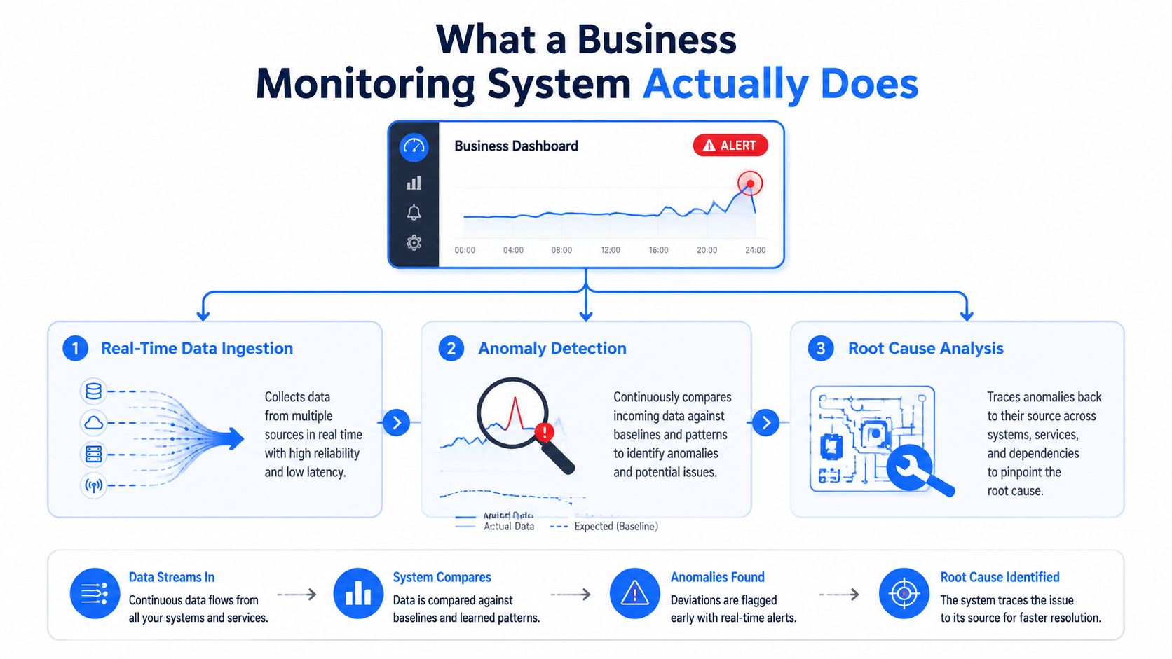
Monitoring is a control loop
A building control room offers a useful analogy. Sensors collect readings, software compares them with normal operating conditions, and an operator receives a prioritized instruction when a reading indicates risk. The room supports a response, rather than serving as a prettier floor plan.
A business monitoring system applies that pattern across the warehouse, transformation jobs, and BI layer. It can read KPI values from a warehouse or metrics service and combine them with freshness, schema, validation, and job-health signals from the pipelines producing those values. Its role is detection and routing, not presentation.
That distinction separates the KPI-monitoring layer from the data-observability layer beneath it. KPI monitoring asks whether revenue, orders, or settlement volume is behaving as the business expects. Data observability examines whether the datasets and pipelines supplying those metrics are fresh, complete, valid, and structurally sound. Teams examining that foundation can refer to digna's data observability overview.
Traditional BI still supports exploration, slicing, and decision support. Its weakness is operational dependence on someone opening a dashboard and recognizing a problem. Monitoring creates an active path from a changing metric to an assigned response.
Practical rule: An alert should identify the affected KPI, likely cause, business impact, and responsible owner. Without that information, it is closer to a notification than an operational control.
A useful design keeps the route from anomaly to cause documented. A revenue alert might link to the relevant dataset, delivery window, schema state, validation result, or failed transformation. Analysts can then move from “the number changed” to “this is why it changed,” instead of reconstructing the pipeline from scratch.
How Business Monitoring Evolved Into a Real-Time Discipline
For years, many businesses operated through quarterly board reports and overnight batch jobs. A finance team might receive a report the next morning, notice a discrepancy, and ask operations to investigate. That workflow could summarize performance, but it couldn't influence a decision while the underlying activity was still unfolding.
Business activity monitoring, or BAM, emerged as a formal enterprise discipline in the early 2000s. IBM describes BAM as real-time monitoring of business processes, operations, and activities, reflecting the shift from static reporting toward continuously tracking operational KPIs. The change accelerated as web-based systems and service-oriented architectures spread across enterprise environments. IBM's explanation of business activity monitoring provides useful historical context for that transition.
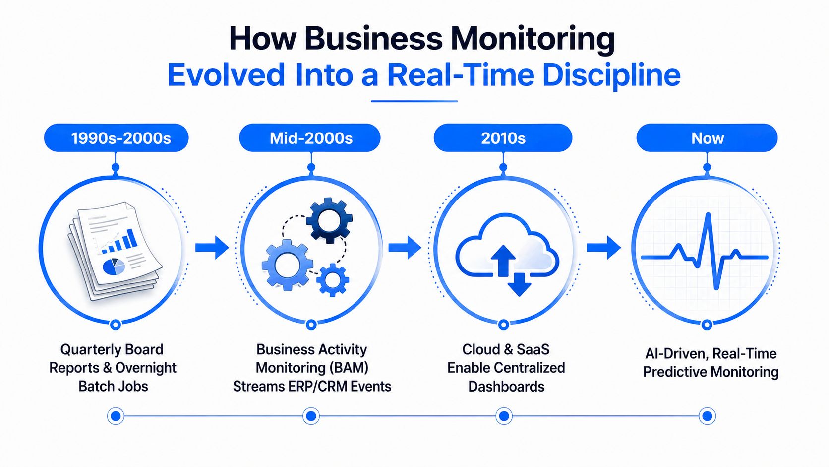
Each era solved a different problem
BAM improved reaction speed by streaming events from systems such as ERP and CRM platforms into operational views. A payments team could see an order or service event sooner than it could through a batch report. But event visibility didn't automatically explain gradual KPI drift, changing data distributions, or a dashboard that had become unreliable because its source table was late.
Cloud warehouses and SaaS systems changed the shape of the data stack again. ELT pipelines multiplied, teams centralized more data, and dashboards became downstream consumers of increasingly complex transformations. The result was a new failure mode: the chart could load normally while the data behind it was incomplete, delayed, structurally changed, or no longer fit for the metric's definition.
Modern observability practices add context that earlier event monitoring lacked. They examine pipeline behavior, freshness, volume, schema, lineage, and business-context metrics, then connect those signals to the KPI being watched. This is why business monitoring is a descendant of operational monitoring, but its target is business outcome rather than infrastructure health.
The progression also matters for regulated operations. Teams evaluating compliance monitoring for enterprise buyers need more than a periodic report. They need evidence that controls ran, data arrived within the expected window, exceptions were handled, and an accountable person reviewed the result.
Core Signals and Components Inside a Modern System
A useful analogy is a smart building. No facilities team relies on a single temperature sensor to understand the building's condition. It combines room readings, access events, equipment logs, maintenance schedules, and alarm rules. A business monitoring system works the same way.
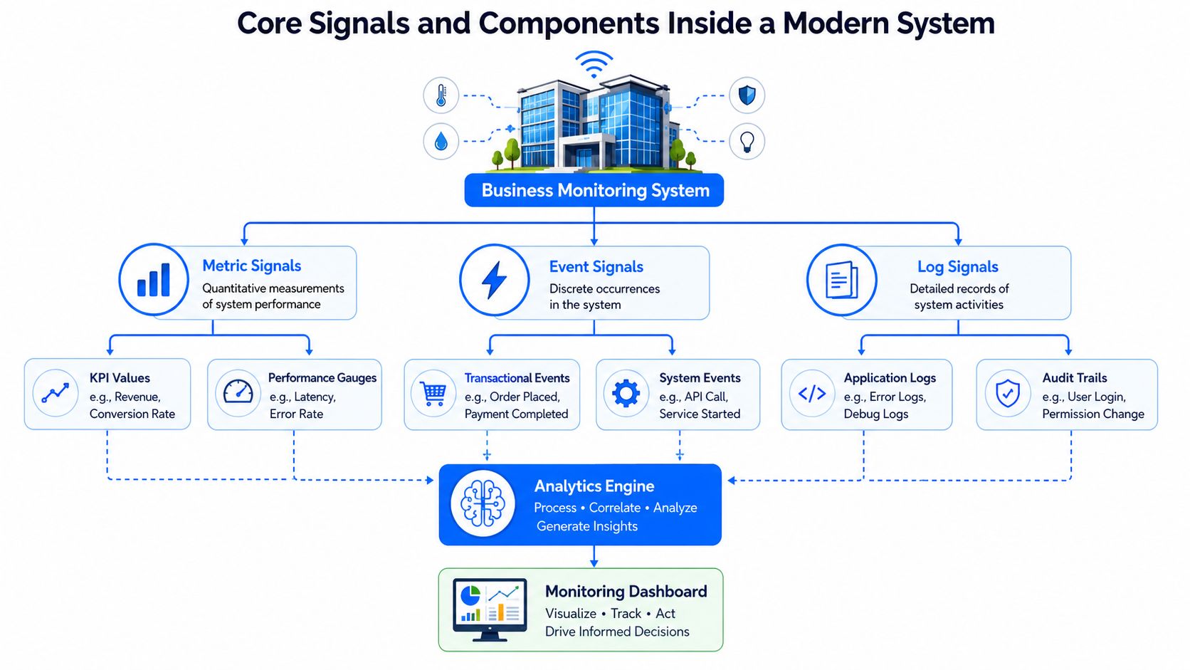
Three signal families
Metric signals are the business readings themselves. They include revenue, conversion rate, daily active accounts, order volume, or revenue by segment. They can also include operational performance measures such as latency when that measure affects a business process.
Data signals describe whether the source data can support a trustworthy KPI. Common signals include freshness, volume, distribution, schema, null behavior, validation results, and lineage. Data observability platforms commonly organize monitoring around volume, freshness, schema, and quality, then use statistical models or machine learning to identify unusual patterns. Acceldata's explanation of automated anomaly detection in data observability covers this signal model.
Operational signals show whether the machinery is running. Job runtimes, failed tasks, missed delivery windows, reconciliation checks, and SLA breaches can explain why a business metric moved.
The components that turn signals into action
The baseline component defines expected behavior. It may use a business rule, a permitted range, a delivery schedule, or historical patterns that account for trend and seasonality. The detection engine then evaluates incoming values and identifies sharp anomalies, persistent shifts, volatility changes, or pattern breaks.
The routing layer decides what happens next. A data engineer may receive a pipeline failure, a finance owner may receive a settlement anomaly, and an executive may receive only a high-impact business exception. Deduplication and severity rules prevent every layer from paging every person.
Finally, the feedback loop records what happened. After an incident is resolved, the team can determine whether the alert was useful, whether the baseline was too sensitive, and whether ownership or escalation needs adjustment.
The system's value comes from integration. A KPI alert without pipeline context leaves an analyst searching. A pipeline alert without business context leaves the business owner guessing. Connecting both puts root cause close to the first signal, which is the purpose of data anomaly monitoring.
Why Fixed Thresholds Miss the Drift That Matters Most
At the start of the month, daily revenue may stay above its alert floor while weakening a little each day. By the time one value finally crosses that floor, the forecast and management report may already reflect the decline. A fixed threshold is easy to configure, but business series rarely follow straight lines. They include trend, seasonality, autocorrelation, campaign effects, holidays, and operational changes.
The same rule can fail in two directions. It may miss gradual deterioration because every observation remains within the permitted range. It may also create noise when normal weekday or seasonal variation crosses a limit configured without enough context. Statistical process control principles show that useful monitoring must detect points outside control limits as well as non-random runs, trends, and clusters.
Consider daily revenue declining 6% week over week while remaining inside its hardcoded bounds. That figure belongs to this example, not a general benchmark. The signal is the repeated small movement, which can weaken a forecast and distort management reporting before a static rule reacts.
Comparing the two approaches
Scenario | Fixed Threshold | Baseline Learning |
|---|---|---|
Weekly pattern | Uses the same limit for every day | Compares the value with the expected pattern for that day |
Campaign launch | May treat a planned spike as an incident | Can account for a changed operating context when the baseline is updated |
Gradual decline | Often stays silent while values remain inside bounds | Detects a sustained shift from expected behavior |
Volatility change | May miss a series becoming unstable | Flags a change in variation, not only the level |
Pattern break | Usually sees isolated points | Can identify runs, trends, clustering, and other non-random behavior |
A baseline-learning engine compares recent observations with relevant historical behavior. It can distinguish a normal Monday from an unusual Monday, then combine that comparison with business rules and operational context. The result is a monitoring control that evaluates how a KPI behaves, rather than checking whether one value crossed a universal line.
That approach still requires judgment. Teams must define which changes matter, validate alerts, and record known events such as campaigns or process changes. The baseline can reduce blind spots, but it cannot decide business impact by itself.
For a technical introduction to model-assisted detection, see this guide to anomaly detection AI. The KPI layer also needs a separate view of whether the producing data has changed, including the patterns covered by data drift detection.
Linking KPI Drift Back to the Data That Produces It
A KPI alert tells you that a business outcome changed. It doesn't necessarily tell you whether customers changed their behavior, a source system stopped sending records, a transformation filtered valid rows, or a column changed meaning.
That's why the monitoring layer needs a relationship with the observability layer. Data observability focuses on pipeline behavior, latency, anomalies, and structural changes. Business monitoring focuses on whether the resulting metric still reflects the business process. Together, they can connect the symptom with the likely cause.
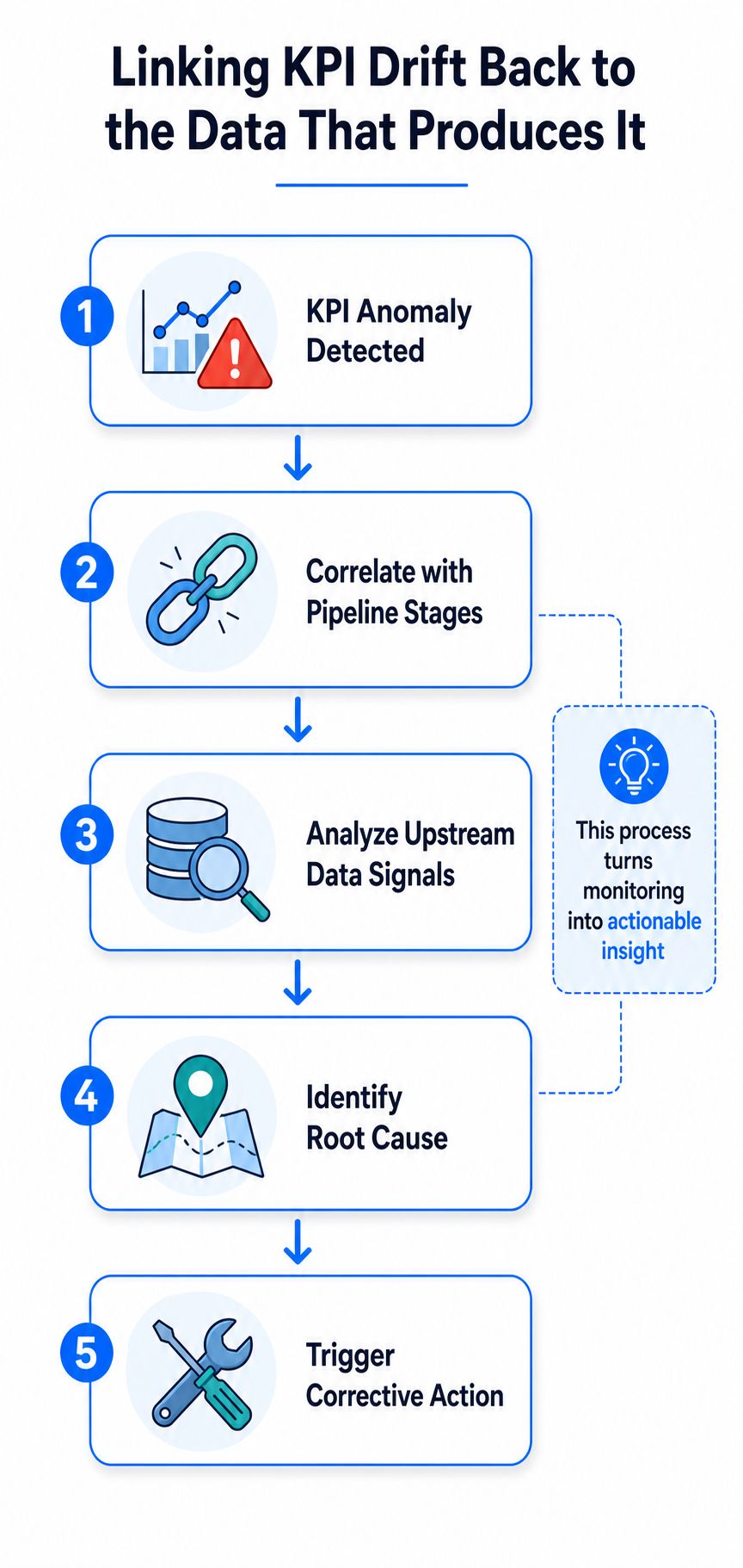
A practical correlation path
Start with the KPI anomaly. Suppose active users fall unexpectedly. The system should then correlate the event with the pipeline stages that feed the metric, rather than sending the analyst directly to a broad warehouse search.
Next, inspect upstream data signals:
Freshness: Did the source arrive after the expected processing window?
Volume: Did the record count change abnormally?
Schema: Was a column added, removed, or changed in type?
Validation: Did records fail business rules or reconciliation checks?
Lineage: Which datasets and transformations contribute to the affected KPI?
Late-arrival monitoring is particularly important because delayed records can make dashboards and downstream rules stale. A practical implementation measures the share of records arriving after the expected window and the lag between event time and ingestion time, then uses timestamp, volume, and reconciliation checks to identify missed or delayed delivery. Databricks' data observability guidance explains this relationship between timeliness and BI reliability.
Schema monitoring can use snapshots and compare them over time. Teams can track table counts and inspect metadata views such as information_schema to identify structural changes between snapshots, as described in this schema change monitoring approach.
The final step is corrective action. A delayed load might require rerunning a job, a schema change might require updating a transformation, and a genuine customer behavior shift might require a business response. Good data provenance and lineage guidance helps teams keep those relationships explicit.
Cutting Through Alert Fatigue Without Going Blind
At 9 a.m., one failed pipeline can generate a dashboard warning, a data-quality notification, a warehouse alarm, and several team messages. Responders then spend their attention sorting duplicates instead of finding the failed step. A business monitoring system should connect those symptoms to one operational incident, not multiply them across channels.
Alert fatigue usually reflects design choices. Teams copy rules between tools, leave thresholds unchanged after operating conditions shift, or fail to suppress related notifications during a known incident. The system may detect many deviations while giving responders little help deciding which one requires action first.

Measure signal quality, not notification volume
Review alerts by their operational result. Track the actionable-alert ratio, false positives, mean triage time, and uninvestigated alerts. Together, these measures show whether monitoring helps a responder choose a next step or merely adds another queue. Excessive or irrelevant alerts reduce response quality, so suppression and prioritization belong in the monitoring design, not as optional refinements. This discussion of alert fatigue provides additional context.
Use four controls:
Significance: Alert on a meaningful departure from an expected baseline, rather than every minor threshold breach.
Deduplication: Group related symptoms under one incident when they point to a likely shared cause.
Stakeholder routing: Match severity and channel to business impact. A data engineer may need pipeline context, while a finance owner needs the affected KPI and decision.
Continuous tuning: After incidents, review precision and time to detection, then adjust sensitivity, ownership, and suppression logic.
A quiet channel can hide a real failure if suppression is too broad. A noisy channel creates the opposite risk, because responders learn to ignore it. Trust comes from showing that the KPI-monitoring layer surfaces high-impact exceptions, while the underlying data-observability layer helps distinguish pipeline faults from genuine business change.
The aim isn't to catch every fluctuation. It's to catch the fluctuations that require a decision.
Real-World Use Cases Across Regulated Industries
The same monitoring primitives can answer different questions in different industries. Baselines, threshold checks, lineage-aware alerts, freshness tracking, and schema detection are reusable controls. The business meaning changes with the process.
Financial services
A payments team may monitor daily settlement volume against a baseline that reflects normal operating patterns. A silent drop in cleared transactions should trigger an investigation, but the useful alert includes more than the KPI. The system should also check whether the core ledger batch completed, whether settlement records arrived within the expected window, and whether reconciliation results changed.
If the pipeline stalled, the team has a technical cause and an operational response. If the pipeline is healthy and the decline is real, the payments team can investigate the business process instead of rerunning jobs unnecessarily.
Healthcare
A revenue-cycle team may track claim denial rate alongside payer mix. A change in denial rate can reflect payer behavior, coding changes, or a broken eligibility feed. Schema monitoring can catch a missing field before the altered structure propagates into month-end reporting.
The important control is the relationship between the KPI and its supporting data. A denial-rate alert without payer-mix and eligibility context may send analysts toward the wrong explanation.
Platform operations
A SaaS company may watch active workspace counts and feature adoption. A volume anomaly paired with a freshness signal can expose a botched backfill that would otherwise distort churn dashboards. The monitoring system should show whether the affected records came from a particular load, transformation, tenant segment, or time window.
Industry | Primary KPI | Signals Monitored | Pipeline Signal Linked to KPI |
|---|---|---|---|
Financial services | Settlement volume | Baseline behavior, reconciliation, delivery timing | Stalled ledger or settlement batch |
Healthcare | Claim denial rate | Payer mix, validation, structural changes | Missing eligibility-feed field |
Platform operations | Active workspaces and feature adoption | Volume, freshness, backfill behavior | Incomplete or incorrect backfill |
These examples share one design principle: the alert becomes useful only when it narrows the investigation. The system should help a responder distinguish a real business event from a data-production failure before the issue reaches a report, forecast, or regulated process.
Choosing and Rolling Out a Business Monitoring System
Start with the operating problem, not the feature list. A useful evaluation checklist includes baseline learning, threshold controls, lineage integration, freshness tracking, schema change detection, validation context, and alert routing. Ask whether the product can explain why a KPI moved, not merely display that it moved.
Pilot a small set of important metrics
Choose two or three KPIs that already have executive visibility and clear owners. Instrument the upstream datasets and pipelines, define the expected delivery behavior, connect lineage, and tune alert sensitivity through real incidents. A focused pilot reveals whether the team can move from first alert to root cause without opening several disconnected tools.
Evaluate vendors and internal builds against practical criteria:
Time to first alert: How quickly can the team create a meaningful monitor and receive a useful result?
Lineage depth: Can the system connect a KPI to source tables, transformations, and delivery events?
Explanation quality: Does the alert identify freshness, volume, schema, validation, or behavioral evidence?
Deployment control: Can monitoring run inside the organization's cloud account, VPC, or data center when data boundaries require it?
Maintenance burden: Who updates rules, integrations, schedules, and ownership as the platform changes?
A managed observability platform can accelerate adoption and provide integrated capabilities, but it may fit most naturally with a particular data stack. An in-house build offers control and customization, yet the team must maintain detection logic, lineage, integrations, user interfaces, and incident workflows.
Database-level approaches can reduce data movement. A database observability design may inspect query plans, wait events, workload patterns, resource usage, and configuration changes using both current and historical context, as described by Quest's database observability overview. An in-database model can compute metrics where the data already lives and return permitted metadata, results, and incident context to the monitoring layer. digna's in-database observability approach describes deployment inside a customer's VPC, cloud account, or data center.
Keep the rollout operational. Assign an owner to every KPI, define what qualifies as actionable, document escalation paths, review false positives after incidents, and expand only when the pilot earns trust. Teams that need a broader implementation framework can consult this data quality implementation guide while formalizing controls, ownership, and evidence.
digna provides an enterprise data quality and observability platform that monitors data behavior, validates records, tracks timeliness, detects schema changes, and monitors business and platform metrics inside the customer's environment. Visit digna to see how its modular monitoring approach can connect KPI changes with the pipeline signals needed for faster, more accountable investigation.
Frequently asked questions
What does a business monitoring system do?
A dashboard reports a current value; a monitoring system continuously checks KPIs such as revenue, orders, conversion rate, active accounts and settlement volume against expected behavior, and raises something when they drift. It is a control loop rather than a reporting surface.
How is it different from data observability?
It sits above it. Business monitoring watches the KPI layer, while data observability watches the warehouse, transformation jobs and BI layer underneath. Separating them is what lets a team tell an actual business movement apart from a data failure that only looks like one.
What makes a business alert actionable?
Four things: the affected KPI, the likely cause, the business impact and the responsible owner. Without that information it is closer to a notification than an operational control, and the route from anomaly to cause should be documented before the first alert fires.
Which signal families does a modern system combine?
Three. Metric signals are the business readings themselves, data signals describe whether the source data can support a trustworthy KPI, and operational signals show whether the machinery is running, including job runtimes, failed tasks, missed delivery windows, reconciliation checks and SLA breaches.
How did business monitoring become real-time?
In stages. Many businesses ran on quarterly board reports and overnight batch jobs until business activity monitoring emerged as a formal discipline in the early 2000s, streaming events from ERP and CRM systems into operational views. Cloud warehouses and SaaS then reshaped the stack again.


