Monitoring & Reporting: A Practical Guide for 2026
|
9
min read

You already know the scene. The dashboards are green, the weekly report went out on time, and then a product manager pings you because the business noticed a stale load hours before your alert did. The problem usually isn't that teams lack data, it's that they've built a reporting stack that describes reality after the fact instead of monitoring it while it's changing.
That gap shows up in regulated environments first. Public systems learned long ago that baseline, deviation, lag, and remediation matter more than one-off publication, which is why the CDC emphasizes regular interval analysis, comparison against the prior 5 years, and review of person, place, and time trends in surveillance work (CDC surveillance analysis guidance). Enterprise observability inherited that logic, even if the tooling looks newer.
Table of Contents
Anomaly Detection, Timeliness, Validation, and Schema Tracking
Dashboards and Alerting That Different Stakeholders Will Actually Use
Reporting as Decision Evidence, Not a Compliance Afterthought
Why Monitoring & Reporting Often Fails Before It Starts
A team can ship the dashboard, wire a few alerts, and still miss the moment that matters. The system looks complete in slideware, then the business spots the issue first because no one tied the metrics to a decision, a delay threshold, or a named owner.
The real gap is usually between data capture and action
Public-sector reporting discipline makes this failure easy to recognize. Programs are expected to map what already exists, identify gaps, and build recommendations around the local context instead of assuming that capture alone solves the problem. UNICEF's guidance on strengthening monitoring and reporting systems says exactly that in practice, even if the wording stays diplomatic (UNICEF monitoring and reporting systems). The same gap shows up in enterprise data platforms. A pipeline can collect a metric correctly and still fail if no one has defined who uses it, what they do next, and how quickly they need to know.
Practical rule: if an alert does not point to an owner, a threshold, and a remediation path, it is commentary.
Weak indicator design makes the problem worse. The UN verification guidance requires each indicator to carry a clear methodology note, unit of measurement, calculation method, data source, collection method, frequency, and tool, because otherwise reports cannot be audited or reproduced (UN verification guidance as reflected in ECDC-related monitoring practice). That is the part enterprise teams often skip. A KPI without a contract is a guess with a chart attached, and it usually breaks as soon as the audience asks for a traceable answer.
Continuous monitoring beats one-time setup
Monitoring programs also fail when teams treat them as a one-time setup. Sources drift, schemas change, baselines move, and the reporting cadence that worked at launch stops matching reality. The CDC analysis guidance makes the same operational point through surveillance work, which is why I use it as a reminder that analysis is not a separate phase from monitoring, it is part of the control loop (CDC surveillance analysis guidance). In practice, the first review should ask whether the signal still matches the business process it was built to watch.
That is where historical reporting discipline connects to modern observability modules. Public systems were built around baseline, deviation, lag, and remediation. Modern data stacks need the same logic, just implemented with schema checks, freshness checks, distribution drift, and owner routing that fit the deployment model. If the platform runs in-database or on-prem, that constraint has to shape the design from the start, because some teams cannot ship telemetry to an external service and some cannot accept a monitoring layer that sits far from the data it is watching. Digna's data quality metrics overview is a useful reference point for how these metrics are framed in practice.
That is why the first question I ask is not, “What dashboard do you have?” It is, “What decision does this reporting trigger, and what changed since last month?” If the answer is vague, the stack is collecting signals without producing action.
Defining KPIs That Survive Contact With Reality
A VP once asked why her dashboard showed 98% accuracy while the on-call engineer was staring at 62% in the incident channel. The KPI looked clean until someone asked how it was calculated, which system it came from, and what counted as a failure. That is the usual moment the reporting stack stops being a management aid and turns into an argument about definitions.
Write every KPI as a contract, not a slogan
Public-sector reporting has always treated baseline, deviation, lag, and remediation as part of the same control loop. Enterprise data teams need that same discipline, because a KPI only holds up when it can be explained, reproduced, and acted on. The ECDC monitoring framework is a useful reference for that style of specificity, and the practical rule is simple, if a stakeholder cannot trace the logic, the KPI is not ready.
Each KPI should name the source, the unit, the calculation method, the frequency, the owner, and the remediation rule. That level of detail matters most in regulated environments, where teams often have to defend a number after the fact and show how it was produced.
Use a simple checklist:
Source: the table, stream, or system of record the metric comes from.
Unit: rows, minutes, records, percentage, or another explicit unit.
Calculation method: the exact aggregation or logic used.
Frequency: how often it updates and how often it is reviewed.
Owner: the person or team accountable for action.
Remediation rule: what happens when the metric crosses the line.
The distinction between timeliness, completeness, and validity matters because each one fails in a different way. Timeliness tells you whether data arrived when it should. Completeness tells you whether the dataset contains what the downstream process needs. Validity tells you whether the records obey the business or structural rule set. If you push all three through one threshold and one alert channel, operators get noisy pages, and important warnings start to lose attention.
I also separate compliance metrics from operational metrics and business-fit metrics. One dashboard should not carry all three without blurring the audience. Compliance teams want evidence, platform teams want early warning, and business owners want to know whether the dataset still supports the decision they are making. Government and equity-focused guidance increasingly expects monitoring to show whether underserved populations are reached, so the KPI set has to reflect the question being asked, not just the data that is easy to count.
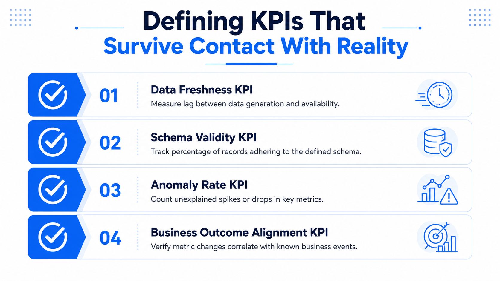
For teams building this discipline into their own stack, a practical reference is the internal guide on data quality metrics. The point is not to multiply KPIs. The point is to make each one defensible when the pipeline misbehaves.
Anomaly Detection, Timeliness, Validation, and Schema Tracking
A payroll team notices the month-end feed looks normal in volume, but one source system started drifting at odd hours, a downstream rule began rejecting valid records, and a column rename broke a reporting job. That is the kind of failure monitoring has to catch early. The useful view is not a single alert type. It is the set of checks that show whether the pipeline is late, wrong, drifting, or structurally changed before someone has to reconcile the damage by hand.
Four technical layers usually decide whether monitoring is useful or decorative. They belong in one reliability picture, even though each one answers a different question. If they sit in disconnected tools, teams end up with duplicate alerts, unclear ownership, and incident reviews that take longer than the fix.
Where the gap usually appears
Timeliness monitoring should usually be the first thing to instrument in a regulated environment. Late loads, missing arrivals, and delivery drift show up as broken reports fast, and they are easier to explain to stakeholders than subtle quality loss. If you run in-database or on-prem deployments, freshness checks also need to respect local job windows, batch schedules, and network handoffs, because the alert is only useful if it reflects the actual operating path.
Record-level validation catches the cases that arrive on time but still fail the business rule set. Invalid states, impossible values, and records that satisfy the schema but fail the process logic all belong here. Historical public-sector reporting has always relied on this kind of discipline, baseline first, then deviation, then remediation, because a clean delivery timestamp does not mean the report can be trusted.
Schema tracking watches for added columns, removed columns, and type changes. It protects downstream jobs from silent breakage when an upstream team ships a change without coordination. In tightly controlled environments, this layer matters even more because a schema change may also affect cached extracts, stored procedures, or in-database transforms that are harder to patch quickly.
Anomaly detection compares current behavior to a learned baseline and looks for drift in volume, distribution, or volatility. It is the layer that catches the issue no one planned for, the spike, the drop, or the gradual shift that would otherwise blend into routine noise. A practical reference for this kind of monitoring is anomaly detection for time series, especially when teams need to separate normal seasonality from a change that deserves attention.
Layer | Primary Question | Typical Trigger | Owner |
|---|---|---|---|
Timeliness monitoring | Did the data arrive on time? | Late, missing, or early load | Pipeline owner |
Validation | Does the record obey the rules? | Business-rule violation or invalid value | Domain team or data quality owner |
Schema tracking | Did the structure change? | Added, removed, or type-changed column | Upstream producer or platform team |
Anomaly detection | Is behavior drifting from the baseline? | Unexplained spike, drop, or volatility | Data engineering or observability |
Sequence matters more than tool count
Start with timeliness if the first complaint is stale reporting. Start with validation if bad records drive rework, audit findings, or manual cleanup. Start with schema tracking if source changes often break downstream jobs. Start with anomaly detection once the pipeline is stable enough that unusual patterns mean something, because before that, every alert is just another unverified symptom.
Keep the layers separate in implementation, but unified in reporting. The operator needs one incident view, not four competing theories about what failed. That is especially true in on-prem and in-database stacks, where access paths are narrower and the cost of jumping between tools is high.
A common mistake is buying overlapping checks and hoping the dashboard sorts it out. Reliable monitoring works better as a layered system with clear escalation paths and a single operational story. If the team cannot tell whether the issue is late delivery, bad content, schema drift, or behavioral drift, the monitoring design still needs work.
For teams that want a clean workspace to present that split, you can setup your Writingmate workspace.
Dashboards and Alerting That Different Stakeholders Will Actually Use
A dashboard only works when the right person sees the right signal with enough context to act. Engineers need detail, analysts need trend history, and executives need a clean summary. If one view tries to serve all three, trust drops fast.
Build for roles, not for vanity metrics
The strongest dashboards separate current status from historical context. NASA's technical assessment guidance is useful here because it emphasizes consistent formatting, preserved history, and color-coded alert zones that support trend identification and cross-project analysis (NASA technical assessment guidance via MRV-style reference). That pattern maps well to observability. Current state shows what is happening now. Historical state shows whether the issue is a blip, a repeat, or the start of an incident.
For engineers, the dashboard should expose enough context to triage quickly, then link to the failed rule, the affected table, and the recent history. For analysts, the useful layer is trend and volatility context, because they need to know whether a movement is statistically unusual or just seasonal noise. For executives, the summary should be readable without operational jargon.
If you're setting up a clean workspace for that split, you can setup your Writingmate workspace and use the same habit in your reporting stack, one surface for action, one for review. The useful idea isn't the product, it's the separation of concerns.
A dashboard also needs a place for the deeper quality view. The same operating principle applies whether the signal comes from freshness, validation, schema drift, or volume changes, and a dedicated data quality dashboard gives teams a clearer path from status to investigation than a crowded general-purpose chart.
Alerting works only when severity is real
Severity bands reduce alert fatigue. Not every deviation deserves a page, and not every issue belongs in the same channel. Standardized alert zones work better than ad hoc thresholds because teams can route low-grade drift to review queues and send high-grade breaks to immediate escalation.
A defensible reporting system also keeps evidence trails. Public-sector reporting disciplines still matter here, because the useful habit is the same, keep the report self-standing, write objectively, separate facts from analysis, and preserve the link between baseline, deviation, lag, and remediation. That discipline is as useful for incident reporting as it is for formal review.
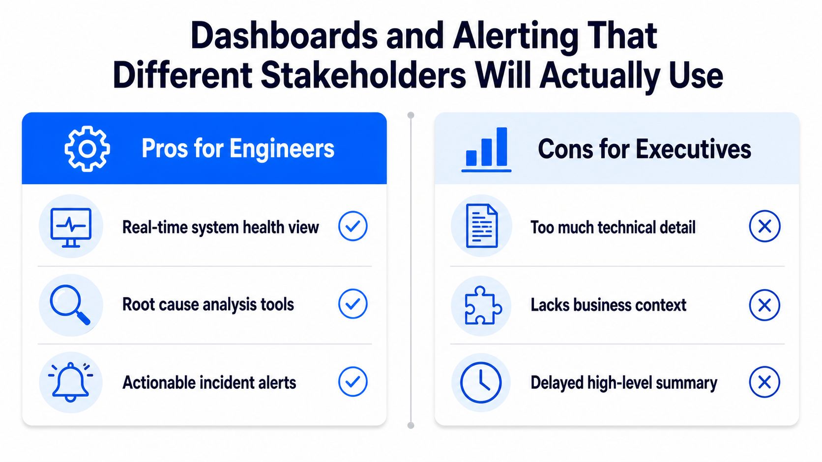
If a reporting view cannot answer who owns the issue, how severe it is, and whether the current state differs from the last known-good period, it is not a decision tool. It is wallpaper.
Deployment Choices That Shape Your Monitoring Architecture
Deployment isn't a packaging detail. It changes what you can inspect, where metrics are computed, what leaves your environment, and how well the architecture fits governance rules. If your monitoring stack requires data movement you can't justify, the deployment model is already working against you.
In-database execution changes the security equation
For regulated enterprises, the biggest architectural question is where metric computation happens. In-database execution keeps checks close to the data instead of shipping production data to a vendor cloud, which is a major advantage when privacy, residency, or internal control boundaries matter. It also reduces the amount of duplicated logic you need to maintain across systems.
That matters because monitoring often touches sensitive records before anyone else sees them. If the platform can operate inside the customer's own environment, the governance story becomes simpler. The vendor doesn't need broad access to raw production data just to compute freshness, schema drift, or validation results.
On-premises and private cloud are operational choices, not footnotes
On-premises and private cloud deployment are about control. They let a team run the monitoring layer inside the customer's cloud, VPC, or data center, which is often the only acceptable answer when policies restrict external processing. The trade-off is that the customer owns more of the operational surface area, including upgrades, runtime capacity, and internal access controls.
Modular licensing becomes useful. Start with a single use case, such as validation on one critical dataset, then expand once the first module proves value. Transparent per-active-table pricing also matters because it avoids incentive problems that show up in alert-volume or API-call models. When usage costs rise with noise, teams start suppressing the very checks they need.
If a vendor's pricing punishes you for looking too often, your monitoring program will eventually under-monitor itself.
The EU ETS monitoring framework is a good reminder that the plan itself is an operational control document, not a narrative. It requires the monitoring plan to show the installation and activities clearly enough to avoid data gaps or double counting, and to define responsibilities and competencies for the people who run it (EU ETS monitoring framework). That's the same standard I'd use for enterprise observability architecture.
The deployment model has to fit the control model. If it doesn't, the reporting stack becomes another place where policy and practice drift apart.
Operational Playbooks for Data Engineers and Stakeholders
A signal without a playbook is just an interruption. The teams that run monitoring well do not stop at detection. They define what happens next, who owns it, and how the fix gets fed back into the system. That is the point where observability turns into operations.
Give every alert a next move
Start with ownership. When a threshold fires, someone has to know whether they investigate, escalate, or suppress it with evidence. The response path should differ for a pipeline delay, a schema change, and a business metric shift, because those issues rarely share the same root cause or the same audience.
In finance, healthcare, telecom, and the public sector, one response model never fits all. Financial services teams usually need tighter control around risk, regulatory, and transactional signals. Healthcare teams need auditable evidence trails. Telecom teams need fast triage for high-volume customer data. Public-sector teams need traceability and reviewable decisions.
A practical playbook usually has four stages:
Signal fires. The alert triggers a defined event.
Investigate. The on-call owner runs the diagnostic steps.
Remediate. The team applies the fix or mitigation.
Review and improve. The post-incident review updates the thresholds or logic.
Close the loop with reviews, not blame
Public-sector reporting discipline still matters here. Baselines, deviation, lag, and remediation give teams a way to separate a bad source, a changing process, and a threshold that no longer fits. If a threshold fires too often this month, the issue might be the metric design, not the pipeline. If it never fires, the threshold may be too loose or the signal too vague.
The review cadence is where reporting becomes a living system, and where the deployment model matters just as much as the metric logic. In-database and on-prem setups change who can see the evidence, where the checks run, and how quickly operators can act. A playbook that ignores that constraint ends up as policy on paper and drift in practice.
Reporting as Decision Evidence, Not a Compliance Afterthought
A report that adds more charts rarely helps. It usually adds more noise, more disagreement, and more time spent arguing over which number should count as the truth. Decision-grade reporting starts with a simpler question, who needs the information, and what will they do with it.
Different audiences need different evidence
Operators need signals they can triage quickly. Managers need trend context and a clear view of volatility. Regulators and executives need summaries they can reproduce and defend. Those groups do not need the same report, and they do not need the same level of detail.
The harder part is deciding which metrics are decision-grade for each audience. As noted earlier, monitoring systems often collect data that looks complete but still fails to support the decision in front of the user. That is why equity and bias dimensions belong in reporting design even when the program begins as an operational one. If underserved groups do not appear in the report, the report is incomplete.
Community-validated monitoring pushes the point further. Standard reporting often misses lived experience, especially where service availability, accessibility, acceptability, equity, and quality matter directly to users (Community-based monitoring evidence brief). Automated checks are necessary, but they do not replace feedback from the people affected by the service.
Make reporting auditable by default
The reporting artifact should separate facts from analysis, stand on its own, and rely on corroborated information rather than rumor. That standard works for incident summaries, monthly business reviews, and regulator-facing output alike. It also means the report should point back to the source, the threshold, and the action taken.
Public-sector reporting discipline still earns its keep here. Baseline, deviation, lag, and remediation help teams separate a bad source, a changing process, and a threshold that no longer fits. If a threshold fires too often this month, the problem may be the metric design, not the pipeline. If it never fires, the threshold may be too loose or the signal too vague.
The review cadence is where reporting becomes a living system, and the deployment model matters as much as the metric logic. In-database and on-prem setups change who can see the evidence, where the checks run, and how quickly operators can act. A playbook that ignores that constraint ends up as policy on paper and drift in practice.


