Data Quality Dimensions Explained for Modern Data Teams
|
8
min read

You can have a dashboard full of green checks, a pipeline that finishes on schedule, and a weekly report that lands in every inbox on time, then still watch the business make the wrong call. That's the part people miss when they treat data quality dimensions like a compliance checklist instead of an operating model. In production, the failure usually isn't obvious corruption. It's a slow shift in one dimension, maybe timeliness, maybe consistency, maybe accuracy, that slips past broad monitoring and poisons decisions.
Table of Contents
When Good Data Leads to Bad Decisions
A financial services team can trust its risk dashboards for months and still get burned. The numbers look stable, the ETL jobs succeed, and no one sees a broken table. Then a model review exposes the problem, the inputs were drifting in a way the team never isolated, so the model's outputs had been degrading long before anyone noticed.
That's the practical danger of a single data quality score. A dataset can be complete but stale, valid but inconsistent, or internally clean but misaligned with the business event it's supposed to represent. When monitoring only tells you that “quality is fine,” it hides the question, which dimension failed, and how.
A lot of teams discover this only after a decision goes wrong. The issue is rarely that the data is unusable in every sense. More often, one dimension slipped just far enough to stay invisible to generic checks while still changing the behavior of downstream models, reports, or alerts.
Practical rule: if your monitoring can't tell you whether the issue is freshness, contradiction, duplication, or missingness, it's not monitoring the thing that actually failed.
That's why practitioners need to treat dimensions separately. The business doesn't experience “data quality” as an abstract score, it experiences late feeds, duplicated entities, missing fields, contradictory systems, and values that no longer match reality. A useful operating model starts by finding the exact dimension that changed, then tracing how that change reached a decision.
For a related perspective on how poor data quality shows up in business outcomes, see digna's discussion of the impact of poor data quality on business decisions.
From Academic Frameworks to Operational Reality
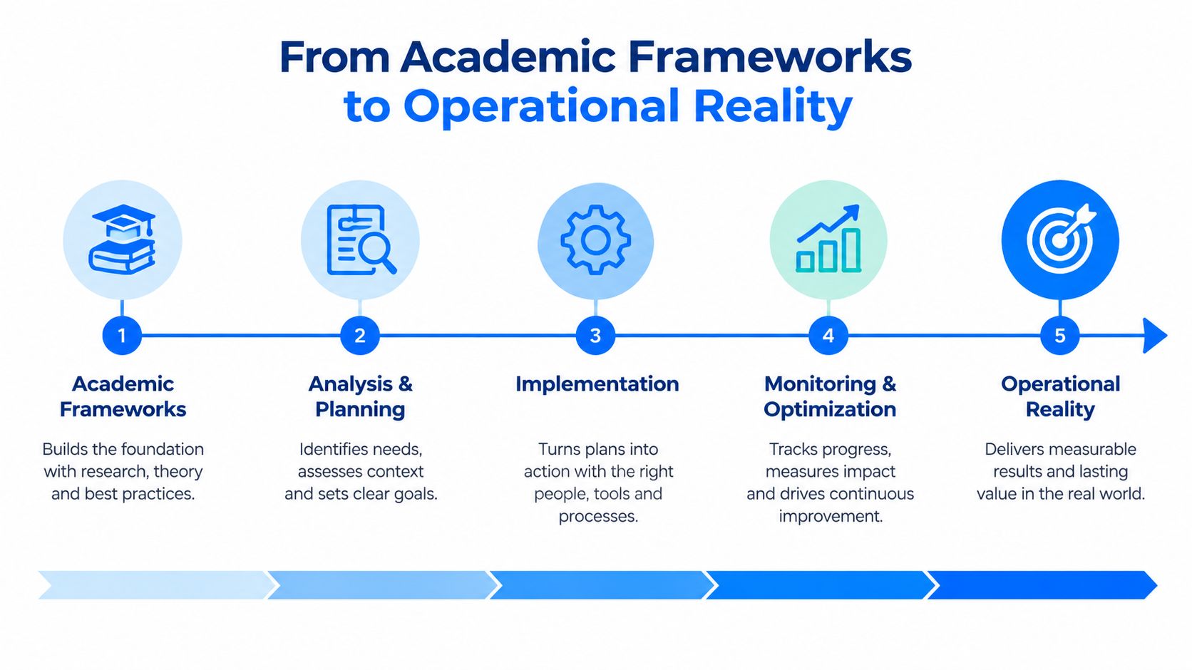
A practical data quality program usually starts with a messy reality, not a tidy taxonomy. The lineage behind modern frameworks goes back to the 1990s, when researchers grouped 15 dimensions of data quality into intrinsic, contextual, representational, and accessibility categories. That broadened the conversation beyond accuracy and helped shape later standards such as ISO 8000 as described in the literature. The history matters because it explains why teams still inherit a fragmented set of definitions, controls, and ownership models.
Why the list got shorter
Most organizations cannot operationalize all 15 characteristics at once. They need dimensions they can measure, alert on, and assign to an owner. IBM's six core dimensions, accuracy, completeness, consistency, timeliness, validity, and uniqueness, reflect that shift toward controls teams can run. For a broader governance lineage, DAMA-DMBOK is often the reference point practitioners use when they need to connect concepts to operating practice.
The same pressure shows up in other frameworks. Statistics Canada uses a more manageable set, with relevance, accuracy, timeliness, accessibility, interpretability, and coherence, which shows how organizations simplify the model when the goal is day-to-day governance rather than academic coverage.
ISO/IEC 25012 pushes the model toward implementation by treating quality as a multidimensional model with 15 high-level characteristics, split into inherent and system-dependent groups as captured in the standard summary. That separation matters in production, because the data can be sound while the pipeline, schema, or interface makes it look broken. ISO 8000-8 then narrows the work into syntactic, semantic, and pragmatic quality as described in the literature, which is the kind of breakdown engineers can turn into checks, exceptions, and escalation paths.
The practical lesson is direct. Academic taxonomies define the space. Operational frameworks tell teams what to inspect, where to inspect it, and how to tell one failure mode from another.
Standards help most when they force tradeoffs into the open. If you cannot say whether the issue is semantic, syntactic, or pragmatic, you usually cannot design the right control either.
The Core Dimensions and How to Measure Them
The six-dimension model is a practical starting point because it gives teams a common language, not because it covers every edge case. In production, each dimension needs a metric, a detection method, and a failure pattern that surfaces before users notice. The goal is catching the kind of breakage that changes behavior downstream. For a focused walkthrough of one dimension, digna's guide to how to measure data accuracy is a useful companion.
Dimension | Key Metrics | Detection Methods | Common Failure Modes |
|---|---|---|---|
Accuracy | Deviation from source of truth, drift from reference values | Cross-check against authoritative systems, sample audits, drift comparisons | Values no longer match reality, model inputs age out of sync |
Completeness | Null rate, missing required records, partial records | Field-level presence checks, row-count reconciliation, required-field validation | Missing IDs, empty attributes, half-written records |
Consistency | Contradiction rate across systems, mismatch counts | Cross-system comparisons, entity reconciliation, rule-based contradiction checks | Same entity has different values in different places |
Timeliness | Delay between reference period and availability, late-delivery rate | Arrival-time monitoring, SLA checks, expected delivery estimates | Loads arrive late, dashboards reflect the wrong period |
Validity | Rule-failure rate, out-of-range values, format violations | Business-rule enforcement, schema constraints, regex and domain checks | Invalid codes, impossible values, malformed fields |
Uniqueness | Duplicate rate, repeated key count | Deduplication logic, key collision scans, fuzzy matching for near-duplicates | Duplicate customers, repeated transactions, inflated totals |
What to measure first
Accuracy starts with a trusted reference. Compare values to that reference and watch for drift over time. A record can pass schema checks and still be wrong, so the control has to compare the data to something outside the dataset. For teams trying to define that control, how to measure data accuracy lays out the mechanics clearly.
Completeness is usually the easiest dimension to put in production early. Track null rates, missing required rows, and partial records by field and by source. The failure mode is simple, a pipeline passes rows through, but one important attribute never gets populated, which breaks analytics and reporting later.
Consistency needs cross-system thinking. Two systems can look fine on their own and still disagree about the same entity. That contradiction hurts reconciliation, especially when downstream teams assume there is one source of truth.
Where checks break in real pipelines
Timeliness is about lag, not a vague freshness label. The Victorian Government guideline defines it as the delay between the reference period and the release of information, which makes it a concrete operational measure rather than a slogan for data freshness. The UK Government framework also treats timeliness as data that reflects the period it represents and stays up to date within the official model.
Validity is where business rules live. Check allowed ranges, exact-value lists, formats, and thresholds, because invalid records often look harmless until a downstream process rejects them or, worse, accepts them.
Uniqueness is about duplication control. It means no duplication in records for the same entity, as the UK Government framework sets out in the same official model. In operational terms, duplicate records inflate volumes, double count customers, or turn a downstream join into nonsense.
Integrity and provenance matter too. Integrity protects relationships between records and tables. Provenance shows where a value came from and how it changed. They rarely get the first call in a quality review, but they often decide whether a fix lands quickly or turns into a forensic hunt.
Why Context Determines Which Dimensions Matter Most
Not every workload needs the same balance of dimensions. A finance team, a clinical team, and an ecommerce team can all use the same warehouse and still care about different failure modes. The mistake is assuming every dimension deserves equal weight everywhere.
In financial services, accuracy and consistency usually rise to the top because regulatory reporting, risk calculations, and reconciliations depend on values lining up across systems. A record that's complete but contradictory is still a problem. In healthcare, timeliness can matter more in the moment because a delayed feed can be less useful than a slightly imperfect one, especially when operational decisions depend on the newest available status.
Ecommerce often prioritizes completeness and validity. A product catalog with missing attributes or invalid categories can break search, filters, and fulfillment logic even if most records look fine. IoT and event-driven systems usually lean heavily on timeliness and accuracy, because stale telemetry can make a real-time decision system react too late or react to the wrong state.
Pick dimensions by use case, not habit
A recent survey argues that data quality dimensions are context-dependent and should be unfolded into practices, not treated as a static checklist of labels. That matches what teams run into in production. The same dataset can be “good enough” for monthly financial reporting and not good enough for a same-day operational dashboard.
The operational question is always, what breaks first if this dimension degrades? If a missing field only affects a minor enrichment, it can wait. If a stale feed changes a clinical or trading decision, it moves to the front of the queue.
Operational insight: prioritize the dimension that changes the decision, not the one that's easiest to measure.
That framing helps teams avoid the common trap of over-optimizing a low-risk area while missing a high-risk one. It also explains why static scorecards fail in regulated environments. A scorecard might look clean while the actual use case still lacks the freshness, contradiction checks, or validation rules it needs.
The practical move is to map each dataset to its real consumers, then write down which dimensions those consumers depend on. Once that's clear, the monitoring design gets much easier.
Operationalizing Dimensions with Continuous Monitoring
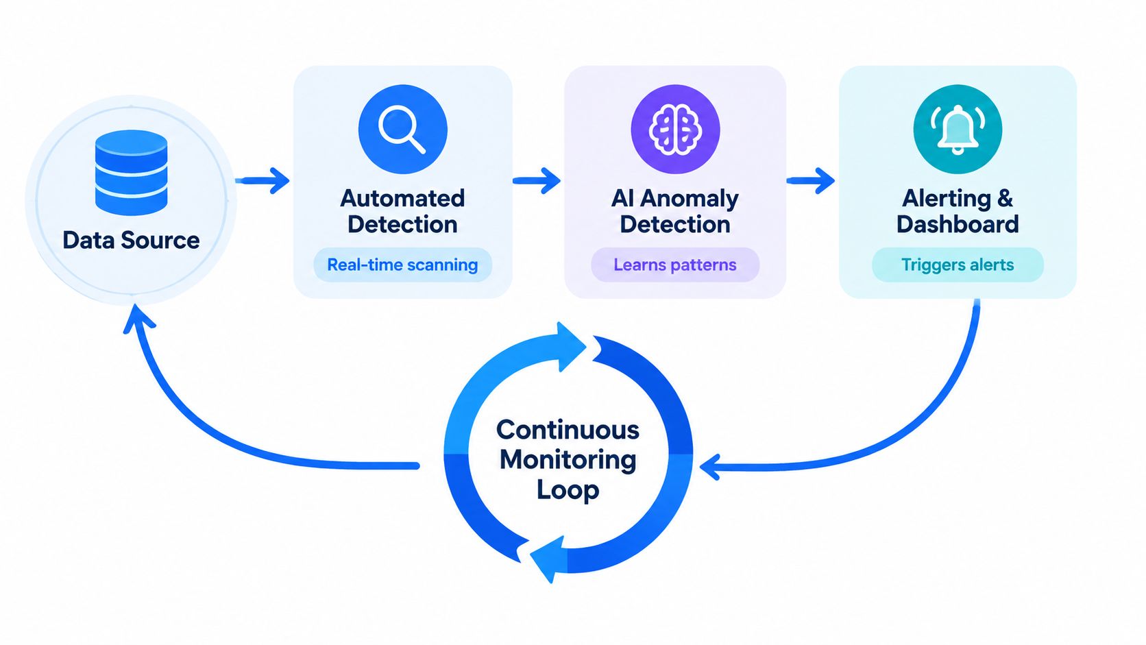
Continuous monitoring is where the theory becomes usable. Instead of waiting for a weekly review, modern platforms watch the data itself, learn normal patterns, and flag deviations as soon as they show up. That matters because most quality failures don't arrive as obvious breakages, they show up as subtle drift.
digna's modular setup reflects that reality. Data Anomalies covers AI-driven baseline learning for accuracy and consistency shifts, Timeliness tracks expected arrival patterns and delivery delays, Data Validation enforces rule-based checks for validity and completeness, and Schema Tracker watches for structural changes that can break downstream consumers. The checks run in-database, so data stays in place while the platform computes metrics and detects issues in the customer environment.
How continuous checks work in practice
Baseline learning is useful because not every anomaly is a simple threshold breach. A table might always spike on the first business day of the month, so a fixed rule would create noise. Learning the baseline lets the system see what normal looks like for that dataset, then flag a deviation when the pattern shifts.
Timeliness monitoring should do more than mark late loads after the fact. It needs to learn the expected cadence, compare it to actual arrivals, and identify missing loads or early deliveries before downstream jobs consume stale data. That's the difference between finding the problem in a postmortem and catching it while there's still time to reroute a pipeline.
Schema tracking closes another common gap. Structural changes, added columns, removed columns, and type modifications can break consumers even when row counts look healthy. The consumer doesn't care that the source table still exists if the shape changed underneath it.
Why the architecture matters
Manual checks don't scale well once teams manage many datasets and many rules. Continuous automation reduces the burden of scanning everything by hand and helps separate true anomalies from routine variation. That cuts alert fatigue, which is usually what kills monitoring programs in the first place.
A platform also has to support remediation, not just detection. Engineers need incidents, trends, and enough context to decide whether to fix upstream, patch a rule, or accept the new baseline. Without that feedback loop, monitoring becomes a stream of alarms with no path to action.
Prioritization Framework and Implementation Checklist
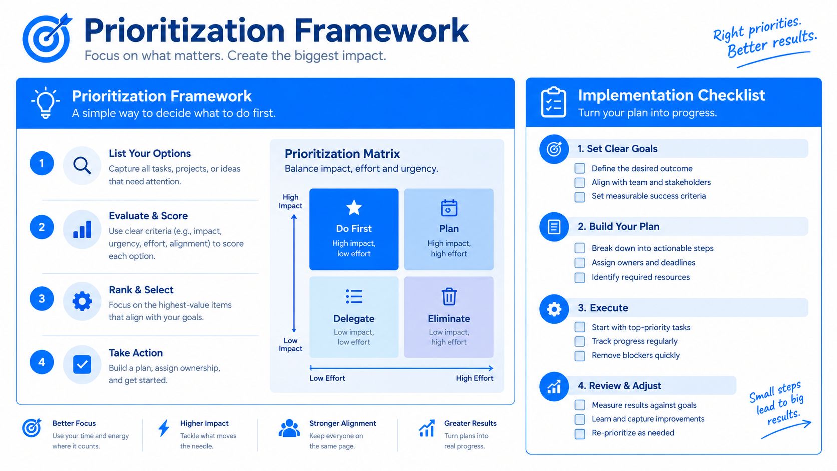
Start with the datasets that can hurt you the most. That usually means financial feeds, operational fact tables, customer master data, regulated reporting sets, or anything feeding executive dashboards. A low-value dataset can wait. A critical one can't.
A phased rollout that works
Phase 1, choose the obvious gaps. Timeliness and completeness are usually the fastest wins because they're easier to define, easier to inspect, and easier to explain to stakeholders. If a feed arrives late or a required field goes missing, many teams can recognize the impact quickly.
Phase 2, add contradiction and rule checks. Once the basics are under control, move into consistency and validity. That's where cross-system contradictions, invalid codes, and bad business-rule combinations start showing up.
Phase 3, tighten accuracy and uniqueness. These tend to need better baselines, better reference data, and more mature remediation workflows. They're harder to nail with a single rule, but they matter a lot once the volume and business impact are high.
A useful checklist for each phase is simple:
Define the metric clearly. If the team can't explain what changed, the metric isn't ready.
Establish a baseline. Without normal behavior, every alert looks suspicious.
Set alert thresholds. Thresholds should reflect business risk, not just technical neatness.
Document the remediation path. Someone needs to know who fixes it, where, and how fast.
A modular platform helps because you don't need to install every capability on day one. You can start with one table, one module, and one class of issues, then expand coverage as the organization gains confidence and the scope gets clearer. That approach is far more sustainable than trying to monitor every dimension everywhere from the start.
The Case for Continuous Monitoring Over Periodic Checks
Periodic checks made sense when pipelines were slower and the number of critical datasets was manageable. They break down once data moves continuously, consumers depend on fresh feeds, and the cost of a late discovery is high. By the time a scheduled report surfaces a problem, the damage is often already baked into decisions.
Continuous monitoring changes the cadence. It detects drift while the data is still moving, not after it has already shaped an analysis or triggered an action. That's especially important because quality issues often start small, then spread through joins, aggregates, models, and dashboards.
This is also where scale matters. Teams managing many rules, many sources, and many downstream consumers can't keep up with manual inspection. Automation handles the repetition, and AI-driven baseline learning helps reduce noise by understanding what normal looks like for each dataset instead of treating every fluctuation as a failure.
The other advantage is response time. When a delay, contradiction, or schema change is caught early, the team can fix the source, pause a downstream job, or reroute the process before users act on bad output. That's much harder to do when the first alert arrives in a weekly review.
Continuous monitoring isn't about replacing judgment. It's about giving engineers enough signal, at the right time, to act before the business feels the fault.
If you're building or tightening a data quality program, start with the datasets that carry the most business risk and monitor the dimensions that change decisions. digna gives teams modular monitoring for anomalies, timeliness, validation, and schema changes inside their own environment, so the checks stay close to the data and the remediation path stays practical. Visit digna to see how that approach fits your stack and where you'd start first.