10 Business Monitoring Tools to Compare in 2026
|
8
min read

Your dashboard can look calm while the underlying data is already off. A delayed load, a schema change, or a strange KPI swing can leave leaders making decisions on numbers that are technically “fresh enough” to pass a glance test, but wrong in the ways that matter. That's why business monitoring tools now sit between analytics and operations, they watch metric behavior, data reliability, timeliness, and business context together, instead of treating each problem in isolation. If you're comparing options, focus on anomaly detection, KPI coverage, schema tracking, deployment model, pricing clarity, and where each tool starts to break down, not just on the marketing layer. A practical starting point is this anomaly detection overview for business data.
Table of Contents
1. digna

digna is built for teams that want business monitoring treated as part of their data infrastructure, not as a BI add-on. It runs in your own environment, in a private cloud, VPC, or on-premises setup, so production data stays under your control and the vendor does not access it. That matters in regulated environments where governance and data movement shape the buying decision.
The implementation choice is also practical. digna computes metrics and validations in-database, which reduces unnecessary data movement and fits security reviews better than tools that rely on exporting large amounts of raw data. Its modules cover Data Anomalies, Timeliness, Data Validation, Data Analytics, and Schema Tracker, so teams can begin with one layer and expand without rebuilding the monitoring stack.
Practical rule: if your team spends more time tuning thresholds than investigating issues, baseline learning is where a platform starts to pay off.
digna states on its site that installation to initial insights takes under two hours, and its pricing posture is usage-stable, with a base fee plus per-active-table per-module licensing rather than API-call, scan, or alert-volume charges. That makes it easier to scope a pilot around a real warehouse slice instead of guessing how noisy the month will be. Learn more in the business monitoring solution.
digna fits teams that need to watch unexpected KPI movement, delivery delays, schema drift, and record-level quality in one place. It is a strong option for finance, healthcare, telecom, and public-sector environments where the key question is whether the dashboard can be trusted for decisions, not just whether a monitor fired.
Pros
Privacy-first deployment: runs in your infrastructure, with production data kept in place.
Minimal manual tuning: machine learning and statistical methods learn baselines automatically.
One platform, multiple layers: anomalies, timeliness, validation, schema tracking, and analytics live in one UI.
Fast time to value: initial insights arrive quickly if the environment is ready.
Transparent pricing posture: base fee plus per-active-table per-module licensing.
Cons
You own the environment: private deployment means your team handles hosting, connectivity, and access controls.
Scope matters: per-table, per-module pricing can grow if you try to light up everything at once.
Website: digna (digna.ai)
2. Anodot

Anodot is the cleaner fit when the business question is the main event. It focuses on real-time KPI monitoring for revenue, cost, and customer experience, then correlates incidents across related metrics so teams can move from “something changed” to “what probably caused it” without building a lot of manual logic first. That makes it useful for commerce, payments, marketing, and operations teams that care more about business telemetry than table health alone.
Where it works well
Its value is in adaptive baselining and low-noise alerting. If your revenue or order-volume patterns change by time of day, channel, or segment, a static threshold can turn into an alert factory pretty quickly. Anodot is a better fit for teams that want the system to learn the shape of normal behavior and surface deviations that actually deserve attention.
It's also the kind of tool that can help business users stay in the loop without asking engineers to translate every metric into a data-quality issue. The trade-off is that it's less compelling if what you really need is table validation, schema drift tracking, or warehouse-level observability.
Business KPI monitoring becomes easier to defend when the alert fires on a revenue pattern, not just a broken job.
Pros
Purpose-built for KPI monitoring: especially strong for revenue and customer-facing metrics.
Fast setup: minimal manual rule setup compared with threshold-heavy tools.
Incident context: correlates issues across related business metrics.
Cons
Sales-led pricing: public pricing detail is limited.
Can be too broad for narrow data-quality needs: if you only need table checks, it may be more than you need.
Website: Anodot
3. Monte Carlo
Monte Carlo is strongest when your real pain is triage. It monitors freshness, volume, schema, distribution, and lineage, so a bad load doesn't just show up as a red light, it shows up with downstream context. That matters when one broken dataset can affect several dashboards, and the analyst who spots the issue needs to know which assets are already contaminated.
The platform's lineage and impact analysis are its key differentiators. In practice, that means you can see what downstream reports or models are likely affected before you start chasing the same problem through Slack threads and ad hoc queries. For teams with a broad analytics surface area, that cuts a lot of time out of the first 30 minutes of incident handling.
Monte Carlo also extends into AI and agent observability, which is useful if your reporting layer now depends on LLM workflows as well as traditional warehouse assets. That said, the feature depth comes with onboarding cost, and the pricing is still enterprise-shaped rather than self-serve.
If the question is “what broke downstream?”, lineage beats a prettier alert every time.
It works best in environments where the data stack is already fairly mature and the team can absorb a tool that rewards careful setup. If you want a broad observability net and strong impact analysis, it belongs on the shortlist.
Monte Carlo simulation and observability coverage is worth reviewing if you're comparing impact-analysis-first tools.
Pros
Strong lineage and impact analysis: faster root-cause work across dashboards and models.
Mature enterprise fit: good connector ecosystem and references.
Covers multiple failure modes: freshness, volume, schema, and distribution.
Cons
Enterprise pricing model: public pricing is limited.
Setup takes time: the depth of the platform usually needs onboarding.
Website: Monte Carlo
4. Bigeye

Bigeye fits teams that need data observability and governance to move together. It pairs automated anomaly detection with an AI Trust layer for classification, policy enforcement, and governance, so the platform is aimed at analytics and AI teams that also have to keep regulated data under control.
A practical strength is downstream context. Bigeye's lineage-aware alerts show how an upstream issue can affect the rest of the environment, which shortens the path from alert to fix when a metric change touches sensitive datasets. That matters when the incident has to be both operationally clear and defensible.
The classification layer is another reason larger enterprises look at it. Bigeye includes discovery for data types that need tighter handling, so it suits teams that need more than watched tables and a ticket when values drift. For smaller teams, that breadth can be more platform than they need.
Bigeye alternatives are useful if you are deciding whether governance and observability should stay in one product or be split across tools.
Practical rule: if you need policy enforcement and root-cause context, fewer tools can make sense, but a lighter setup may be easier to operate.
Pros
Lineage-aware alerts: faster downstream impact analysis.
Governance features included: classification and policy controls are built in.
Enterprise posture: better suited to regulated environments.
Cons
Sales-led pricing: list pricing is not public.
May be too much for small teams: the feature set is broad.
Website: Bigeye
5. Acceldata

A broken KPI is not always the first sign of trouble. Sometimes the problem is a slow pipeline, a warehouse that is burning through capacity, or a processing job that is putting service levels at risk. Acceldata is built for that layer of the problem.
Where it fits
Its main value is connecting data health with platform efficiency. If a workload starts consuming more compute or storage than expected, the question is not only whether the job finished, but whether that spike will affect the rest of the day. Acceldata helps platform teams watch reliability and consumption in the same place.
That makes it a practical choice for teams that own both the platform and the datasets. It is less focused on front-line KPI alerting, and more on keeping the environment stable enough that downstream business monitoring remains trustworthy.
Data platform observability becomes easier to justify when reliability, workload behavior, and cost are reviewed together.
Pros
Reliability and performance in one view: useful when platform issues show up as data issues.
Cost governance support: helps teams watch consumption patterns.
Enterprise reach: works across warehouses, lakes, and processing engines.
Cons
No public pricing: buying usually starts with sales.
Shared ownership model: platform, data, and finance teams may need to align on how it is run.
Website: Acceldata
6. Anomalo
Anomalo is built for teams that want automatic coverage on large tables without writing a mountain of rules. It profiles tables, learns what normal looks like, and flags unusual changes, missing data, or rule violations before a dashboard goes stale. That makes it especially useful for analysts and data consumers who don't want to wait for a broken report to surface the problem.
The product's strength is speed of coverage at the table and column level. It gives you visual context for investigation, which is useful when the first person to see the issue isn't the same person who can fix the pipeline. The trade-off is that it stays more focused on table-level observability than on broader platform operations.
That focus is a feature if your problem is broken datasets, not infra sprawl. If your team already has another tool for lineage or job observability, Anomalo can sit nicely on top as the quality layer.
Pros
Minimal rule writing: quick to cover large tables.
Good visual context: helps analysts investigate faster.
Useful deterministic and ML mix: catches both known and unknown issues.
Cons
Narrower scope: less about full platform ops.
Enterprise pricing model: public pricing isn't listed.
Website: Anomalo
7. IBM Databand
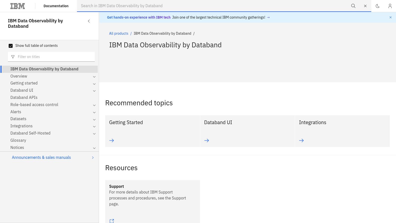
A missed pipeline run can break a dashboard long before anyone notices the source table is wrong. IBM Databand is built for that problem. It watches metadata, job runs, and SLAs to surface delays, failures, and schema drift before downstream reporting starts to lose trust.
Best fit
IBM Databand fits teams that need observability at the delivery layer, especially in IBM-oriented environments or shops that already align with IBM operating standards. It answers a different question from data-quality tools. Those tools tell you whether the data is valid. IBM Databand tells you whether the data arrived on time and executed cleanly.
That distinction matters in practice. If the common failure mode is “the job did not land when it should have,” pipeline observability is more useful than a generic monitoring layer because it understands runs, dependencies, and SLA misses rather than just logs.
IBM Databand documentation is the right starting point if your stack already leans toward IBM-managed workflows.
Practical rule: pipeline observability reduces surprise. It does not replace quality checks, it makes them earlier and more useful.
Pros
Pipeline-first coverage: useful for delays, failures, and SLA misses.
Fits IBM environments: easier to adopt where IBM standards already exist.
Complements table checks: works well beside a data-quality platform.
Cons
Pricing is not transparent: public buying detail is limited.
Narrower than full observability suites: may not cover every platform concern.
Website: IBM Databand (ibm.com/docs/en/dobd)
8. Soda
Soda treats data reliability as code, putting checks in version control and connecting engineering workflows with business-facing monitoring. SodaCL gives data teams readable checks, while its business UI and data contracts let non-engineers participate in ownership.
Where it fits
Use Soda when the main operational problem is a data-quality failure, such as a failed check or contract violation that could undermine reporting. Open-source components and managed options provide a practical pilot path, allowing teams to test the workflow before committing to a heavy enterprise rollout.
The trade-off is focus. Soda supports reliability and validation, but its anomaly detection is less specialized than dedicated anomaly tools. Teams that primarily need advanced baseline learning for business KPIs may need a separate KPI-first monitoring layer. Start with checks for priority datasets, assign alerts to owners who can resolve failures, then expand coverage as responsibilities settle.
Pros: Developer-friendly checks fit modern engineering workflows. The Clear adoption path supports a staged rollout, while the Good collaboration model gives business and technical teams shared ownership through the UI and contracts.
Cons: Less specialized anomaly detection makes Soda a weaker single choice for KPI-first monitoring. Some enterprise features are gated, so higher tiers may be required.
Review Soda-io alternatives when deciding where code-driven checks stop and broader observability begins.
Website: Soda
9. Metaplane
Metaplane is a good fit for teams that want a predictable monitored-asset model. It watches freshness, volume, nullness, uniqueness, distributions, and schema changes, then adds lineage and downstream BI impact analysis so teams can see how a bad table reaches the dashboard layer.
The pricing model is especially relevant for teams with a defined set of critical assets. Per-monitored-table pricing can be easier to budget than usage models that fluctuate with scans or alerts, and the free tier makes it easier to test before scaling. That said, the platform is tuned to warehouse-centric stacks, so it's less of an all-purpose platform layer than some broader tools.
It's a practical option when your monitoring scope is specific and well-owned. If you know which tables drive the business, Metaplane gives you a straightforward way to keep those assets visible.
Pros
Predictable scope: table-based pricing is easier to plan around.
Clear downstream context: lineage and BI impact analysis help triage.
Easy to try: free tier and plan limits lower the barrier.
Cons
Warehouse-centric: may need complements for wider platform ops.
Advanced add-ons: some CI/CD and spend monitoring features cost extra.
Website: Metaplane
10. Lightup
Lightup targets enterprise data quality and observability with AI-assisted detection and remediation across structured and unstructured data. Its support for GenAI and LLM use cases suits teams monitoring more than conventional warehouse tables.
Lightup's practical distinction is the workflow around an alert. Slicing and segmentation help isolate the affected population, while playbooks and remediation guidance create repeatable next steps. This connects detection with ownership, so teams can identify the responsible layer and address a bad metric or dataset faster.
Plan for an enterprise rollout rather than a lightweight point deployment. Onboarding material, guided workflows, documentation, and playbooks can support adoption across teams. Smaller teams with a limited dataset footprint may find the operating model and feature surface heavier than their needs.
Pros
AI-assisted remediation: connects detection with concrete follow-up.
Supports structured and unstructured data: covers analytics and GenAI monitoring.
Strong onboarding posture: documentation and playbooks help standardize use.
Cons
Enterprise sales motion: pricing is not public.
May be heavier than necessary: limited deployments may not need the full platform.
Website: Lightup
Top 10 Business Monitoring Tools Comparison
Product | Core features | UX & quality (★) | Value & pricing (💰) | Target audience (👥) | Unique selling points (✨) |
|---|---|---|---|---|---|
🏆 digna | ✨ In‑DB checks, AI anomaly, timeliness, validation, schema tracking | ★★★★★ Shared UI, rapid TTV (<2h) | 💰 Transparent: base + per‑active‑table/module; no volume fees | 👥 Regulated enterprises (Finance, Healthcare, Telecom, Public Sector) | ✨ Runs inside customer infra; vendor never accesses prod data; modular licensing |
Anodot | ✨ Real‑time KPI monitoring, adaptive baselining, incident correlation | ★★★★ Business‑focused real‑time alerts, noise reduction | 💰 Sales‑led; fast TTV | 👥 Product/ops teams needing business KPI monitoring | ✨ Strong KPI correlation & root‑cause context |
Monte Carlo | ✨ Freshness, volume, schema, distribution, end‑to‑end lineage | ★★★★ Mature connectors; lineage UI | 💰 Enterprise contracts; pricing opaque | 👥 Enterprises needing lineage & impact analysis | ✨ End‑to‑end lineage & impact analysis; AI/agent observability |
Bigeye | ✨ Automated anomaly detection, lineage, governance, PII/PHI discovery | ★★★★ Enterprise security & governance posture | 💰 Sales‑led; enterprise pricing | 👥 Regulated industries & security‑sensitive teams | ✨ “AI Trust” layer + data classification & remediation suggestions |
Acceldata | ✨ Data reliability + platform performance & cost observability | ★★★★ Ties data health to platform performance | 💰 Pricing limited; enterprise | 👥 Teams focused on FinOps + pipeline performance | ✨ Integrated cost and consumption insights with reliability metrics |
Anomalo | ✨ Table profiling, ML checks, deterministic validation, visuals | ★★★★ Quick coverage; analyst‑friendly investigation views | 💰 Enterprise sales; not public | 👥 Analysts & teams fixing broken dashboards/KPIs | ✨ Rapid table/column anomaly detection with visual root‑cause |
IBM Databand | ✨ Pipeline/job monitoring, SLAs, metadata & run tracking | ★★★ Pipeline‑centric; IBM ecosystem integration | 💰 Enterprise (IBM) pricing | 👥 IBM/cloud‑native enterprises, pipeline ops teams | ✨ Strong job/SLA observability and IBM platform fit |
Soda | ✨ Deterministic checks, SodaCL, data contracts, OSS + managed | ★★★★ Developer‑friendly; versionable checks | 💰 Free/low‑cost tiers; clear on‑ramps | 👥 Devs and teams favoring “quality as code” | ✨ Open‑source components + data contracts and business UI |
Metaplane | ✨ Table observability (freshness, volume, nulls), schema alerts, dbt | ★★★★ Simple UI; per‑table visibility | 💰 Per‑monitored‑table pricing; free tier | 👥 Warehouse/dbt‑centric teams | ✨ Clear per‑table pricing and free trial tier |
Lightup | ✨ AI‑driven detection, validation, slicing, remediation playbooks | ★★★★ Strong onboarding & operational playbooks | 💰 Sales‑led; enterprise | 👥 Large orgs needing guided remediation at scale | ✨ Playbooks, segmentation and GenAI/LLM support |
Choose the Monitoring Layer Your Team Can Operate
The right choice depends on the failure mode you're trying to catch first. If unexpected KPI movement is the main concern, start with a KPI-first tool such as Anodot or a platform that explicitly watches business metrics in context. If the bottleneck is triage, choose lineage and impact analysis, because the fastest way to reduce incident time is to see what the upstream issue touched before people start guessing.
If the business pain is delivery and SLA misses, pipeline observability should come first. IBM Databand fits that lane well, and it's the right style of tool when jobs, runs, and timeliness are the incident pattern. If the problem is table or record reliability, pick a data-quality platform, not a generic monitor, because deterministic checks, anomaly detection, schema tracking, and timeliness checks work best when they're designed together.
Deployment model matters just as much as feature depth. Private infrastructure, in-database execution, and data-residency controls are not niche concerns anymore, especially for finance, healthcare, telecom, and public-sector teams. The strongest product on paper can still fail in practice if it forces too much data movement, too much vendor access, or too much operational overhead on the customer side.
Pricing should be judged the same way. Look for whether the vendor charges by table, by usage, by alert volume, or by some combination that becomes hard to forecast once the pilot grows. Then check ownership and integration effort, because the tool that looks cheapest at purchase time can become the most expensive if every incident still needs manual handoff.
A sensible rollout path is simple. Start with a representative set of critical datasets and KPIs, define who owns each alert, and verify whether the tool finds problems early enough to protect downstream decisions. If it only tells you what already broke, it's not solving the monitoring problem yet.
digna gives teams a way to monitor business metrics, timeliness, schema change, validation, and platform behavior inside their own environment, which is exactly where regulated and security-sensitive teams need the work to happen. If you want one platform that connects KPI movement to data reliability without handing production data to a third party, visit digna and see how it fits your monitoring stack.
If you are still deciding what your monitoring layer has to cover before you shortlist any of these vendors, start with our practical guide to designing a business monitoring system for data teams.
Frequently asked questions
What are business monitoring tools?
Business monitoring tools watch business metrics and the data behind them together, so a delayed load, a schema change or an odd KPI swing is caught before leaders act on it. Unlike a plain BI dashboard, they combine anomaly detection, KPI tracking, timeliness checks and schema tracking in one monitoring layer.
How do I choose the right business monitoring tool?
Start with the failure mode you need to catch first. KPI-first tools such as Anodot suit unexpected metric swings, lineage tools such as Monte Carlo suit triage, IBM Databand suits late pipelines and SLA misses, and data-quality platforms suit table and record reliability. Then weigh deployment model and pricing.
What is the difference between KPI monitoring and data observability?
KPI monitoring asks whether a business number such as revenue or order volume behaves abnormally, while data observability asks whether the tables and pipelines feeding it are fresh, complete and structurally intact. A wrong dashboard can come from either side, which is why many teams combine both layers.
How are business monitoring tools usually priced?
Most vendors in this comparison are sales-led and publish little pricing. Models vary between per monitored table, usage, alert volume or a mix of these. Metaplane charges per monitored table and offers a free tier, while digna uses a base fee plus licensing per active table and module.
Can a business monitoring tool run without sending data to the vendor?
Yes, some tools deploy inside your own infrastructure. digna runs in a private cloud, VPC or on-premises environment and computes metrics in-database, so production data stays in place and the vendor never accesses it. That matters for finance, healthcare, telecom and public-sector teams facing strict security reviews.