Statistical Methods for Data Analysis: Guide 2026
|
5
min read

You're probably dealing with one of two situations right now.
A dashboard that looked stable on Friday is nonsense on Monday. Or a model that behaved well in staging is making bad calls in production, even though nobody touched the code. In both cases, the usual culprit isn't dramatic system failure. It's quieter than that. A late load, a broken schema, a drifting distribution, or a column that still exists but no longer means what downstream logic assumes it means.
That's where statistical methods stop being theory and start acting like operational controls. In a modern data stack, they help teams detect the difference between normal fluctuation and actual failure. They turn raw observability signals into usable decisions. They also give data engineers a way to monitor health without hard-coding endless manual rules for every pipeline, table, and metric.
Table of Contents
Descriptive Statistics for Data Profiling and Anomaly Detection
Inferential Statistics for Forecasting and Root Cause Analysis
Why Statistical Methods Are Your First Line of Defense
A lot of teams first learn the value of statistics during an incident.
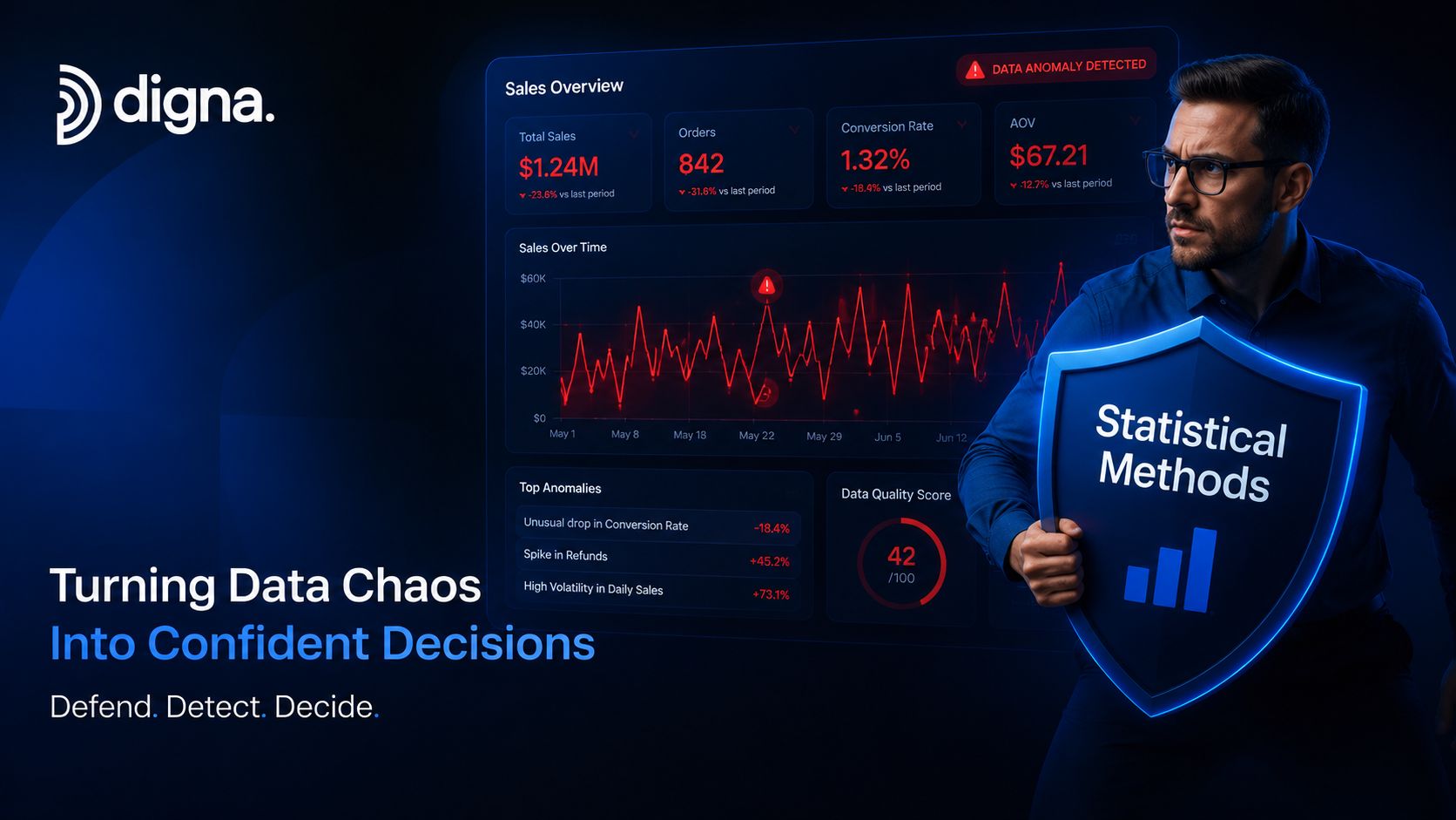
The revenue dashboard drops overnight. Product analytics suddenly shows impossible conversion behavior. A feature store still refreshes on schedule, but model inputs have shifted enough that predictions are no longer trustworthy. Logs may tell you that jobs ran. Orchestration may tell you tasks succeeded. Neither tells you whether the data still looks right.
Data failures are often valid data
This is the trap. The pipeline can complete successfully while the data becomes operationally useless.
A column can shift from one business meaning to another without breaking type checks. Event volumes can stay within a rough historical range while freshness slips enough to invalidate reporting. A distribution can drift gradually, which is exactly why crude “greater than” or “less than” threshold alerts often miss the underlying problem.
Practical rule: If your monitoring only checks system success, you're monitoring compute, not data.
The first line of defense is statistical monitoring of the data itself. That means establishing normal behavior, measuring variation, and flagging deviations that matter. In observability platforms, those methods become automated checks over record counts, null rates, freshness signals, schema changes, and metric behavior over time.
Why engineers need this, not just analysts
Statistical methods for data analysis have deep roots. The historical path runs from early population and economic estimation work through modern big data analytics, where machine learning, predictive modeling, and natural language processing have become standard, with analytics also becoming more accessible beyond specialist statisticians, as outlined in this history of analytics.
That history matters because the same core idea still applies. Collect data systematically. Analyze it to guide action.
For data engineers, the action is rarely academic. It's deciding whether to trust a pipeline, halt a release, quarantine a feed, or escalate an incident before business users see the damage.
The Core Concepts of Statistical Analysis
Statistics serves two operational purposes in a data system. It summarizes current behavior, and it helps decide whether an observed change is signal or noise.
Two jobs statistics performs
Descriptive statistics summarizes what is already in the data. In a pipeline or warehouse, that usually means row counts, averages, medians, null rates, distribution spread, cardinality, and outliers. These are the metrics observability tools calculate first because they establish a baseline for normal behavior.
Inferential statistics estimates, tests, or forecasts beyond the observed slice of data. Teams use it to judge whether a shift is likely random, whether a difference between groups is meaningful, or whether recent behavior points to a larger issue. In practice, this shows up in change detection, drift analysis, incident triage, and forecasting.
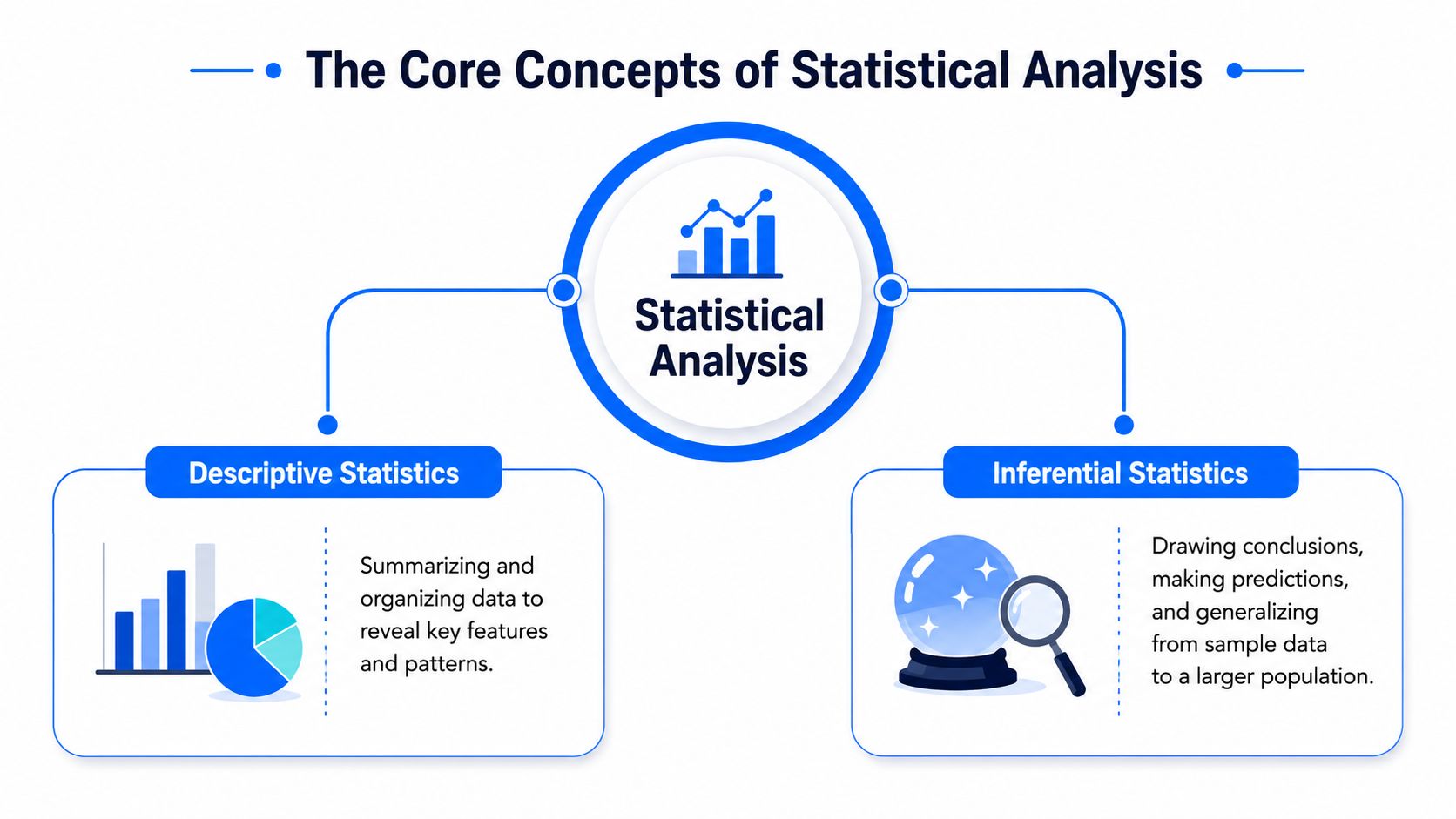
The distinction is practical. If daily order counts spike, descriptive statistics identifies the deviation. If the team needs to know whether the spike reflects random variation, a deployment issue, or a real business event, inferential methods do the heavier lifting.
A second concept sits underneath both: population versus sample. In data engineering, the population may be every event produced by a service, every row loaded into a fact table, or every record processed during a batch window. A sample is the subset used to estimate properties of that full set. Sampling becomes useful when full-table analysis is too expensive, when validation has to run quickly inside a pipeline, or when teams are testing assumptions before they scan billions of records.
Descriptive methods are your gauges. Inferential methods are how you decide whether to investigate, suppress, or escalate.
Teams also misuse statistical significance. A p-value does not tell you there is a fixed probability that your result is correct, and treating one threshold as a universal pass-fail rule leads to bad decisions. The American Statistical Association's guidance on p-values and statistical significance is still one of the clearest references on this point. In observability work, practical significance usually matters more anyway. A tiny but statistically detectable shift may be irrelevant in a noisy event stream, while a smaller change in payment failures or freshness lag may justify immediate action.
How method choice actually works
Method choice follows data shape and decision cost. Data type matters. Time structure matters. Sample size, baseline stability, and the cost of missing a real issue all matter too.
That is why a null-rate spike might call for simple descriptive thresholds, while a gradual distribution shift needs a hypothesis test, a control chart, or a time-series model. The same logic applies outside data observability. In quantitative finance, for example, market-neutral trading strategies rely on estimating normal relationships between assets and acting when those relationships deviate far enough to justify intervention.
Inside modern pipelines, this is less about textbook categories and more about implementation. Can the check run in SQL against production tables? Can it tolerate seasonality? Can it distinguish one late partition from a system-wide drift event? Strong statistical analysis in engineering starts there.
How to Choose the Right Statistical Method
A pipeline misses its 6 a.m. SLA, row counts are down, and nulls spike in one business-critical column. The first question is not which test to run. The first question is what decision the team needs to make before the next downstream job fires.
That framing changes method selection. In data engineering, statistical methods are not academic categories sitting outside the stack. They are checks embedded in SQL, warehouse models, stream processors, and observability rules. The right method is the one that matches the decision, fits the data shape, and can run reliably at production cadence.
Start with the decision, not the method
Method choice usually gets clearer once the operational task is explicit.
If the team needs a baseline for normal behavior, descriptive statistics are usually enough. If the team needs to decide whether a change is likely real rather than routine noise, inferential methods make more sense. If the issue involves recurring hourly, daily, or weekly patterns, time-aware methods belong in the first pass, not as an afterthought.
I use a simple filter in practice:
Summarize the current state: Use descriptive statistics for counts, distributions, null rates, cardinality, and spread.
Compare groups or periods: Use a t-test for two-group mean comparisons when the assumptions are reasonable, and ANOVA when comparing several groups.
Estimate relationships: Use regression when an outcome may change with one or more inputs, such as volume shifts after a deployment or latency changes by source system.
Reduce metric sprawl: Use PCA or factor analysis when dozens of related signals need to collapse into a smaller monitoring set.
Handle time dependence: Use time series analysis when seasonality, trend, lag, or changing baselines affect what counts as normal. For teams building production checks around cyclical behavior, this guide to detecting anomalies in time series is a practical reference point.
The trade-off is usually between precision, interpretability, and operating cost. A simple percentile-based rule is easy to explain and cheap to run in-database. A time-series model may catch subtler failures, but it needs more history, more tuning, and better handling of missing partitions, holidays, and backfills.
Match the method to the failure mode
Different data problems call for different statistical tools.
A broken upstream extractor often shows up first as missing records, duplicate keys, or null inflation. That usually points to profiling metrics, control limits, and change detection on simple aggregates. A schema-preserving business change is different. Counts may stay stable while category mix, value distributions, or join behavior drift. That is where distribution comparison, segmentation, or regression-based analysis earns its keep.
Static thresholds still have a place. They work well for hard constraints such as freshness, uniqueness, and impossible values. They work poorly for metrics with strong weekly cycles or monthly closes. Engineers get into trouble when every problem is forced into the same rule format because the alerting system only supports one pattern.
A practical selection guide
Analysis Goal | Common Methods | Example Question |
|---|---|---|
Summarize dataset behavior | Mean, median, mode, standard deviation, distribution plots | What does healthy daily sign-up activity usually look like? |
Compare two groups | t-test | Did conversion behavior change between two release cohorts? |
Compare multiple groups or drivers | ANOVA, regression | Which factors are associated with variation in order value? |
Reduce high-dimensional complexity | PCA, factor analysis | Which metrics can be compressed into a smaller signal set for monitoring? |
Explore patterns without a fixed hypothesis | Exploratory data analysis | Are there clusters, anomalies, or strange shapes in this table before formal testing? |
Analyze behavior over time | Time series analysis, forecasting models | Is today's data volume consistent with learned historical behavior? |
A good method on paper can still be a bad operational choice. Ask a few implementation questions before committing:
Can the check run close to the data, ideally in SQL or inside the warehouse?
Does the method tolerate late-arriving data, backfills, and sparse history?
Are the assumptions understandable enough for an on-call engineer to trust the alert?
What is the cost of a miss versus the cost of noise?
That last point matters. In observability, a false negative can let corrupted data reach dashboards, models, or customer-facing systems. A false positive can flood Slack and train engineers to ignore alerts. Method choice sits in that trade-off, not in a textbook definition.
Selection is usually iterative. Teams often start with descriptive profiling because it is fast to deploy and easy to validate against production incidents. As historical patterns become clearer, they add group comparisons, drift tests, regression, or time-aware models where the simpler checks stop carrying their weight.
Descriptive Statistics for Data Profiling and Anomaly Detection
Descriptive statistics is where reliable monitoring starts.
Before a team can detect an anomaly, it needs a baseline for normal. That baseline usually begins with familiar measures. Average row count per batch. Median order value. Distribution of event types. Standard deviation of daily sign-ups. Percentage of missing values in a critical field.
Build a baseline before you build alerts
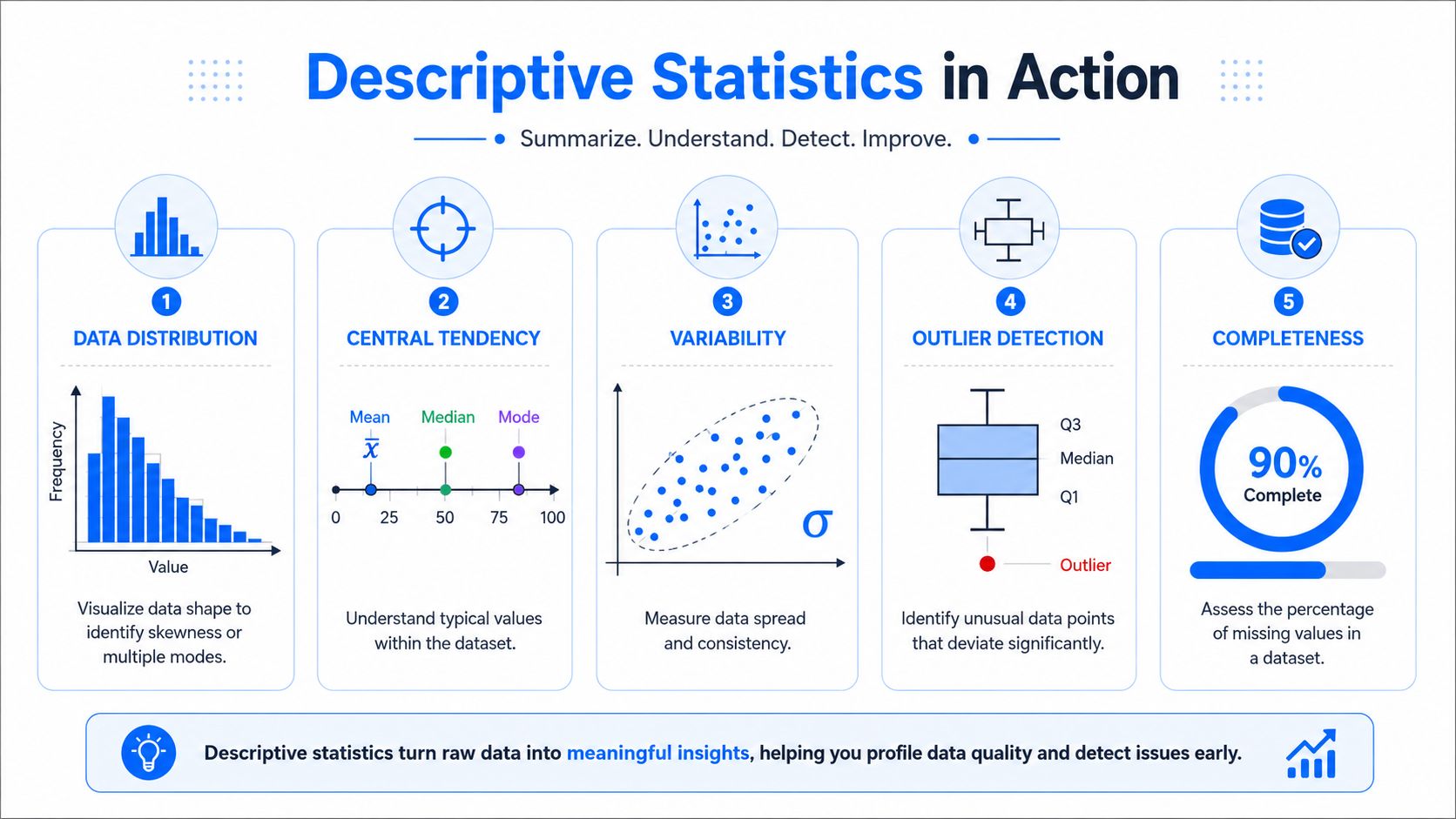
A healthy dataset has a fingerprint. You can usually see it in five profiling dimensions:
Distribution shape: Is the data roughly symmetric, skewed, or multi-modal?
Typical value: Mean and median help locate the center.
Spread: Standard deviation and range show how much movement is normal.
Extreme values: Outlier checks identify unusual records or batches.
Completeness: Missing values often signal upstream breakage before counts move.
If you monitor daily user sign-ups, for example, a count alone isn't enough. You need to know whether a lower count is normal for that weekday, whether a referral source vanished, and whether nulls rose in acquisition metadata.
A practical walkthrough of this kind of monitoring appears in this guide to detecting anomalies in time series, especially for teams moving from reporting metrics to operational anomaly detection.
Where Z-scores work and where they do not
The Z-score is one of the simplest useful anomaly tests. It measures how far a value is from the mean in units of standard deviation. The method flags a point as an outlier when it exceeds a threshold of standard deviations from the mean, with a common industry threshold of 3.0 standard deviations or |Z| > 3 for extreme anomalies in normally distributed data, as described in this write-up on Z-score anomaly detection.
In SQL-oriented environments, that makes implementation straightforward. Compute the mean and standard deviation for a metric over a reference window, calculate each row's Z-score, then flag rows or days that exceed the chosen threshold.
What works well:
Stable numerical metrics: Daily row counts for mature pipelines.
Operational summaries: Average latency, null counts, aggregate spend.
Early warning layers: Fast screening before deeper analysis.
What doesn't:
Non-normal distributions: Heavy skew breaks the intuition behind the threshold.
Strong seasonality: Normal Monday behavior may look anomalous against a weekend-centered average.
Schema-level issues: A column rename won't show up in a Z-score.
A Z-score is a useful smoke detector. It isn't a fire investigation.
That's why descriptive statistics is the first layer, not the whole system.
Inferential Statistics for Forecasting and Root Cause Analysis
Once you know something changed, inferential methods help answer two harder questions. What likely caused it, and what should have happened instead?

Regression for explanation
Regression is one of the most practical methods in applied analytics because it forces teams to state relationships explicitly.
Suppose sales drop after a campaign change. A descriptive view tells you the drop happened. A regression model can help test whether marketing spend, channel mix, pricing shifts, or regional effects are associated with the outcome. The value isn't just prediction. It's structured explanation.
In data platform work, that same mindset applies to incident analysis. If freshness deteriorates, you may model whether upstream latency, partition size, concurrent workloads, or schema churn are related to the issue. The point is to move from “something is wrong” to “these variables are likely connected to the failure pattern.”
Time series models for operational forecasting
For observability, the more powerful inferential tool is often time series forecasting.
Time-series anomaly detection often uses ARIMA models to forecast expected values and flag significant deviations. A data point is treated as anomalous if it falls beyond the model's confidence interval, which is typically 95%, according to this explanation of ARIMA-based anomaly detection.
That matters because expected behavior in pipelines is rarely flat. Data arrival follows schedules. Volumes rise and fall by business cycle. Some metrics trend upward over time while still being perfectly healthy.
A strong operational use case is expected-arrival monitoring. If a feed usually lands within a learned window and today's delivery falls outside that forecasted pattern, the alert is meaningful even if the job hasn't technically breached a static SLA yet. The same logic applies to event counts, API payload sizes, or warehouse ingestion rates.
For teams working through historical pattern inspection and trend interpretation, this resource on data trend analysis is useful because it connects forecasting concepts to pipeline behavior rather than only business dashboards.
Applying Statistics in Modern Data Observability
A warehouse load finishes on schedule, dashboards refresh, and the pipeline reports green. Two hours later, finance notices revenue by region is off because one upstream system changed a field pattern without breaking the job. That is the operating reality modern data observability has to handle. Statistical methods are not separate from the platform. They are the mechanism the platform uses to decide whether today's data still looks like healthy production data.
Modern observability platforms apply statistical methods continuously, at scale, and as close to the data as possible. That architectural choice affects speed, cost, and governance. If monitoring requires exporting large slices of production data into a separate vendor environment, teams add latency, increase data movement, and create approval overhead. Running checks in the warehouse or private infrastructure changes that trade-off and makes it easier to turn statistical analysis into part of the pipeline itself.

Adaptive baselines beat static thresholds
The practical shift is from fixed alert rules to learned baselines.
Time series analysis for anomaly detection often separates behavior into trend, seasonal, and residual components. The residual spread can serve as a dynamic baseline, and the IQR method flags anomalies when values exceed Q3 + 1.5×IQR or fall below Q1 - 1.5×IQR, as explained in this overview of statistical methods in data anomaly analysis. Many pipeline metrics are not nicely Gaussian. They follow schedules, business cycles, backfills, and uneven user activity that simple averages miss.
That shows up in familiar cases:
Nightly ingestion volumes that rise and fall by weekday
Freshness windows tied to source system delivery patterns
Latency metrics shaped by recurring compute and queue behavior
Usage tables that spike during billing or reporting periods
Static thresholds still work for hard constraints. A required field cannot be null. A locked schema should not gain a new column without review. But behavioral metrics need a baseline that adapts to normal change, or teams end up paging on healthy variance and missing slow drift.
Operational advice: Use hard rules for invariants. Use statistical baselines for behavior.
In-database execution improves this further. Baseline training, metric aggregation, and anomaly scoring happen where the source data already lives, so teams get faster detection without creating another copied monitoring store. In regulated environments, that is often the difference between a workable design and one that stalls in security review.
Statistical validation inside the warehouse
Statistics can tell a team that a table's shape changed. They cannot, by themselves, tell the team whether an order moved from pending to refunded without ever being paid, or whether an insurance claim date now precedes the policy start date.
That is why observability platforms need both statistical checks and record-level validation.
Traditional statistics guides spend plenty of time on t-tests, ANOVA, and chi-square tests. In production data systems, the harder question is usually narrower and more operational: how do you catch silent drift in non-normal data while still enforcing table-specific business rules? The answer is to combine distribution monitoring with explicit assertions on records, fields, and relationships.
Later in the monitoring workflow, video can help show how these controls fit together operationally.
One option in this category is digna, which runs anomaly detection, validation, timeliness monitoring, schema tracking, and in-database metric computation inside customer-controlled environments. That model fits teams that want observability without moving production data outside their warehouse or private infrastructure.
The six anomaly categories teams monitor
In production, engineers monitor distinct failure modes, not a single generic anomaly bucket.
According to this overview of anomaly detection in data observability, observability work commonly focuses on Volume Anomalies, Schema Anomalies, Freshness Anomalies, Distribution Anomalies, Duplicate or Missing Records, and Metric Outliers. Freshness issues are often detected by comparing actual delivery times against learned patterns and expected schedules.
That maps closely to what fails in data stacks:
Volume anomalies: A feed lands, but record counts collapse or spike.
Schema anomalies: Columns are added, removed, or changed in type.
Freshness anomalies: Data arrives later than expected and breaks reporting trust.
Distribution anomalies: Values still load, but their shape has shifted enough to affect downstream logic.
Duplicate or missing records: Counts alone can hide duplication and omission.
Metric outliers: Aggregate business indicators move in ways that require investigation.
For teams building a broader operational practice across logs, metrics, and runtime signals, this Webtwizz guide on app health is useful alongside data observability material. Application health and data health sit in different layers, but incidents often cross both.
The operational challenge is implementation. Teams need statistical methods wired into scheduled jobs, warehouse queries, alert routing, and triage workflows so healthy behavior is learned automatically and deviations are caught before stakeholders stop trusting the data.
Conclusion From Methods to Trustworthy Data
Reliable data systems don't come from dashboards alone. They come from disciplined detection.
That's the practical value of statistical methods for data analysis. Descriptive statistics gives teams a fast health check. Inferential methods help explain change and forecast expected behavior. Time-aware anomaly detection turns recurring patterns into baselines. Record-level validation covers the cases where statistics alone isn't enough.
Data operations don't universally require every data engineer to become a statistician. They do need systems that apply sound statistical reasoning automatically and consistently. That includes monitoring for timeliness, schema drift, distribution shifts, duplicates, missing records, and unexplained metric behavior inside the environments where data already lives.
Trustworthy data is not a manual habit. It's an operating model. When teams embed statistical monitoring into pipelines and observability workflows, they reduce the gap between “the job succeeded” and “the data is safe to use.”
If you want to operationalize these ideas in your own environment, digna is built for teams that need anomaly detection, record-level validation, timeliness monitoring, and schema tracking inside customer-controlled databases and private infrastructure.
To see learned baselines replace hand-tuned Z-score and IQR thresholds on production tables, look at how digna Data Anomalies applies this kind of statistical monitoring directly inside your database.
Frequently asked questions
What is the difference between descriptive and inferential statistics in data analysis?
Descriptive statistics summarize what is already in the data, such as row counts, medians, null rates and cardinality, and establish a baseline. Inferential statistics estimate, test or forecast beyond the observed data, helping teams judge whether a spike in daily orders is random variation, a deployment issue or a real business event.
How do I choose the right statistical method for data analysis?
Start with the decision you need to make, not the method. Use descriptive statistics to summarize current state, a t-test or ANOVA to compare groups, regression to estimate relationships, PCA or factor analysis to reduce metric sprawl, and time series analysis when seasonality or trend defines what counts as normal.
What Z-score threshold is used for anomaly detection?
A common threshold is 3.0 standard deviations from the mean for extreme anomalies in normally distributed data. Z-scores work well for stable metrics like daily row counts of mature pipelines, but they struggle with skewed distributions, strong weekly seasonality and schema-level issues such as a renamed column.
How does the IQR method detect anomalies?
The IQR method flags a value when it exceeds Q3 plus 1.5 times the interquartile range or falls below Q1 minus 1.5 times that range. In time series monitoring it is often applied to the residual component after trend and seasonality are separated, giving a dynamic baseline for non-Gaussian pipeline metrics.
What types of data anomalies should data teams monitor?
Observability work commonly covers six categories: volume anomalies, schema anomalies, freshness anomalies, distribution anomalies, duplicate or missing records, and metric outliers. Freshness issues are typically caught by comparing actual delivery times against learned patterns and expected schedules, while hard invariants like required non-null fields still need explicit rules.


