10 KPI Tracking Template Resources for Every Team
|
10
min di lettura

Your team needs a KPI tracking template by tomorrow. Finance wants a leadership pack, operations wants a live view, analysts want drill-downs, and data engineering wants every number tied to a trustworthy source. Choosing the first attractive spreadsheet won't solve that conflict. The right resource depends on whether data is entered manually, synced from operational systems, displayed live, or governed through an enterprise BI stack.
This comparison focuses on data freshness, ownership, collaboration, visualization depth, setup effort, and responsible customization. It covers lightweight spreadsheets, collaborative registers, browser reports, operational displays, and enterprise accelerators. A sound template should also help teams scegliere i KPI giusti by linking each measure to a decision, owner, target, definition, and review cadence.
Reliable presentation starts with reliable data. For teams that need in-database monitoring of business and platform metrics without moving production data, digna is a relevant option alongside the resources below.
Table of Contents
1. Smartsheet KPI Dashboard and Worksheet Templates
Where it fits
2. Databox Pre-Built KPI Dashboard Templates
What it handles well
3. Geckoboard Dashboard Templates and Examples
Where it falls short
4. Tableau Accelerators
Why enterprises choose it
5. Looker Studio Report Gallery
The practical limitation
6. Notion KPI Tracker Templates
Good for context, not complex charts
7. Airtable Goal and KPI Templates
The trade-off between register and dashboard
8. monday.com KPI Dashboard Templates
When it works best
9. HubSpot Free KPI Dashboard Template
What manual tracking costs
10. ProjectManager KPI Dashboard Template
Keep project KPIs comparable
Top 10 KPI Tracking Template Comparison
Turn the Template Into a Reliable KPI Routine
Choose by operating context
Separate reporting from reliability
1. Smartsheet KPI Dashboard and Worksheet Templates
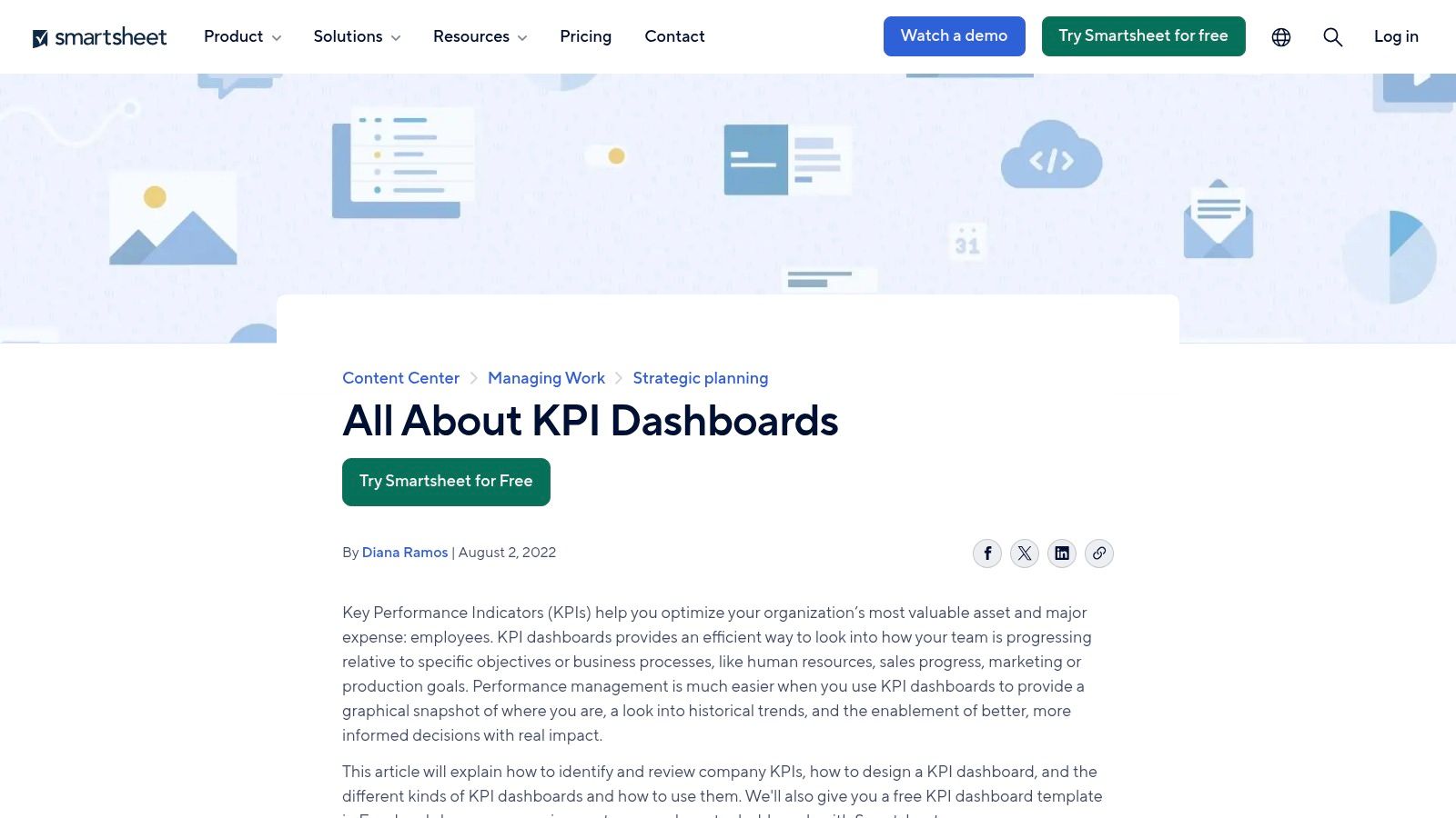
Smartsheet works well when a team wants a quick starting point but doesn't want to choose immediately between an offline worksheet and a shared cloud dashboard. Its resource set includes downloadable KPI business dashboards and tracker worksheets, alongside native Smartsheet dashboards that use charts, tiles, and setup guidance.
The spreadsheet route suits a finance lead or operations manager who needs to assemble a monthly pack with limited technical support. The native dashboard route assumes that the team is willing to maintain data inside Smartsheet and pay for the capabilities required for live collaboration. Either way, the template provides a useful structure for grouping KPIs by category, objective, or scorecard area.
Where it fits
Smartsheet is strongest for collaborative reporting with moderate visualization needs. Documentation and learning resources make it easier for a non-specialist to adapt a worksheet, define status fields, and publish a dashboard for stakeholders.
It isn't a substitute for governed BI when calculations span complex warehouse models. Advanced analysis is also simpler than what a dedicated BI platform provides. Teams should document the source, formula, owner, refresh expectation, and approval status in the worksheet rather than assuming the dashboard itself supplies governance.
Practical rule: Treat the Smartsheet file as a business-facing KPI specification, not as proof that the underlying data is accurate.
For teams that need a separate operational layer, digna's KPI monitoring dashboard can complement the presentation by tracking targets, thresholds, ownership, trends, and drill-down context directly against underlying data.
Best fit: Collaborative teams moving from spreadsheet reporting to shared dashboards.
Visit Smartsheet's KPI dashboard resources for the templates and implementation guidance.
2. Databox Pre-Built KPI Dashboard Templates
Databox is designed for teams that want to connect sources and reach a live KPI view quickly. Its library spans marketing, sales, finance, customer success, and product use cases, with ready-made dashboards that can populate after integrations are connected. The Metric Library provides prebuilt measures, while goals, alerts, scheduled snapshots, and mobile access support recurring management routines.
The assumed workflow is straightforward: a team has data in supported applications, selects a dashboard, maps the relevant metrics, and shares the result with managers. That makes Databox more suitable for connected reporting than for a manually maintained KPI register.
What it handles well
Databox is useful for executive rollups where the question is, “Are the main numbers moving in the right direction?” It reduces the initial work of building cards, trend views, and goal indicators from scratch. Sharing options also help teams distribute a consistent view instead of emailing different spreadsheet versions.
The trade-off appears when an organization has complicated warehouse logic, custom semantic definitions, or tightly governed reporting layers. A prebuilt metric may be convenient, but convenience doesn't guarantee that its definition matches the organization's approved calculation. Teams should validate the numerator, denominator, filters, date logic, timezone, and source ownership before adopting a metric.
Use it when:
Speed matters: You need a connected dashboard without building every visualization manually.
Sources are distributed: Marketing, sales, finance, and product data need a common reporting surface.
Alerts support action: Owners need notifications when a goal or threshold moves off track.
Warehouse governance is complex: Pair it with a governed BI or semantic layer rather than making it the only analytical environment.
A KPI should also be monitored for data behavior, not only business movement. digna's KPI monitoring tools are relevant when teams need to examine anomalies, timeliness, validation results, and schema changes alongside business measures.
Best fit: Operations and leadership teams that need fast, connected KPI rollups.
Explore Databox dashboard templates before deciding whether its integrations match your stack.
3. Geckoboard Dashboard Templates and Examples
Geckoboard is built for visibility rather than deep investigation. Its template-driven setup helps teams create tactical dashboards for screens, team spaces, Slack, Teams, email, and mobile. That makes it a natural choice for operations centers, sales floors, support teams, and any group that needs a KPI visible during the working day.
The workflow assumes that a team already knows which measures matter. A manager chooses a dashboard pattern, connects supported applications or a spreadsheet, defines thresholds, and publishes the view. For custom metrics, spreadsheet and API options provide a route beyond the standard integrations.

Where it falls short
Geckoboard is less useful when the first question is “Why did this KPI change?” Its strength is the immediate signal, not ad hoc analysis, complex modeling, or detailed historical investigation. Teams may need another tool for root-cause analysis and governed metric definitions.
The thresholding model is valuable when it leads to a named action. A red indicator without an owner, escalation path, or decision rule just creates visual noise. Configure each alert with a responsible person and a documented response.
A live screen should tell people what needs attention. It shouldn't force them to interpret an unexplained color.
Template availability can also depend on the connected application. If a team relies on unusual sources, the implementation may require a spreadsheet feed or API work instead of a direct template connection. That adds maintenance responsibility, especially when source schemas or update schedules change.
Best fit: Teams that need tactical, always-visible operational KPIs with clear thresholds.
Review Geckoboard's custom dashboard templates to assess supported sources and publishing options.
4. Tableau Accelerators
Tableau Accelerators target organizations that already use Tableau or are prepared to support an enterprise BI environment. These ready-to-use dashboard templates cover industries and common KPI domains, often with KPI cards, trends, filters, and data-mapping guidance that helps teams replace sample data with their own.
The operating context is materially different from a spreadsheet. A BI developer or analytics engineer usually needs to map fields, confirm joins, apply security rules, validate calculations, and publish the workbook through the organization's governed Tableau environment. Business users then consume a reusable dashboard rather than manually editing formulas.
Why enterprises choose it
Tableau provides far more room for visual exploration, filtering, and extension than lightweight worksheet templates. It can support strategic, operational, and analytical views without forcing every audience into the same level of detail. Governance, permissions, certified sources, and reusable data models are also stronger foundations for enterprise reporting.
The cost is skill and platform commitment. A team without Tableau experience may spend more time configuring the accelerator than defining the KPI itself. An accelerator also doesn't remove the need to settle ownership, calculation logic, baseline selection, and data-quality controls.
A responsible implementation should preserve the accelerator's reusable structure while replacing generic assumptions with approved business definitions. That includes documenting source tables, aggregation grain, inclusion and exclusion rules, refresh expectations, and threshold ownership.
For teams building or maintaining the surrounding BI stack, digna's BI developer tools can support monitoring of the data conditions behind reports and metrics.
Best fit: Governed enterprise BI teams with Tableau skills and established data models.
Browse Tableau Accelerators to compare industry coverage and data-mapping requirements.
5. Looker Studio Report Gallery
Looker Studio is a practical browser-based option for teams that need a shareable KPI report without adopting a full enterprise BI platform. Its report gallery includes scorecards, trend charts, filters, and community or partner visualizations. Users can copy a template and replace its sample connections with their own data.
This model works particularly well for marketing, web analytics, and small to medium reporting workflows where the source data is already accessible through compatible connectors. Sharing and embedding through Google identity also reduce friction for teams that already work in Google's environment.

The practical limitation
Looker Studio makes the first report easy, but complexity eventually moves into the data layer. Heavy transformations, large datasets, row-level access requirements, and reusable metric definitions may require BigQuery or another managed modeling approach. Without that discipline, different reports can calculate the same KPI differently.
A good implementation starts with a controlled source view. Keep business logic upstream where possible, expose clear field names, and record the report's filters and date logic. Don't rely on a copied chart as the authoritative definition of a metric.
A strong use case includes:
Browser access: Stakeholders need a link rather than a desktop application.
Light reporting: The dashboard summarizes established measures instead of replacing a semantic model.
Fast iteration: Analysts need to test layouts and stakeholder views quickly.
Google-based collaboration: Sharing and embedding should fit existing identity and permissions.
digna's monitoring and reporting capability is relevant when the report needs supporting evidence about metric freshness, validation, anomalies, or pipeline behavior.
Best fit: Marketing, analytics, and business teams that need low-friction browser reporting.
Open the Looker Studio report template guidance before connecting production sources.
6. Notion KPI Tracker Templates
Notion templates suit teams that want KPI hygiene close to objectives, meeting notes, and narrative explanations. A typical tracker uses databases for KPI names, targets, periodic logs, owners, and review notes, then presents those records through a dashboard page. Duplication into an existing workspace makes adoption straightforward for non-technical users.
The assumed workflow is partly manual. Someone enters or imports the latest value, updates the status, and adds context about what changed. That can be a feature for leadership reviews, because the number and the explanation live together. It becomes a weakness when the team expects automatic refresh from multiple operational systems.
Good for context, not complex charts
Notion is effective as a KPI register and review journal. It gives teams a place to define what a KPI means, record decisions, and preserve the narrative around target changes. That is often missing from dashboards that show a number without explaining the management response.
Visualization is lighter. Native charts and rollups won't replace a BI tool for detailed trends, segmentation, or exploratory analysis. Advanced charts may require add-ons or a connected external workflow, which increases maintenance.
Use a Notion tracker responsibly by adding fields for:
Definition: What the KPI measures and what it excludes.
Source: The system, table, report, or person providing the value.
Cadence: When the value should be refreshed and reviewed.
Owner: The person responsible for interpretation and action.
Change history: Why the definition, target, or source changed.
Best fit: Founders, department leads, and cross-functional teams that need lightweight KPI accountability with narrative context.
View Notion's KPI tracker templates to compare workspace structures and duplication options.
7. Airtable Goal and KPI Templates
Airtable sits between a spreadsheet, a structured database, and a lightweight workflow application. Its SMART goals and OKR templates can function as a KPI register with fields for targets, deadlines, owners, and status. Interfaces provide manager-friendly views, while automations can support recurring notifications and status updates.
The main advantage is schema flexibility. A team can add business objective, KPI definition, source system, review period, confidence, action owner, and approval state without rebuilding the entire tracker. That makes Airtable useful when the organization needs more structure than a document but less complexity than a warehouse-backed BI application.
The trade-off between register and dashboard
Airtable's strongest role is governance around the KPI itself. It can record who owns a metric, when a definition changed, and what action follows a threshold breach. Its visualization is lighter than a dedicated BI product, and direct warehouse-grade integrations may require additional tools or connectors.
Avoid treating an Airtable status field as a data-quality check. “Green” should mean the KPI meets an agreed business condition, not that the source loaded successfully. Pair the business status with fields for freshness, validation state, last successful load, and schema version when the KPI depends on production data.
Best fit: Teams that need a flexible KPI catalog, collaborative reviews, and no-code workflow support.
Airtable's SMART goals template shows the basic structure, but teams should adapt it to their own decision rights and source controls.
8. monday.com KPI Dashboard Templates
monday.com is a sensible choice when the work itself already lives in monday.com boards. Its dashboard widgets can roll up numbers, charts, and goals from multiple boards, while automations and AI features can support status reporting, analysis, and risk identification.
The workflow is operational by design. A project manager or team lead updates work items, and the dashboard presents performance alongside execution details. That proximity helps users connect a KPI to an owner, task, deadline, or risk without switching to a separate reporting environment.
When it works best
monday.com is strongest when the KPI is derived from work-management records. Delivery progress, task status, project deadlines, and workload indicators fit naturally. Sharing with internal stakeholders is also straightforward.
The boundary appears when the KPI depends on finance, healthcare, telecom, or warehouse data that doesn't originate in monday.com. Syncing can help, but it introduces another dependency and may not provide the modeling, lineage, or access control expected from an enterprise BI stack. Full dashboard export and embedding can also be more limited than teams expect.
Build the board around the decision rather than the widget. Define whether a status change should create a task, notify an owner, request review, or trigger escalation. An attractive dashboard that doesn't change work is only a report.
Best fit: Project, operations, and delivery teams that already manage execution in monday.com.
Review monday.com's KPI dashboard template guidance for board, widget, and automation patterns.
9. HubSpot Free KPI Dashboard Template
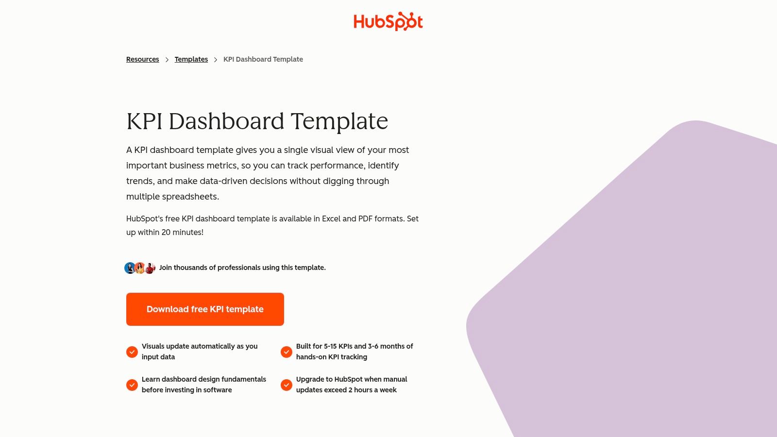
HubSpot's Excel KPI dashboard is aimed at a familiar leadership workflow: download a file, enter values, and send or present a polished summary. The workbook includes prebuilt charts, gauges, color-coded status treatment, multiple layout tabs, and an instruction tab intended for non-analysts.
That offline design is its main strength. A finance manager or department lead can prepare a leadership packet without installing an application or connecting a data warehouse. It also gives users direct control over layout and wording, which can matter when a monthly review needs narrative context around the numbers.
What manual tracking costs
The workbook assumes that someone will collect, normalize, and enter the data. That makes it unsuitable for live operational monitoring and risky for multi-source rollups unless the team adds controlled imports or automation. Manual copying also creates an opportunity for stale values, inconsistent definitions, and undocumented changes.
Use the template for a contained leadership pack, not as the system of record. Add a data dictionary, source reference, reporting period, timestamp, owner, and review note to each input area. Protect formula cells and preserve snapshots so later reviewers can distinguish a changed result from a changed calculation.
A polished offline dashboard is useful when the reporting cadence is deliberate. It becomes dangerous when readers mistake manual freshness for live accuracy.
Best fit: Small teams and leadership groups that need an offline, stakeholder-ready Excel pack.
Download HubSpot's KPI dashboard template and test it with a real reporting cycle before distributing it widely.
10. ProjectManager KPI Dashboard Template
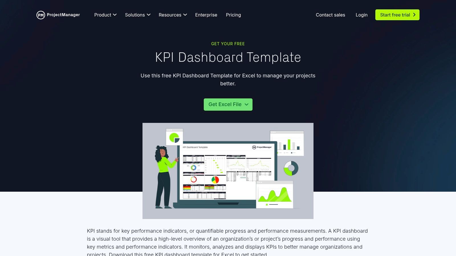
ProjectManager's Excel template is narrower than a general business KPI workbook. It focuses on project and PMO reporting, with cards and charts for schedule, cost, delivery, and project performance. Input tabs are designed to feed the dashboard automatically within the workbook, making it accessible to project managers who don't need a full BI implementation.
The best fit is a weekly or monthly project review where the source data can be assembled consistently. Project managers can update the input areas, review the resulting visuals, and share the workbook with stakeholders. That workflow is simple enough for a PMO with limited analytics support.
Keep project KPIs comparable
The template doesn't provide live connections out of the box, and its scope is less flexible than an enterprise BI dashboard. It also won't automatically tell you whether a late project figure reflects genuine delivery risk or a missing source update. Those checks remain the responsibility of the PMO and data owners.
Customize it by defining the reporting period, project population, cost treatment, schedule baseline, and status rules. Keep actuals, forecasts, and approved changes distinct. If a project slips because its source data is late, record that condition instead of forcing a red business status.
For project organizations, digna's data-quality dashboards can provide a separate view of freshness, validation, anomalies, and structural changes affecting the inputs behind project reporting.
Best fit: PMs and PMOs that need a straightforward Excel dashboard for recurring delivery reviews.
See ProjectManager's KPI dashboard template and compare its input fields with your current project reporting process.
Top 10 KPI Tracking Template Comparison
Template | ✨ Key features (integration & fit) | 👥 Target audience | ★ UX / Quality | 💰 Price / Value |
|---|---|---|---|---|
Smartsheet KPI Dashboard and Worksheet Templates | ✨ Spreadsheet + native Smartsheet dashboards; strong docs; template gallery, limited enterprise data connectivity | 👥 Ops teams, spreadsheet starters, small IT | ★★★★☆ Fast setup; guided UX | 💰 Free templates; live features need Smartsheet plan |
Databox Pre‑Built KPI Dashboard Templates | ✨ 200+ templates, 100+ integrations, auto-populate, goals & alerts, good for multi-source rollups | 👥 Marketing/sales/finance execs & ops | ★★★★★ Very quick to live; mobile & alerts strong 🏆 | 💰 Paid subscription; high integration ROI |
Geckoboard Dashboard Templates and Examples | ✨ Real-time TVs/Slack, API & spreadsheet metrics, template-driven TV-ready dashboards | 👥 Ops teams, on‑call/ops TVs, support teams | ★★★★☆ Extremely fast for team visibility | 💰 Paid; ideal for tactical/real-time KPIs |
Tableau Accelerators (KPI Dashboard Templates) | ✨ Enterprise BI accelerators, data mapping, deep customization & governance, enterprise-ready 🏆 | 👥 BI teams, enterprise analytics | ★★★★☆ Powerful but requires Tableau skills | 💰 Enterprise cost (Tableau license +) |
Looker Studio Report Gallery | ✨ Free browser templates, easy copy-replace, marketing/analytics focus, good for light reporting | 👥 Small teams, marketers, analysts on a budget | ★★★☆☆ Simple UX; limited for large datasets | 💰 Free; scales with BigQuery costs |
Notion KPI Tracker Templates (Marketplace) | ✨ Narrative-friendly KPI databases, review cadence templates, one-click duplication, manual data flow | 👥 Founders, small teams, product managers | ★★★★☆ Low overhead; great for narratives | 💰 Low-cost/marketplace; manual unless integrated |
Airtable Goal/KPI Templates | ✨ Flexible schema, Interfaces, automations & AI assistant, good cataloging & collaboration | 👥 Managers, teams needing catalogs & reviews | ★★★★☆ Collaborative; adaptable views | 💰 Freemium; paid for advanced Interfaces/automation |
monday.com KPI Dashboard Templates | ✨ Widgets from boards, automations, Sidekick AI for analysis, KPIs next to work items | 👥 Teams executing in monday.com, PMs | ★★★★☆ Strong operational context; easy sharing | 💰 Paid; best value when work already in monday.com |
HubSpot Free KPI Dashboard Template (Excel) | ✨ Color-coded Excel dashboard, gauges & instructions, offline, simple leadership packs | 👥 Executives, small teams preparing reports | ★★★☆☆ Straightforward; manual updates | 💰 Free Excel template; manual data entry |
ProjectManager KPI Dashboard Template (Excel) | ✨ Project-focused KPI cards, schedule & cost metrics, weekly/monthly cadence | 👥 Project managers, PMOs | ★★★★☆ Easy for PM reporting; stakeholder-ready | 💰 Free; Excel-only, no live connections |
Turn the Template Into a Reliable KPI Routine
The best KPI tracking template is the lightest resource that supports the actual workflow without hiding its weaknesses. Start by defining the decision each KPI supports. If nobody can explain what they'll do when the value rises, falls, arrives late, or becomes unavailable, the metric probably needs refinement before it belongs on a dashboard.
Assign ownership at more than one level. The business owner decides what the KPI means and which action follows a threshold breach. The data owner controls the source. The analytics or engineering owner maintains the transformation. The consumer uses the result in a meeting, workflow, or operational decision. A single “owner” field often fails to distinguish these responsibilities.
Document the calculation before choosing the visualization. A dependable KPI record should include the definition, numerator, denominator, unit, population, filters, timezone, source, aggregation grain, target, tolerance, refresh cadence, timestamp, and approval state. It should also distinguish actuals, forecasts, and benchmarks, then preserve historical snapshots for comparison.
The Balanced Scorecard remains a useful organizing idea because it connects financial measures with customers, internal processes, and innovation or improvement activities. Kaplan and Norton introduced the framework in the February 1992 issue of Harvard Business Review, and a historical review estimated adoption at 53% of companies worldwide by 2008 before estimating approximately 29% by 2018. Those adoption figures come from a secondary review, not the original framework authors, but the practical lesson remains relevant: a KPI register should connect operational measures to strategic objectives across multiple performance dimensions. Read the Kaplan and Norton framework reference for the underlying structure.
Choose by operating context
Use an offline Excel resource when the audience needs a controlled leadership packet and the reporting process is intentionally periodic. Use Notion or Airtable when the main problem is definition, ownership, review history, and collaboration. Choose Geckoboard for visible operational signals, Looker Studio for accessible browser reporting, Databox for fast connected rollups, and monday.com when the work and KPI records already share a workspace.
Choose Tableau Accelerators when the organization needs governed enterprise BI and has the skills to maintain it. Smartsheet occupies the middle ground for teams moving from worksheets to collaborative dashboards. None of these choices removes the need to verify data quality.
APQC's 2024 research found that organizations use KPIs to improve performance, ensure quality and consistency, optimize resource utilization, reduce cost, and boost revenue. Yet only 38% of respondents rated their current measures as effective or very effective for decision-making, leaving 62% who did not rate them at those levels. Review APQC's KPI findings when evaluating whether a template supports decisions rather than merely collecting values.
Separate reporting from reliability
A manually maintained tracker should be labeled as manual. A connected dashboard should expose its refresh status. A governed BI report should provide lineage, access controls, and a change process. In every case, record the last successful load, validation state, schema version, expected delivery time, and anomaly status next to the business KPI where possible.
Spreadsheet use remains widespread. A large spreadsheet-user survey found that 79% considered spreadsheets very important or critical, 90% used them for financial or operational analysis, and 75% shared part or all of their spreadsheets. Review the spreadsheet survey for the context behind those findings. The implication is practical: versioning, protected formulas, change ownership, and read-only publication views matter even when the chosen template is “just Excel.”
Set a review cadence that matches the decision cycle. Review definitions when objectives, source systems, or business rules change. Test the template with real reporting periods, including late loads, missing records, schema changes, unusual values, and a legitimate business movement. Don't wait until a leadership meeting to discover that the number is technically current but semantically wrong.
Teams whose KPIs depend on reliable warehouse and pipeline behavior may need observability alongside presentation. digna combines business monitoring with timeliness, validation, anomaly detection, and schema tracking, and executes checks in the customer's own databases. That makes it relevant when the KPI process must distinguish a genuine business change from a late load, incomplete data, invalid record, or structural change in the source.
digna monitors business and platform metrics in place, with capabilities for timeliness, record-level validation, anomaly detection, and schema tracking. Visit digna to see how its data observability platform can support a more reliable KPI tracking workflow.
Before a KPI reaches any of these templates, its numbers need their own checks: KPI quality control covers the governance side of keeping each figure correct, complete and on time.
Frequently asked questions
What is a KPI tracking template?
A KPI tracking template is a ready-made structure for recording each measure's definition, owner, target, source and review cadence, then presenting the results as a sheet or dashboard. The post compares ten options, from Smartsheet worksheets and Notion trackers to Tableau Accelerators for governed enterprise BI.
Which KPI tracking template is best for a small team?
Small teams usually start with a spreadsheet-style resource such as Smartsheet's KPI worksheets or HubSpot's free dashboard template, because both need little technical setup. The catch is manual entry: label the tracker as manual, protect the formulas and record who changed which value and when.
Should I track KPIs in a spreadsheet or a connected dashboard?
Use a spreadsheet when reporting is intentionally periodic and the audience needs a controlled leadership pack. Choose a connected tool such as Databox or Looker Studio when numbers must refresh from source systems, and show the refresh status so readers know how current each figure is.
What should a KPI definition include?
A dependable KPI record lists the definition, numerator, denominator, unit, population, filters, timezone, source, aggregation grain, target, tolerance, refresh cadence and approval state. It should also separate actuals from forecasts and benchmarks and keep historical snapshots, so a changed formula never silently rewrites past results.
How can I tell whether a KPI on a dashboard is reliable?
Show data health next to the business number: last successful load, validation state, schema version, expected delivery time and anomaly status. Readers can then tell a genuine business movement from a late load or incomplete data. digna monitors these signals directly inside your own databases.


