How to Build Data Quality Dashboards That Actually Work
|
7
min read

You already know the pattern. A dashboard looks fine at 8:30, someone assumes the nightly load landed, and by the time finance opens the numbers in the executive review, they're staring at last week's data. Nobody gets paged because nothing “broke” in a way the dashboard could explain, just the pipeline, the timing, and the trust behind the report.
That's the real problem with many data quality dashboards. They look like oversight, but they behave like decoration unless they're tied to the data journey, explicit controls, and ownership. A useful dashboard doesn't just show a score, it tells the team what failed, where it failed, who owns it, and what to do next.
Table of Contents
Panel Patterns for Timeliness, Anomalies, Schema, and Validation
Choosing Visual Patterns That Drive Decisions in Under Ten Seconds
Architecture, In-Database Computation, and Governance Handoffs
Why Most Data Quality Dashboards Fail Before Noon
Monday morning usually exposes the weak spots. Finance opens a dashboard, sees last week's numbers, and nobody notices that the nightly load slipped because the view still renders cleanly. The report looks healthy, the executive meeting starts, and the first person who realizes there's a problem is the one forced to explain why the dashboard was lying by omission.
That failure pattern is common because teams treat dashboards like static reports instead of operational control layers. They monitor downstream symptoms after data has already been consumed, which means the alert arrives after the business impact. They also lean on binary pass/fail checks, and that creates a false sense of certainty, because a green light often hides slow decay, stale freshness, or a schema change that hasn't exploded yet.
Practical rule: if the dashboard can't tell you what changed, when it changed, and who should act, it isn't a control system.
A better dashboard would have surfaced the delay as soon as the scheduled delivery slipped, not after finance refreshed the report. It would have shown that the issue sat in the delivery path, not in the business logic downstream. That distinction matters because a stale batch, a broken join, and a missing column all need different responses, and a single health score hides that difference.
A lot of teams also make the same structural mistake with ownership. They collect a wall of metrics, but no one knows which team owns the fix or which check maps to which risk. The result is alert noise, blame diffusion, and dashboards that get glanced at during an incident and ignored the rest of the week.
Map the Data Journey Before You Pick a Single Metric
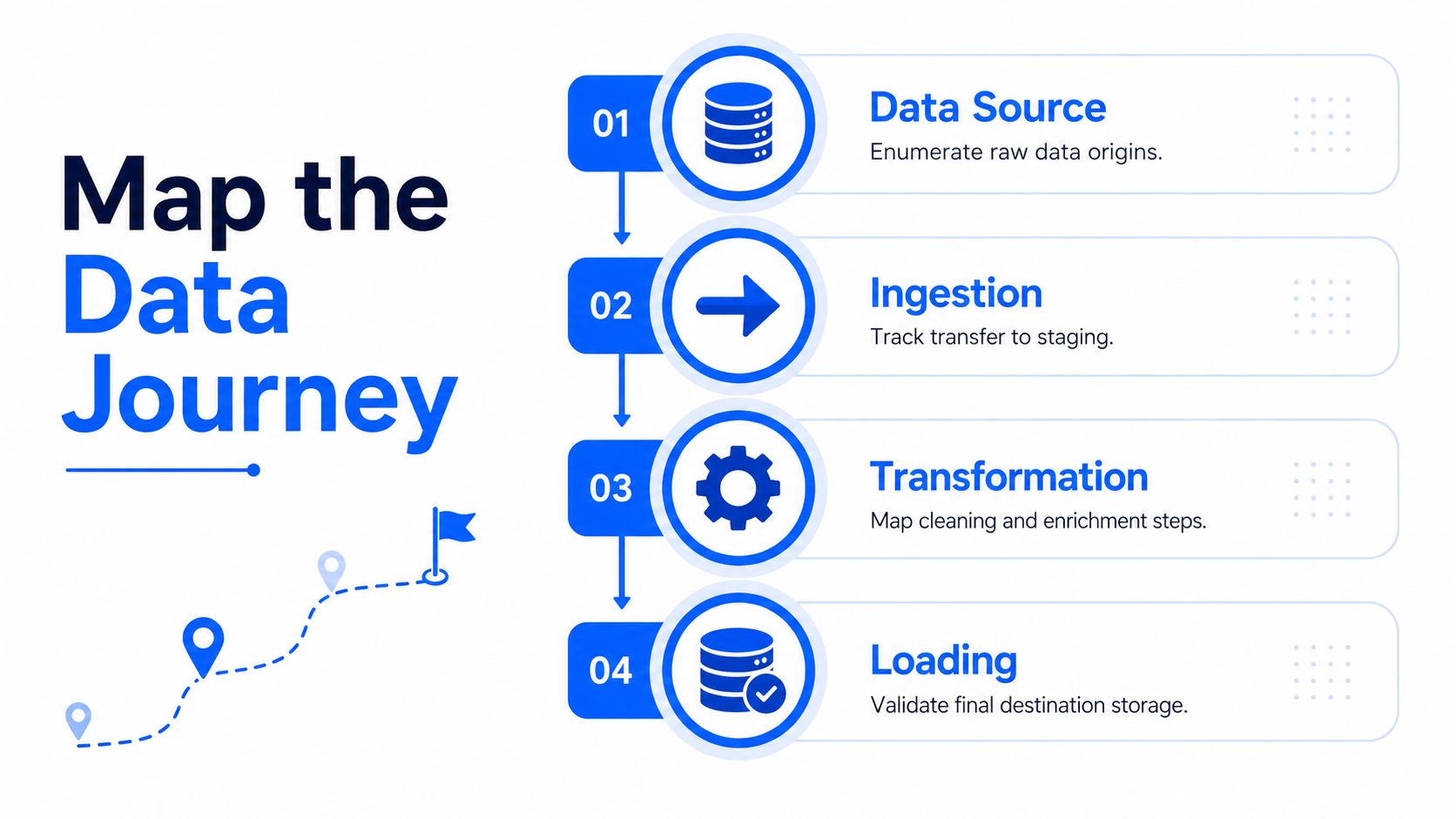
A dashboard becomes useful only after the pipeline is understood as a sequence of controllable steps. Start by mapping the full data journey, from source to ingestion to transformation to serving, and identify where corruption can enter at each stage. That mapping is the difference between detecting a broken outcome and preventing the break in the first place, which is why process context matters more than raw metric volume.
Attach controls to failure modes
Each risk should get a control at the point where the risk can occur. In practice, that means deciding whether the control is preventive, detective, or corrective, instead of throwing generic checks at the end of the pipeline and hoping for the best. A late vendor file is not the same thing as a malformed record, and a duplicate key in staging is not the same thing as a broken reference table.
The useful unit of design is the control record. For each control, document the risk, the impact if undetected, the control narrative, and the evidence of execution. That structure makes the dashboard auditable and gives operators something actionable instead of a vague red tile.
A customer orders pipeline is a good example. At ingestion, a preventive control can reject a malformed file before it lands. During transformation, a detective control can flag unexpected null growth in order status. At loading, a corrective control can route a failed batch to a quarantine table and notify the data owner.
Don't monitor only the final table. If corruption enters upstream, the downstream symptom is already too late to prevent business damage.
A simple mapping discipline that works
Enumerate each stage. Write out where data enters, moves, changes shape, and becomes consumable.
Name the failure mode. Think missing file, duplicate row, invalid code, schema drift, or stale load.
Choose the control type. Preventive for stopping bad data, detective for spotting drift, corrective for routing remediation.
Record ownership. The control is incomplete until someone is accountable for the response.
A small amount of discipline here saves a lot of noisy monitoring later. When the dashboard is anchored to the journey, every metric has a place, and every alert points to a real operational risk.
The Six KPIs Every Data Quality Dashboard Must Track
The six core dimensions are still the backbone of any serious data quality dashboard, but they only work if each one is tied to a measurable control. The point is not to score the data in the abstract. The point is to detect whether a specific risk is worsening, stable, or already breaking a business process.
Measure each dimension as a control signal
Accuracy is the match between the dataset and a trusted system of record. In practice, that can mean sampled reconciliation between source and target records, or field-level comparison for critical attributes.
Completeness is usually expressed as null rate, but row count drift matters too. A table can look populated and still be missing a large slice of expected records.
Consistency checks whether relationships hold across tables. Referential integrity is the obvious example, but so is cross-field agreement where one column must logically align with another.
Timeliness needs more care than a simple freshness check. Expected arrival time and actual arrival time tell you whether the delay is harmless or a business problem, and that distinction is essential for volatile pipelines.
Validity measures whether record-level values satisfy business rules, such as allowed ranges, formats, or conditional logic.
Uniqueness tracks duplicate keys or other duplication patterns that would distort downstream counts, joins, or customer views.
The most practical methodology is to define critical data elements first, map business rules to technical checks, and then use tiered thresholds instead of a binary pass/fail model. Guidance in the field recommends prioritizing fields that affect compliance, reporting, or revenue, then setting severity bands so teams can triage instead of treating every failure as equally urgent. The same source also recommends a strict bronze threshold below 95% for immediate remediation, which is a useful pattern when a field is central to a regulated workflow or a revenue report. Practical framework for accuracy and trust
Dimension | Control type | Example metric | Bronze threshold pattern |
|---|---|---|---|
Accuracy | Detective | Sampled record match against system of record | Immediate review when critical fields diverge |
Completeness | Detective | Null rate and row count drift | Below strict floor for required fields |
Consistency | Detective | Referential integrity failures | Immediate remediation for broken relationships |
Timeliness | Preventive or detective | Expected arrival versus actual arrival | Delay beyond agreed schedule band |
Validity | Preventive or detective | Rule pass rate on field-level checks | Below floor for regulated or high-risk fields |
Uniqueness | Detective | Duplicate key rate | Immediate investigation for identity or transaction keys |
A common mistake is to give all six dimensions equal weight. That dilutes attention and produces noisy alerts, because not every rule deserves the same operational response. A small number of critical checks, clearly banded and owned, beats a giant pile of green and red badges every time. For a more detailed metric catalog, the internal guide at digna's data quality metrics page is worth pairing with your own critical data element list.
Panel Patterns for Timeliness, Anomalies, Schema, and Validation
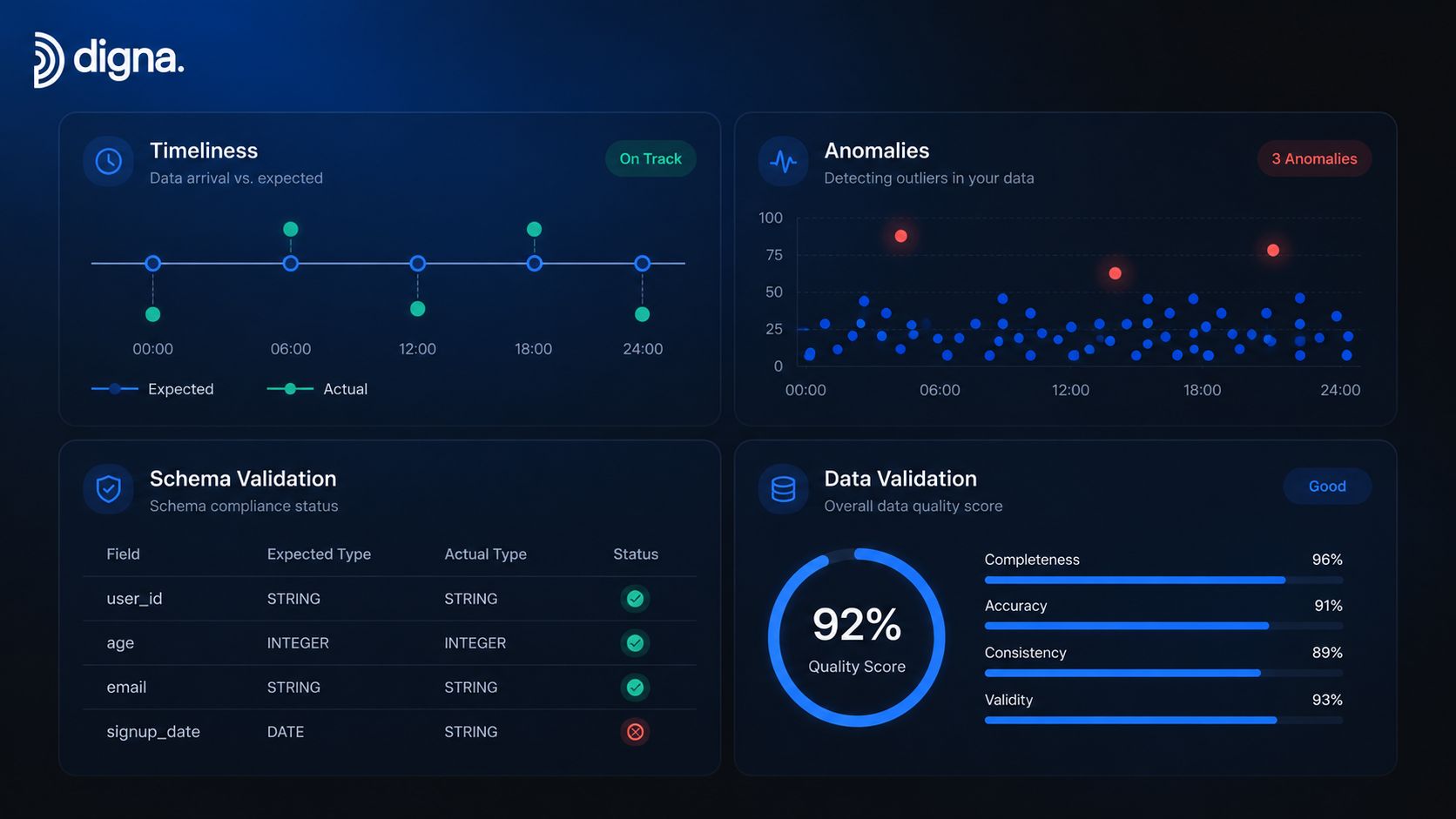
A dashboard surface should reflect the type of question being asked, not the other way around. The landing view needs a fast read on whether the pipeline is healthy. The drill-down views need enough detail to explain why it isn't. That separation matters because a health score without inspectable panels becomes a screenshot, not a working tool.
Timeliness and anomaly panels
A timeliness panel should compare expected arrival time to actual arrival time and make the delay obvious. If a batch is late by a few minutes, that's a different operational posture than a batch that missed the schedule entirely. The useful output is delay in a concrete unit, plus a visible schedule marker that tells the operator whether the issue is routine or off-pattern.
The anomaly panel should show learned baseline behavior against the current value, then highlight points that fall outside the expected band. That works better than a single number because it captures gradual drift as well as abrupt breaks. Historical context belongs here too, since a raw spike means little without the prior pattern that defines “normal.”
Schema and validation panels
A schema tracker should log added columns, removed columns, and type changes with timestamps and affected downstream objects. That lets engineering see the blast radius before a broken field reaches reporting or model scoring. It also helps when a harmless-looking rename turns into a production incident because a downstream job still expects the old shape.
The validation panel should list failed record-level rules, sample records, and ownership routing. It should not hide the actual bad rows behind a score. Operators need to know what failed, which dataset it hit, and who is on point for the fix.
A good landing page answers one question, is anything trending toward breakage. Everything else belongs one click deeper.
Platforms such as digna organize these surfaces around Data Timeliness, Data Anomalies, Schema Tracker, and Data Validation. That arrangement maps well to the panels above because it separates operational monitoring from forensic inspection. The internal best-practices note at observability best practices is a useful reference point when you're deciding how much detail belongs on the first screen versus the drill-down.
Choosing Visual Patterns That Drive Decisions in Under Ten Seconds
Every chart on a data quality dashboard should answer a decision in under ten seconds. If it can't do that, it's probably consuming space that should belong to a scorecard, a trend line, or a lineage view. The right pattern depends on whether the viewer needs to spot, compare, or investigate.

Match the chart to the decision
A scorecard with traffic-light coloring works best when the only question is whether action is needed right now. That's useful for an executive who wants a quick signal across several critical datasets.
A stacked trend line is better when the job is to spot slow decay. Single-value gauges look clean, but they hide whether a metric is drifting week by week or staying stable with normal variance.
A topology or lineage view is the only honest way to show the blast radius of a schema change. If a column rename affects three downstream jobs and two dashboards, the viewer should see that path, not just the failing table.
Use separate views for separate roles
An executive view should compress the state of the program into a small number of decisions. A data steward view needs ownership, exceptions, and remediation status. An on-call engineer view needs timestamps, samples, and the specific control that failed.
The same underlying metric can serve all three audiences, but not with the same presentation. A clean bar chart may be enough for prioritization, while a dense drill-down tree is better for investigation after the fact. Decorative visuals are a waste if they don't shorten the time to action.
If a chart looks impressive but doesn't change the next move, it belongs in a slide deck, not a monitoring system.
The rule of thumb is simple. Use the lightest visual that still answers the operational question. Anything more complex increases cognitive load without improving the fix.
Alerting, Escalation, and Tuning Out Alert Fatigue
Alerting is where many dashboards either earn trust or lose it permanently. If every threshold breach triggers the same kind of noise, operators stop believing the system. If the system only alerts on major failures, it misses the slow decay that would have been cheap to fix earlier.
Design alerts around ownership and severity
Tiered alerts work better than a single threshold because they map to response paths. A critical band should page a named owner. A high band can trigger urgent review. Lower bands should log, trend, and wait for aggregation unless they persist.
Each alert needs a named owner and a runbook link. Without that, the alert is just a complaint with a timestamp. Ownership mapping matters because the person receiving the signal should already know whether they can fix it, reroute it, or escalate it.
The hardest part is tuning. One public ITSV example described 140 plus daily alerts, and most of them were ignored because the inbox flood made it impossible to separate signal from noise. That's the cost of uncalibrated alerting, and it's exactly why baseline learning and ownership mapping matter. Data quality dashboard importance and alert fatigue
Reduce noise without hiding real risk
Known-good windows should be suppressed. Planned maintenance, batch cutovers, and scheduled backfills shouldn't page the team if the event was expected and documented. Quiet hours and exception windows keep the dashboard usable without turning it into a loophole.
The operational metric that matters most is not raw alert count. It's whether people acknowledge the right alerts quickly and whether the system keeps producing false positives. If the acknowledgement rate is weak, the threshold is probably too noisy, the routing is wrong, or the owner isn't real.
I've seen teams regain trust only after they narrowed the page-worthy conditions to the handful that threaten service or compliance. Everything else still gets tracked, but it doesn't interrupt someone's night unless the business impact justifies it. That balance is what makes a dashboard act like a control system instead of a siren.
Architecture, In-Database Computation, and Governance Handoffs
The default architecture for a serious dashboard is in-database metric computation. Keep the analyses where the data already lives, and you preserve freshness, reduce unnecessary movement, and avoid copying sensitive records into another system just to measure them. That pattern also makes it easier to keep trend analysis, anomaly detection, and schema tracking on the same metric store without fragmenting the pipeline.
Connect the dashboard to governance, not just monitoring
The dashboard should hand off cleanly to governance. Data stewards own the business interpretation of the panels, engineering owns the operational checks, and audit needs a traceable record of what changed and what was done. That handoff works only when the dashboard writes back enough context for review, including the check history and evidence of execution.
Platform design matters. A system such as digna computes signals inside the customer environment, which keeps the operational view aligned with the data residency model and avoids extra copies just for monitoring. That same approach also supports governance workflows because the findings can be linked to data contracts, lineage, and review processes without turning the dashboard into a separate island.
The clean rollout path is straightforward:
Keep computation close to the data. Freshness signals are weaker when they depend on movement across systems.
Store history per check run. One row per run gives you trends, not just the current state.
Route findings to owners. A finding without ownership is just a note.
Feed governance from the same metric store. That keeps stewardship, audit, and engineering aligned.
A dashboard is not the deliverable. It's the control point where operations, analytics, and governance meet. When it's built that way, the dashboard helps teams spot decay earlier, assign the right fix, and prove that the fix worked.
If you're building or reworking data quality dashboards, focus on process mapping, tiered thresholds, and alert ownership before you polish the visuals. digna provides in-database monitoring for anomalies, timeliness, validation, schema changes, and trend analysis, so teams can keep the control loop inside their own environment. Visit digna if you want a dashboard design that connects checks, ownership, and response without turning monitoring into another source of noise.


