KPI Monitoring Dashboard Design and Implementation
|
0
min. Lesezeit

Most advice about a kpi monitoring dashboard starts in the wrong place. Teams obsess over chart styles, color palettes, and layout grids, then act surprised when stakeholders stop trusting the numbers. In enterprise settings, dashboards usually don't fail because they look bad, they fail because the data underneath them shifts in shape, goes stale, or drifts away from the business definition everyone thought they were using.
A dashboard can be visually clean and operationally dangerous at the same time. If a finance team, a CRM workflow, and a marketing model all compute the same KPI differently, the chart can look polished while the decision it supports is already compromised. That's why reliable monitoring starts with trust, not decoration, and why the strongest dashboards behave less like scorecards and more like control systems.
Table of Contents
Why Most KPI Monitoring Dashboards Fail
The most common failure mode is simple. Teams build a dashboard that looks complete, then assume the presence of charts means the underlying metric is stable. In reality, a KPI monitoring dashboard often becomes fragile the moment upstream data shifts, a transformation changes, or a business rule gets rewritten without anyone updating the definition layer.
A pretty view can hide deep operational problems. One of the clearest examples is the gap between what users see and what the data pipeline is really doing. If the dashboard is fed by a nightly reload cycle with retained history, like the public KPI guide from Los Angeles County, it is already acting as an operational system rather than a static report, because the value comes from continuity, history, and controlled refresh, not from presentation alone (Los Angeles County KPI Dashboard User Guide).
Silent drift is what breaks trust
Silent drift is worse than a broken chart because it doesn't announce itself. A chart with missing data looks suspicious, but a chart with slightly wrong logic often looks normal enough to pass review. That's the danger in enterprise environments, especially when different teams calculate the same KPI from different source systems.
Trust dies long before the chart looks broken.
The practical response is to treat the dashboard as a monitored product, not a static artifact. That means watching the inputs, the definition, and the usage pattern together. Usage matters because dashboard value is often measured by whether intended users open it over a defined period, and adoption guidance commonly tracks weekly active viewers, return rate across weeks, export volume, and citation count in business reviews (dashboard adoption guidance).
A dashboard that nobody returns to is usually telling you something. Either the data is stale, the definitions are confusing, or the layout hides the signal behind too much noise. For a practical quality lens, a useful internal reference is why data issues continue to create conflicts and how to improve data quality, because conflicts over data are often really conflicts over trust, ownership, or lineage.
Selecting Metrics That Drive Real Business Action
A dashboard full of vanity metrics is worse than a blank screen. It creates the illusion of control while leaving operators with nothing to change. Select KPIs that map to a business consequence, a threshold, and a named owner.
Start with the decision, not the chart. Ask what action should happen if the KPI moves, who should take it, and how large the change must be before it deserves attention. If those three answers are unclear, the metric belongs in a report, not in a monitoring dashboard.

Build the metric around the decision
A useful KPI does three things. It reflects a business outcome instead of raw activity. It has a warning zone and a critical zone. It also has a human owner who can act when the metric crosses a line.
That structure matches practical guidance for exception-based management, where each KPI has a target, warning threshold, and critical threshold. It also supports keeping the primary view to about 5 to 10 KPIs so the dashboard does not turn into a visual backlog (Domo KPI dashboard best practices). The point is not to minimize information. The point is to keep attention available for anomalies that deserve action.
Practical rule: if a metric doesn't trigger a response, it's not a monitoring KPI, it's a reference value.
OKRs and KPIs serve different jobs. An OKR describes a direction or objective. A KPI checks whether the system is behaving as expected. The OKR vs KPI leader's guide helps teams keep aspiration separate from operational control.
Ownership matters as much as the metric itself. Real-time KPI dashboard guidance recommends static limits tied to business impact, plus a responsible owner so a decline leads to escalation instead of passive observation (real-time KPI dashboard guidance). If a threshold is breached and nobody knows who owns the response, the dashboard is only documenting failure.
For teams building quality reporting alongside monitoring, digna's data quality reporting approach is useful because it favors structured evidence over loose interpretation. That matters when the KPI affects audit, finance, or regulated operations.
Designing Layouts for Exception-Based Management
The strongest dashboards stay quiet until something changes. Stable metrics should remain in the background, and the layout should force attention toward the few signals that need action. That approach fits how operations teams work, in short sessions, under pressure, with little tolerance for noise.
Exception-based management works because no one can scan fifty gauges and assign them equal weight. The layout has to rank signals before the user sees them. Clear thresholds, muted stable metrics, and a single obvious failure state do that work for the reader.

Design for selective attention
Put only the most operationally important indicators in the primary view, then move supporting diagnostics deeper in the stack. That keeps the dashboard from becoming a wall of equal-weight tiles where nothing stands out.
Alert fatigue is the trade-off to watch. If every metric is treated as an emergency, none of them is heard. Warning and paging thresholds give the signal meaning when an alert finally fires, and the team responds with more care because the escalation is specific.
A good layout also makes stability visible. When a KPI stays inside its target band, that is useful information, because it tells the team where not to spend time. Enterprise guidance makes the same point in a different way, since hidden definitions, stale refreshes, and missing ownership are common failure modes in a crowded primary view (Domo KPI dashboard best practices).
A practical structure separates the view by urgency.
Top layer: the KPIs that require immediate review when they cross a threshold.
Middle layer: trend context and supporting comparisons.
Bottom layer: drill-downs, lineage, and diagnosis.
That hierarchy works well with internal quality workflows, especially when a team uses digna's data quality dashboards as the diagnostic layer under business-facing metrics. The dashboard then becomes a path into investigation instead of a dead end.
Implementing Alerting and Data Observability Controls
A KPI is only as reliable as the pipeline that feeds it. That's why alerting needs to start below the business layer, where freshness, schema, volume, and null rates can be checked before bad data reaches a leadership dashboard. When those controls are in place, the monitoring stack stops being reactive theater and starts acting like an incident system.
The strongest pattern I've seen is a control chain that follows the data through each stage. First, enumerate the pipeline stages. Then define the failure modes, such as missing files, duplicates, schema drift, or stale loads. After that, encode checks as executable queries and preserve the results so every run leaves a historical record.
Turn checks into incident evidence
Historical check rows matter because they let teams see trend lines, not just failures. A one-off alert tells you something broke today. A stored history tells you whether the problem is recurring, widening, or moving between stages. That's a far more useful basis for escalation.
The observability layer should also map directly to known control pillars. Data observability is commonly organized around freshness, distribution, volume, schema, and lineage, which line up with timeliness checks, anomaly detection, completeness checks, structural-change detection, and provenance tracking (data observability pillars). In practice, those pillars are easier to manage when the checks are explicit and tied to owners.
A good control set is specific. Guidance on data-quality monitoring recommends checks for freshness, row volume, schema drift, nulls in required columns, primary-key uniqueness, and accepted values or ranges, run at ingestion, after transformation, and again at the serving table, with blocking checks on every execution and reconciliation jobs daily (data quality best practices). That's the right mindset for KPI systems too, because the dashboard should never be the first place that broken data becomes visible.
Route every finding to a named owner. If no one is accountable, the alert becomes noise.
Schema monitoring deserves separate treatment because structural changes can break downstream logic even when the row counts look fine. Research on observability systems describes alerts that fire when metadata changes in source tables so added, removed, or modified structures are detected before reporting assumptions break (schema-change monitoring research). That control is especially important in finance, healthcare, telecom, and public sector environments, where the cost of a silent reporting error is much higher than the cost of a noisy check.
A practical internal reference for this layer is digna's data observability, since that category includes timeliness, validation, anomaly detection, and schema tracking in one operational view.
Tailoring Views for Different Stakeholder Teams
One dashboard rarely fits every stakeholder. Data engineers need failure signals, analysts need context, and executives need a short view that supports decisions without forcing them to sift through pipeline noise. If you give all three groups the same screen, technical users miss the details they need and business users get buried in clutter.
The better pattern is one governed metric layer with role-specific views on top. That keeps KPI definitions aligned while letting each team see the level of detail it can act on.
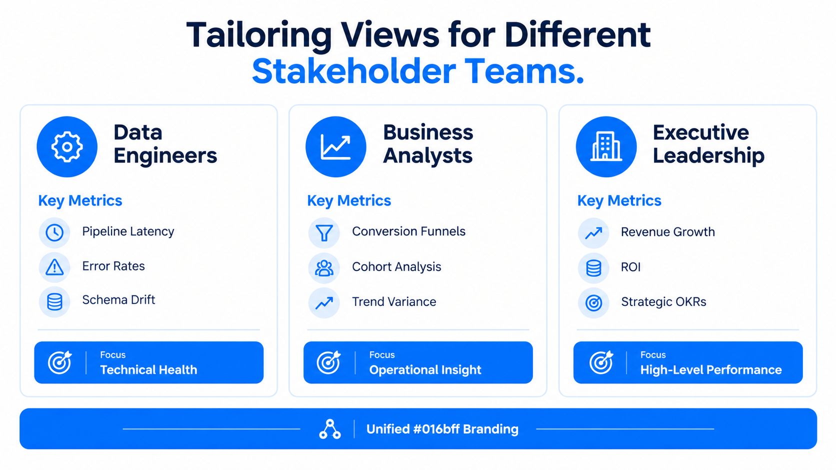
Engineer, analyst, executive
Data engineers need technical health signals. They need to see whether loads are late, schemas have changed, checks are failing, or a lineage assumption has broken. Their view should expose the pipeline, not just the business output. If the serving metric is wrong, they need a fast path back to the source.
Business analysts need context they can explain. Trends, variances, and operational patterns matter, but not a wall of infrastructure noise. They need enough lineage and definition detail to explain why the KPI moved, without having to reconstruct the metric from scratch.
Executives need a compact performance picture. They want a small set of indicators that shows whether the business is on track, drifting, or under pressure. If they export the summary into slides and rebuild it elsewhere, the executive view is not carrying the decision.
Role-specific usage is a better signal than generic traffic counts. If the engineering view gets ignored during incidents, if analysts keep exporting a cleaned metric into spreadsheets, or if executives bypass the dashboard for a separate summary, the view is not matching the job it is supposed to do.
A useful way to structure the views is simple.
Engineers: pipeline latency, schema drift, failed checks, lineage breaks.
Analysts: trend variance, cohort patterns, metric context, exception explanation.
Executives: a narrow summary of business health, with clear threshold status.
A practical reference for building this kind of role-based setup is digna's self-service analytics. Self-service only works when the governed layer underneath it is trustworthy enough for different users to pull from without recreating the metric in their own spreadsheet.
Maintaining Metric Governance and Semantic Integrity
The most dangerous dashboard is the one that looks right while computing the wrong thing. That happens when KPI definitions drift across finance, marketing, CRM, or operational systems, and nobody is continuously checking whether the same label still means the same calculation. At that point, the chart is not a source of truth, it's a source of confusion.
Metric governance is the missing layer in many dashboard programs. Teams often spend all their effort on layout and thresholding, then leave the semantic layer unmonitored. That creates a gap where a KPI can stay visually stable while the underlying logic changes, which is exactly how audit risk and decision risk creep in.
Govern the definition, not just the display
A serious monitoring strategy needs a way to detect definition drift. That means tracking source-of-truth disputes, stale data, upstream transformation changes, and business logic mismatches before they spread across reports. This is especially important in regulated environments, where inconsistent KPI logic can create compliance problems long before a visual trend looks suspicious.
The practical move is to treat metric definitions like production assets. Version them, document them, and watch for when a downstream consumer no longer matches the authoritative calculation. That's not a visualization problem, it's a semantic integrity problem.
Independent guidance has already warned about conflicting metrics, source-of-truth disputes, stale data, and missing operating context, which points to the same conclusion, the deeper problem is governance, not the dashboard frame. For enterprises, the risk is bigger because different teams may pull the same KPI from different systems and never realize they're disagreeing until a business review or audit exposes it. A useful internal anchor on this topic is digna's dbt semantic layer, because the semantic layer is where consistent definitions either hold together or fall apart.
The practical standard is simple.
Define the KPI once.
Track where it's reused.
Alert when its meaning changes.
Document the owner who approves the change.
When that discipline is in place, the dashboard becomes credible enough for operational use. Without it, even the cleanest interface is just a very polished way to spread ambiguity.
If you want to build a KPI monitoring dashboard that catches silent drift, not just pretty charts, work with digna. Its data quality and observability capabilities help teams monitor freshness, validation, schema change, and business metrics inside their own environment. Visit digna to see how it fits into a governed monitoring stack.