Build Trust with Data Quality Reporting: 2026 Guide
|
9
min read

You know the moment. The board deck is ready, the dashboard is live, and then one number looks wrong enough to stop the room. The BI tool didn't fail. The data underneath it did, and now the team has to decide whether to trust the chart, pause the meeting, or spend the next hour tracing a bad load through three systems.
That's why data quality reporting matters. It turns trust from a gut feel into a repeatable practice, and it gives every team, from engineering to finance, a common way to see whether the data is usable, current, and coherent enough to drive decisions.
Table of Contents
Why Your Dashboards Are Lying to You
The worst dashboard problems rarely look like software failures. They look like a revenue dip that doesn't match the pipeline, a customer count that changes overnight, or an executive scorecard that forces everyone into detective mode before a meeting. The dashboard is only the surface. The root cause is that the underlying data lost trust somewhere between ingestion, transformation, and consumption.
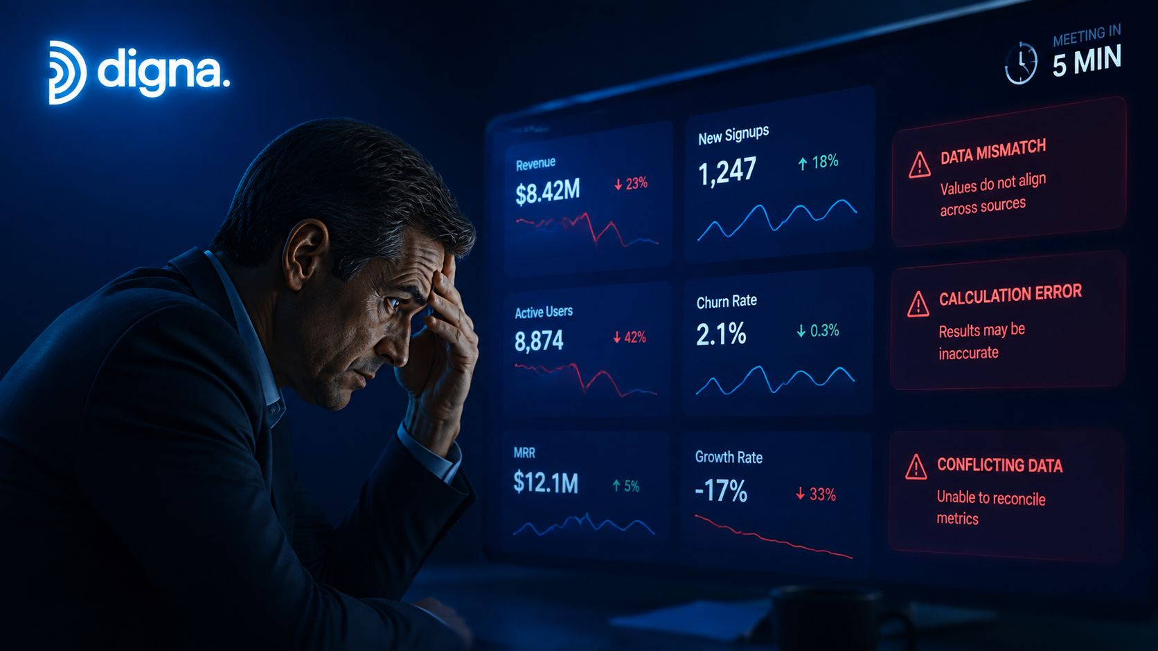
The financial cost is not abstract. Poor data quality costs organizations an average of $12.9 million annually, and 68% of data professionals say it takes four hours or more just to detect a data incident, with average time to resolution at 15 hours per incident (Gitnux data quality statistics). That's not a reporting inconvenience. That's lost decision time, broken workflows, and delayed action across the business.
A lot of teams assume the answer is “better dashboards.” It's usually better evidence. When a metric is wrong, the team needs to know whether the problem is a missing load, a broken rule, a schema change, or a transformation that shifted the meaning of the data without being noticed.
One useful way to think about this is that the dashboard is the symptom, while the reporting system is the diagnostic layer. If you've ever seen duplicate records inflate a count or a stale table drive a false trend, the issue is often upstream in the pipeline. That's why many teams start by mapping their reporting stack to the behavior of the data itself, not just the chart surface, and digna's explanation of data redundancy and anomalies in analytics reporting systems is a practical reference point for that kind of thinking.
Practical rule: if a dashboard number can't be traced back to a quality signal, it shouldn't be treated as decision-grade.
What Data Quality Reporting Means
Data quality reporting is a structured way to prove that data is fit for purpose. It is not a screenshot, and it is not a checklist buried in a workflow tool. It is the evidence layer that tells stakeholders what was measured, what passed, what failed, and what context they need before using the data in analytics, operations, or AI.
From ad hoc checks to auditable evidence
The discipline has formal roots in official statistics. The UN and the European Statistical System built reporting around core dimensions such as accuracy, timeliness, and coherence, which made quality measurable, comparable, and auditable across organizations and industries (UN and Eurostat quality guidance). That history matters because it shows that modern reporting did not begin as a BI convenience. It began as a governance discipline.
The goal is not to produce more documents. The goal is to create a record that supports action. A strong report tells you whether the data is good enough for the use case, where the weaknesses are, and how those weaknesses affect business decisions.
UN quality-report guidelines make that structure clear. They require the report to state the main variables and inputs, define statistical units and target populations, describe geographic and time coverage, explain validation methods, and note any breaks in time series with clear explanations (UN quality-report guidelines). That is the opposite of “looks fine on the dashboard.”
What a real report has to prove
A useful report answers a narrow but critical question, can this dataset be trusted for this decision?
That question has to be tied to fitness for purpose, not to a generic pass or fail label. A practical reporting system also needs to show the quality signals behind the answer, so analysts can trace the result back to the pipeline rather than treating the report as a static summary. Digna's data quality metrics overview is a useful example of how these checks can be framed for operational use.
A modern reporting system also needs to capture structure, not just summary language. ISO 19157-1:2023 treats geographic-data quality as a standardized metadata artifact with quality components, evaluation procedures, and reporting principles that can be exchanged consistently across organizations (ISO 19157-1:2023). That idea translates well to enterprise data, where teams need reports they can validate, share, and compare over time.
For regulated and cross-functional teams, the hardest part is often not calculating a score. It is defining the context around the score. If no one can see what was transformed, filtered, or recoded before measurement, the report can look clean while still being misleading.
The Six Core Metrics Your Reports Must Include
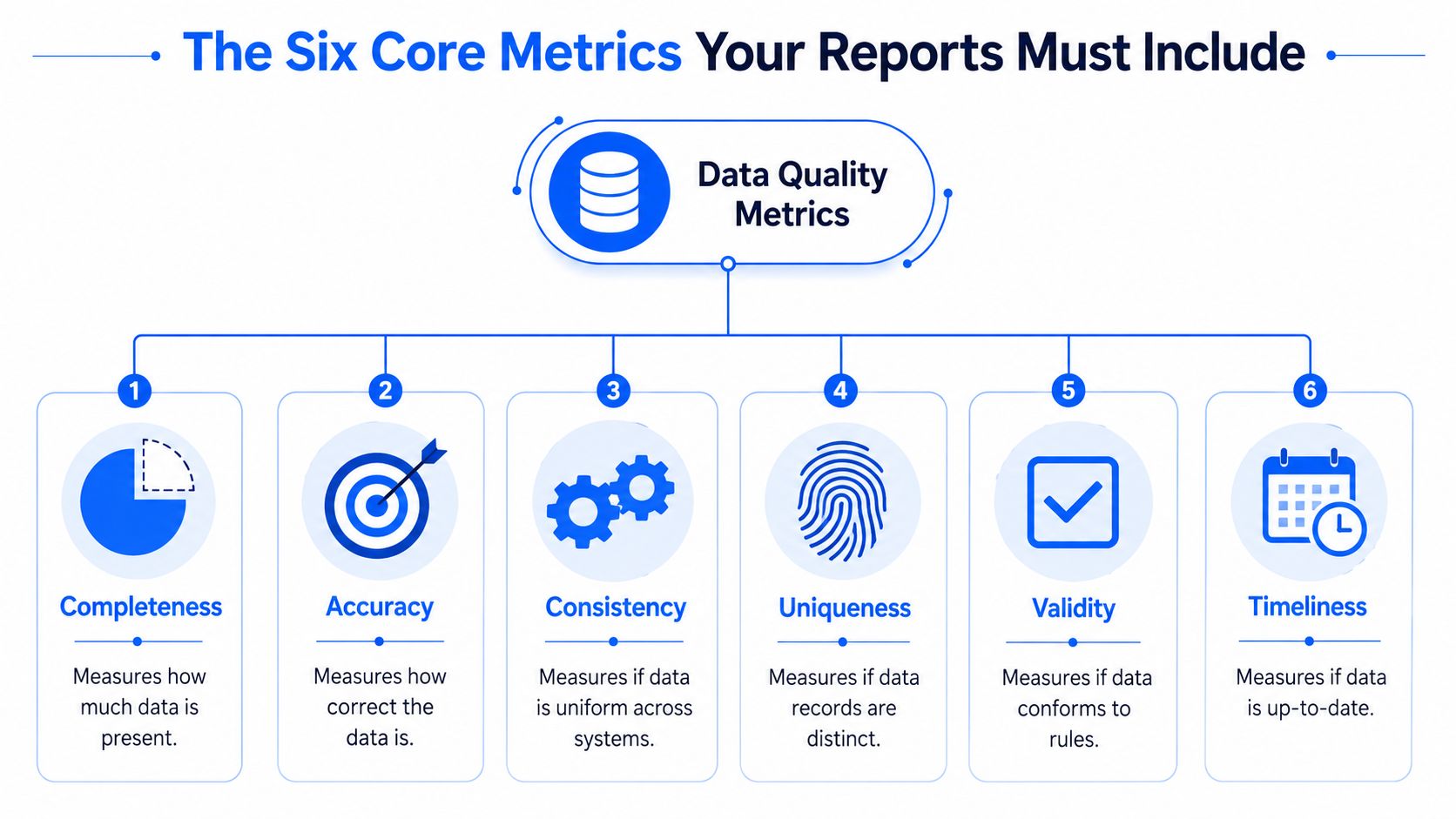
A serious report doesn't try to cover every possible data issue. It anchors the conversation in six dimensions that governance teams can act on. A governance-aligned report should include completeness, accuracy, consistency, timeliness, uniqueness, and validity, plus a business impact analysis and a remediation plan (Murdio data quality report guide).
The dimensions that matter
Completeness tells you whether required data is present. It's the first place many teams look, but it's also easy to over-trust. A field can be filled in and still be wrong.
Accuracy measures whether the data reflects reality. In practice, that usually means checking against source systems, approved reference values, or business rules that define what “correct” looks like.
Consistency asks whether the same concept has the same meaning across systems, pipelines, and reports. A customer, product, or account attribute often drifts between teams in such instances.
Timeliness measures whether data arrives early enough to be useful. That's where a platform such as digna can monitor freshness, expected delivery, and late or missing loads inside the customer environment.
Uniqueness checks whether records are distinct. Duplicate identities, repeated transactions, and copied events all show up here.
Validity tests whether values conform to the rules. That might mean type checks, domain checks, range checks, or record-level business constraints, and it's where digna's validation-style checks fit naturally.
Practical rule: if a metric doesn't map to a decision, a threshold, and an owner, it belongs in exploration, not in the report.
Turn metrics into operating signals
The strongest reports avoid generic scorecards. They tie each dimension to a question a team asks. Is the data complete enough to publish? Is it accurate enough to bill? Is it timely enough for an operations meeting? Is it valid enough for regulatory use?
That's also where the report stops being passive. A well-designed system pairs these metrics with exception tracking, trend history, and remediation status. Teams can then see whether a problem is getting better, getting worse, or moving between pipelines and domains.
If you want a compact reference for the metric model, digna's data quality metrics overview is useful as a product-side translation of the same governance pattern.
Choosing the Right Report for Your Audience
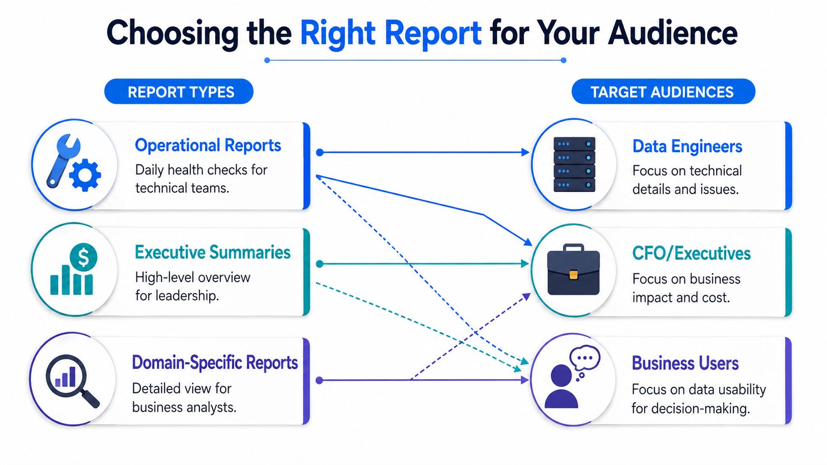
A report that helps a data engineer can overwhelm a CFO. A summary that works for the executive team can hide the exact failure a steward needs to fix. The trick is to match the level of detail to the decision being made, not to treat every audience as if they need the same artifact.
Data Quality Report Types by Audience | ||||
|---|---|---|---|---|
Report Type | Primary Audience | Purpose | Example Metrics | Frequency |
Operational reports | Data engineers, on-call analysts | Catch failures fast and route incidents | Freshness, failed rules, schema changes | Continuous or daily |
Tactical reports | Data stewards, analytics leads | Track patterns and prioritize fixes | Repeated rule failures, missingness, duplicates | Weekly |
Strategic reports | CFOs, executives, governance committees | Review risk, business impact, and accountability | Critical asset status, unresolved incidents, remediation progress | Monthly or quarterly |
Match the report to the job
Operational reporting should be blunt and narrow. It's there to tell a technical team what broke, where it broke, and what needs attention now. That's why alert routing matters so much, the message needs to land with the person who can do something about it.
Tactical reporting sits in the middle. It helps teams spot recurring defects, compare domains, and see whether remediation is sticking. This is the right place for trend views and domain-by-domain quality summaries.
Strategic reporting is different again. Executives do not need every failed row. They need a summary of business exposure, ownership, and whether the organization is improving or drifting. A clean strategic report should read like a governance instrument, not an engineering log.
Design choices that reduce noise
A report becomes useless when it mixes audiences. If a dashboard contains every validation result, every anomaly flag, and every lifecycle note, no one knows what to do next. The better pattern is separation with shared lineage, so each audience gets the slice they need while everyone still sees the same underlying truth.
A simple rule helps here, too. If the report is for action, keep it operational. If it's for prioritization, keep it tactical. If it's for accountability, keep it strategic. The content changes, but the evidence should stay consistent across all three.
Modern Architectures for Continuous Reporting
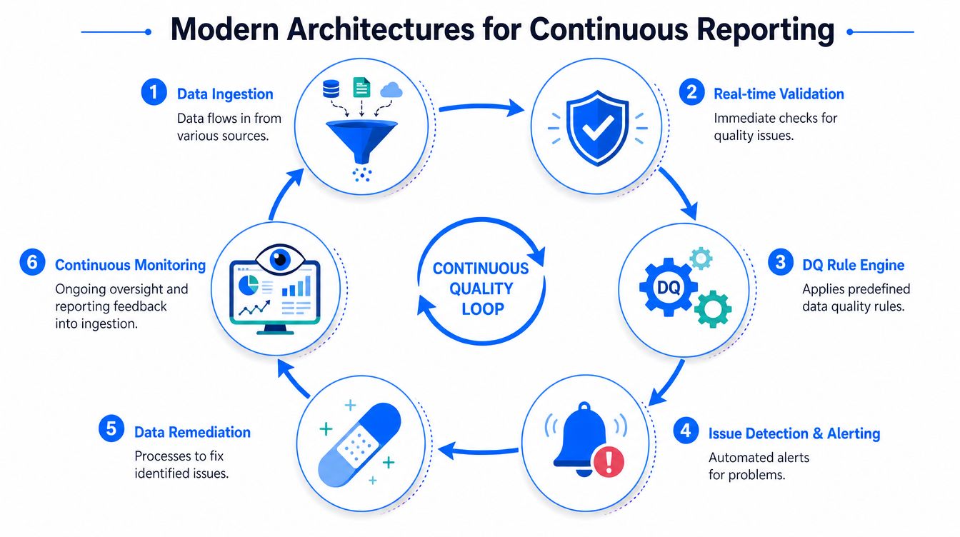
A warehouse can look healthy in the morning and be misleading by noon. Source systems drift, pipelines slow down, schemas change, and the report people rely on still shows yesterday's version of reality. Legacy reporting was built for after-the-fact review, so it falls apart when data arrives continuously and business teams need to trust the result while the pipeline is still in motion.
Why static documentation falls behind
Static documentation cannot keep up with an operating environment that changes every day. The NCES data quality framework treats reporting as something that has to surface trade-offs, revisit threats, and use modern templates or tools that turn internal documentation into reports people can act on. That logic fits warehouses and pipelines where drift, delays, and schema changes appear without warning.
The architectural response is to bring quality checks closer to the data itself. In-database execution keeps data in place, cuts unnecessary movement, and makes monitoring practical at scale. It also supports continuous checks that can separate a short-lived pipeline incident from a broader quality problem.
Practical rule: if the check runs hours after the data lands, the report is already behind the business.
What continuous reporting needs to do
A continuous reporting system has to watch incoming data, validate it against rules, detect anomalies, and preserve a clear trail of what changed. Freshness signals, rule outcomes, structural changes, and trend history all need to point back to the same asset, so the report stays connected to operational reality.
The architecture behind that system matters just as much as the metrics. A modern data pipeline architecture should support checks where the data already lives, keep lineage visible, and make it easy to trace a failed signal back to the source and the downstream consumers. Without that, reporting becomes a stack of disconnected outputs instead of a system that supports action.
digna fits that model well as one option among others. Its platform runs inside the customer's own environment, executes checks in-database, and combines Data Anomalies, Timeliness, Data Validation, and Schema Tracker to monitor behavior without moving production data. The value is continuity, not just detection. Teams get a system that can follow data as it changes instead of waiting for a scheduled audit to catch up.
Continuous reporting also changes incident handling. It lets teams tell whether a failure is a one-off pipeline break, a recurring upstream issue, or a durable data-quality problem. That distinction is what makes reporting strategic instead of reactive.
Designing an Actionable Data Quality Dashboard
A useful dashboard doesn't try to impress people. It helps them decide. The layout should make it obvious what changed, whether the change matters, and who owns the response. If someone has to click through five tabs just to learn that a table is late, the dashboard isn't doing its job.
Build the page around the asset, not the org chart
Start with one critical dataset or domain, then anchor the dashboard around its current health. A strong layout usually includes a freshness panel, a validation summary, an anomaly trend, and a schema-change indicator. That gives engineers, analysts, and stewards one place to see whether the data is ready, risky, or broken.
The point is not to surface every metric equally. The point is to make the important signal obvious at a glance. A timeline for timeliness tells people whether delivery is drifting. A validation widget shows rule failures by type. An anomaly chart highlights unexpected volume or value behavior. A schema panel shows whether structure changed in ways that could break downstream consumers.
Design for diagnosis, not decoration
Dashboards fail when they only report status. They succeed when they support diagnosis. That means each widget should answer a different question, and the whole page should connect symptoms to context.
A solid layout usually follows this sequence:
Current status first: show whether the asset is healthy, degraded, or failed.
What changed next: highlight schema shifts, missing loads, and spikes in anomalies.
Why it matters: attach the affected business process, table, or downstream report.
What to do now: route the issue to the right owner and remediation path.
That's also why user-centric dashboards work better than isolated operational tools. When the same interface serves data engineers, analysts, and stakeholders, the report doesn't fragment into separate truths. It becomes a shared operating surface for trust, triage, and follow-up.
Integrating Reporting into Your Governance Framework
A report without ownership is just noise. If nobody is responsible for the fix, the dashboard becomes decoration, and the organization gets very good at observing the same problem over and over again. Governance is what turns a signal into accountability.
Make ownership and context nonnegotiable
The biggest blind spot in reporting is provenance. Users need to know the original source and the transformation steps applied before a dataset is called high quality, because a clean report can still be misleading when the data came from multiple systems or secondary-use workflows (provenance and transformation context guidance). That context matters as much as the quality score itself.
Alert routing should be explicit, not improvised. High-risk failures need clear owners, while lower-priority issues can be grouped into scheduled reviews. Thresholds should be meaningful enough to avoid alert fatigue, because too much noise trains people to ignore the system.
A governance framework also needs evidence that survives review. If you're working in regulated environments, a resource like avoiding GDPR penalties with data governance is a useful companion because it connects controls, accountability, and compliance thinking in a way technical teams can use.
Treat reporting as a shared operating model
The most effective organizations don't bolt reporting onto governance after the fact. They build the reporting rules, the ownership model, and the escalation path together. That way, every quality signal has a human path attached to it.
The outcome is a system that helps teams trust the data, act faster when something breaks, and explain to stakeholders why a metric is safe to use or not. This is the primary function of data quality reporting, not just showing what happened, but making sure someone can do something about it.
If you're ready to replace reactive data fire-fighting with continuous trust signals, digna gives teams in-database monitoring, validation, timeliness tracking, anomaly detection, and schema change visibility inside their own environment. Visit the site, review the modules, and see how a reporting system can help your team move from after-the-fact cleanup to proactive control.
Frequently asked questions
Why do dashboards mislead rather than fail?
Because the worst dashboard problems rarely look like software failures. Nothing errors, so nothing prompts investigation, and the report keeps presenting a number whose basis has quietly changed.
What is the relationship between the dashboard and the reporting system?
The dashboard is the symptom and the reporting system is the diagnostic layer. Teams that respond to a bad dashboard by building a better dashboard are improving the symptom's resolution.
Is the answer better dashboards?
Usually better evidence. A clearer chart of an unexplained number does not make the number defensible, whereas a record of what was checked, when, and with what result does.
How long does detection actually take?
Longer than most teams assume. Poor data quality costs organizations an average of $12.9 million annually, and 68% of data professionals say it takes four hours or more just to detect a data incident, with average resolution at 15 hours per incident.
What should a quality report contain?
Evidence rather than scores. The useful content is which controls ran, which failed, who owns the failure and what changed since the last report, because those are the four things a reader can act on.