Data Integrity Monitoring: A Practical Guide for 2026
|
7
min read

Your dashboards rarely fail with a dramatic crash. More often, someone in finance opens a revenue view on Monday, sees yesterday's numbers, and assumes the business is fine. Under the surface, a source table stopped refreshing, a weekend job missed a load, and an AI model already trained on last week's data is now making confident decisions on stale inputs.
That's why data integrity monitoring matters now. It's not a back-end cleanup task, and it's not the same as occasional testing. It's a continuous control layer that watches for breaks in freshness, volume, distribution, schema, and lineage, so teams see quiet failures before stakeholders do. An academic review frames those five pillars as the core framework for understanding whether data is arriving on time, retaining expected statistical properties, staying complete, preserving structure, and keeping traceable provenance, which is exactly the kind of visibility modern pipelines need academic review.
A useful mental model is to treat integrity monitoring as the safety net between tests. Tests tell you whether a known rule still passes. Monitoring tells you whether the system has drifted into a state that will break reporting, models, or downstream automation later. If you already think about anomaly detection, a practical companion read is ELECTE's guide to find hidden patterns in data, because the same instincts apply when the pattern you care about is silent pipeline decay.
If you're mapping this to your own stack, the dashboard layer matters too. A shared view of incidents, trends, and status becomes much more useful when it's backed by continuous checks, not just spot audits. One reference implementation for that kind of visibility is digna's data quality dashboards, which reflects the same operational idea from a different angle.
Table of Contents
The Moment a Dashboard Breaks Without Anyone Noticing
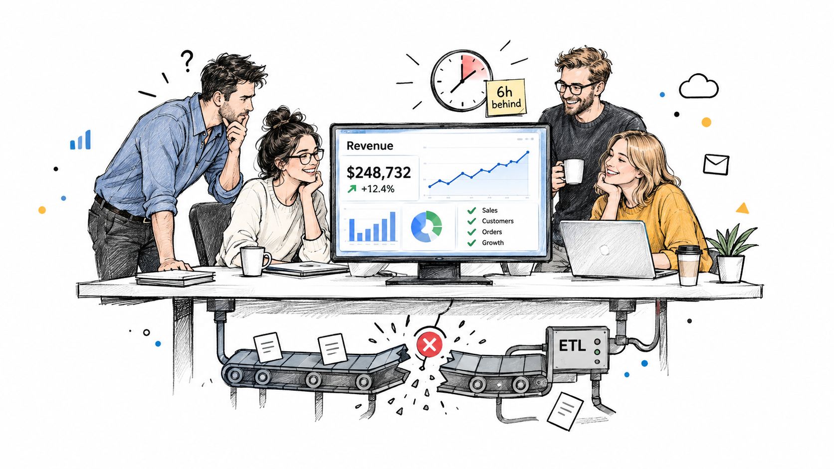
Monday starts with a message nobody likes. The warehouse load that should have landed overnight did not finish cleanly, the source table is six hours stale, and the executive dashboard still shows yesterday's revenue without any error banner. The product team misses it too, because the recommendation model they shipped last week keeps running on the old cohort.
That is the failure mode data integrity monitoring is built for. The point is to watch the data itself, continuously, so stale loads, missing records, schema shifts, and broken dependency chains surface while there is still time to act.
A loud failure is easy to spot. The pipeline breaks, an alert fires, and someone gets paged. A quiet failure is harder, because the numbers still look believable while the underlying data has drifted far enough to distort a decision.
Practical rule: if a check only fires after a stakeholder complains, it is too late to call it monitoring.
That is also why this layer is different from one-off testing. Testing usually happens around deployment or validation points. Data integrity monitoring sits in the middle of the lifecycle, watching the live state of the pipeline as it changes, like a control room that keeps checking the gauges while the machine is already running.
The distinction matters for teams that run both analytics and ML. A model can keep producing predictions when the input table is stale, the schema changed, or a source feed stopped sending rows. Nothing crashes, but the business logic degrades anyway. That is why the monitoring layer has to track whether the job ran and whether the data is still trustworthy.
The strongest setups also correlate several signals at once. Freshness alone can miss duplication. Volume alone can miss a schema shift that drops a column without changing row counts. Schema checks alone can miss a late file that arrives intact but too late to support reporting. One reference implementation for that kind of visibility is digna's data quality dashboards, which shows how incident views can sit beside continuous checks. For a closer look at how observability and incident views fit together, a shared incident dashboard is useful because it reflects the kind of operational visibility teams need once they move beyond manual spot checks.
The Five Lenses of Data Integrity Monitoring
Think of a triage desk in a hospital. A doctor doesn't diagnose a patient from one signal. They check the pulse, ask questions, review bloodwork, look at imaging, and compare the current state with history and family background. Data pipelines deserve the same discipline.

Freshness, volume, distribution, schema, and lineage
Freshness answers whether the data arrived on time. If your sales feed usually lands before 6 a.m. and it hasn't arrived by 8 a.m., that's not a theoretical issue, it's stale reporting. The same applies to late batch jobs, missed incremental loads, and delayed partner feeds. A data observability guide groups freshness with availability, volume, and schema change as core checks for dataset monitoring dasca guide.
Volume looks at row counts, file sizes, and other count-based signals. A sudden drop can mean an upstream extractor failed. A sudden spike can mean duplicates or accidental reprocessing. The number itself doesn't explain the cause, but it tells you something changed.
Distribution covers ranges, null rates, cardinality, and value patterns. Sudden null spikes, broken category balances, and out-of-family values appear here. It's the difference between “the table loaded” and “the data still looks like the same kind of data.”
Schema catches added, removed, renamed, and type-changed columns. Those changes are often the reason downstream SQL breaks or dbt models start returning incomplete results. A structural shift is easy to miss if you only look for job success.
Lineage traces where the data came from and what depends on it. That matters when you need to know whether a defect started in a source extract, a transform, or a downstream consumer. It's also what helps teams understand why one broken field can affect several dashboards at once.
Single signals can point at a symptom. Correlated signals point at the cause.
That's the core lesson. Mature monitoring doesn't just fire on one anomaly. It correlates multiple lenses so teams can tell the difference between a stale table, a business-seasonality swing, and a genuine pipeline break. If you want a practical example of how those signals fit together in a monitoring view, the digna data observability page maps closely to this five-lens model.
Why Integrity Monitoring Is Now a Strategic Layer
A few years ago, many teams treated data quality as cleanup work. Fix the bad rows, patch the dashboard, move on. That mindset doesn't hold once analytics and AI start driving decisions at scale.
The industry shift is visible in adoption data. A 2026 survey found that only about 35 to 36 percent of organizations are actively monitoring or optimizing their data integrity programs, while roughly 15 to 16 percent are still in pre-planning stages survey. That means the practice has crossed into mainstream operations, but it's still far from universal.
Why AI raises the stakes
AI systems don't just consume data, they amplify it. If the input is stale, incomplete, or structurally changed, the model can still emit a clean-looking output. That output may be wrong, but it'll often look confident, which is exactly what makes the problem dangerous.
That's why integrity monitoring is no longer just a technical hygiene concern. It acts as a control plane for AI readiness, because teams need evidence that the data feeding analytics and models is current, complete, and traceable. It also helps with governance and auditability, because lineage and structural changes become visible instead of buried in ad hoc logs.
Who cares, and why
Driver | Stakeholder | What Breaks Without Monitoring |
|---|---|---|
AI readiness | Data and ML teams | Models train or score on stale, incomplete, or structurally changed data |
Governance | Risk and compliance teams | Teams can't prove what changed, when it changed, or what it affected |
Operational reliability | Platform and analytics teams | Dashboards, transforms, and downstream consumers drift before anyone notices |
The strategic point is simple. If data integrity monitoring is missing, the cost isn't just a bad dashboard. It's a chain of bad decisions made faster by automation. For teams evaluating operational controls, the framing on digna's data quality monitoring is useful because it treats integrity as a standing control rather than a one-time cleanup event.
Comparing Monitoring Approaches That Actually Work
Not every monitoring approach belongs everywhere. The right design depends on where the data lives, how fast it changes, and how much noise your team can absorb. The best programs usually mix methods instead of betting on one.
Where each approach shines and struggles
In-database execution keeps checks close to the data. That reduces movement, which matters in secure or high-volume environments, and it fits teams that want the validation logic to run where the warehouse or lake already sits. The trade-off is obvious, though. You inherit the constraints of the platform you're running on, so portability can be tighter than with external tools.
External scanners are more flexible across systems. They can inspect files, APIs, warehouses, and downstream apps from outside the database boundary. That flexibility comes with overhead, especially when environments get large or when you're trying to keep latency low.
Rule-based thresholds are easy to reason about. They catch obvious breaks, like a table that should never fall below a minimum count or a feed that should arrive by a fixed time. They struggle when the business is seasonal, because a static limit can flag normal change as a problem.
AI-learned baselines adapt better to that kind of variation. They're useful when a dataset has weekly cycles, gradual drift, or messy history. They need warm-up time, though, and the team has to accept that early confidence will be lower than with a fixed rule.
Use static rules for known invariants, learned baselines for changing behavior, and multi-signal correlation when one symptom isn't enough.
That last point matters most. A single alert on freshness can be noise. Freshness plus volume plus schema drift tells a more credible story. A team that wants to keep checks close to the warehouse while still handling broad coverage can look at digna's data integrity checker as one example of how those pieces can be combined without treating every signal the same way.
Approach | Strength | Limitation | Best Fit |
|---|---|---|---|
In-database execution | Low data movement, strong fit for governed environments | Less portable across platforms | High-volume warehouse checks |
External scanners | Broad coverage across systems | More overhead at scale | Cross-system and multi-tool estates |
Rule-based thresholds | Clear, easy to explain | Brittle during seasonal swings | Fixed business rules and hard limits |
AI-learned baselines | Adapts to normal variation | Needs warm-up and tuning | Volatile or changing datasets |
Multi-signal correlation | Reduces false noise and improves diagnosis | More design work up front | Mature monitoring programs |
Implementation Patterns and Best Practices
Most monitoring programs fail because they try to do too much too soon. A better rollout starts by learning the normal shape of the pipeline, then layering alerts only after the team understands what “normal” really looks like.
The benchmark to keep in mind is scale. One cited monitoring dataset found an average of 42 distinct metrics per pipeline, including freshness, volume variance, schema drift, and processing latency querysurge. That doesn't mean every team should alert on all 42 at once. It means mature programs watch multiple signals and use them together.

A rollout that won't drown the team
Learn the baseline first. Run checks in observation mode before you page anyone. Teams need a sense of the ordinary daily rhythm before they can tell whether a change is real.
Prioritize by business impact. Start with freshness, volume, schema, and the distribution checks that protect the most visible datasets. Don't spread the team across every table just because the tooling makes it easy.
Use dynamic thresholds. Set limits per asset, not one global cutoff. A sales feed, a clinical feed, and a telecom usage feed won't share the same normal pattern.
Refine with feedback. Every resolved incident should improve the next alert. If a notification was noisy, tune it. If it caught a real break early, keep the pattern and maybe broaden it.
Ownership matters just as much as alert logic. Every monitored asset should have a named steward, because alerts without an owner become abandoned tickets. A quarterly coverage review also helps, since pipelines change faster than static monitoring maps.
The operational version of this thinking shows up clearly in digna's data quality implementation, where rollout discipline matters as much as the checks themselves.
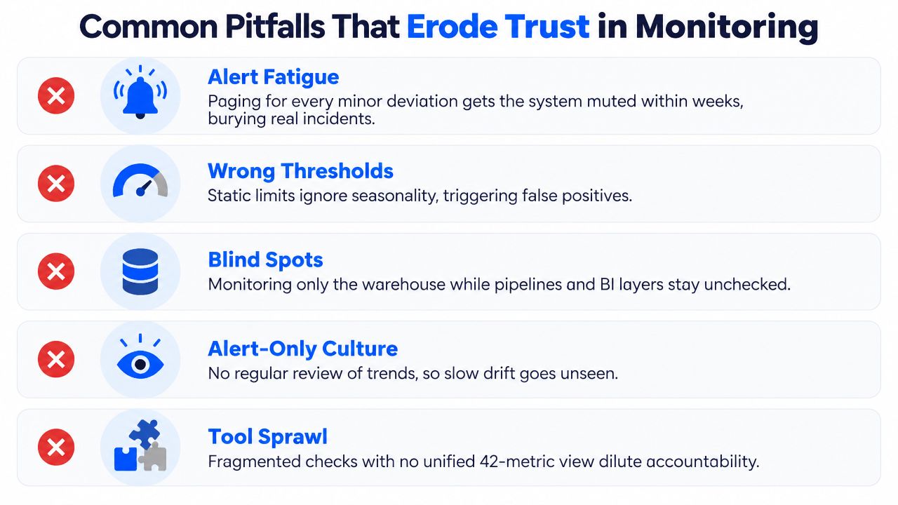
Common Pitfalls That Erode Trust in Monitoring
Monitoring loses credibility fast when it behaves like a noisy alarm system. Teams don't stop trusting it because the idea is wrong, they stop trusting it because the implementation is annoying, brittle, or blind to the actual failure modes.
The failures that show up in real programs
Alert fatigue is the fastest way to lose the room. If the system pages for every minor deviation, people mute it, and then the actual outage slips through.
Wrong thresholds create a different kind of distrust. Static limits ignore seasonality, promotions, month-end peaks, and other business rhythms, so perfectly normal shifts look like incidents.
Blind spots happen when teams watch only the warehouse and ignore the pipeline stages and BI layer that consume it. The result is a false sense of coverage.
Alert-only culture is another quiet failure. If nobody reviews trends, the system misses slow drift that never crosses the hard threshold until it's already visible to users.
Tool sprawl makes accountability fuzzy. Fragmented checks scattered across multiple systems rarely add up to a single operational picture, which is why a unified view matters.
Trust comes from fewer, better alerts, not more noise.
The countermeasures are straightforward but not optional. Use severity tiers, tie thresholds to baseline behavior, add schema-change subscriptions, and keep a review cadence on the calendar. Above all, treat monitoring as a living control, not a project you declare finished after launch.
Industry-Specific Stakes Across Regulated Data
The same monitoring logic lands differently depending on the industry. A finance team, a hospital analytics group, a telecom operator, and a public agency all care about integrity, but they don't fear the same breakpoints.
Four examples, four different failure patterns
In financial services, the most dangerous failure is often a stale or shifted risk feed. A model can keep scoring transactions while the underlying fraud signal is old, and that can distort both decisions and audit trails.
In healthcare, the sharp edge is structural change. A renamed diagnosis column can silently push high-severity cases into the wrong bucket, which means the problem shows up in clinical reporting long before anyone notices the schema issue.
In telecommunications, the trouble is usually scale and volatility. A churn dashboard can miss a regional outage if revenue or usage tables keep loading normally while another feed lags behind.
In the public sector, dependency breaks often show up in eligibility or benefits workflows. A vendor schema change can stop a join from matching records correctly, and that creates downstream service issues that are hard to untangle after the fact.
Industry | Primary Integrity Risk | Most Valuable Signal | Regulatory Stakes |
|---|---|---|---|
Financial services | Stale or shifted risk inputs | Freshness and lineage | Auditability and reporting controls |
Healthcare | Silent structural change | Schema and distribution | Clinical reliability and traceability |
Telecommunications | High-volume pipeline drift | Volume and freshness | Operational continuity and service accuracy |
Public sector | Broken joins after vendor changes | Schema and lineage | Service eligibility, accountability, and records integrity |
The mistake is assuming one configuration fits all. The framework is the same, but the weighting changes. A regulated environment needs the signals tuned to the failure it can least afford to miss, not a generic checklist copied from another team's stack.
Bringing It All Together with digna
The opening dashboard failure, the five-lens framework, the 42-metric benchmark, and the industry-specific examples all point to the same conclusion. Data integrity monitoring works when it becomes a continuous control layer, not an occasional inspection task.

A practical reference point
digna is one way to implement that model inside a customer's own environment, with checks that run in-database and cover freshness, volume, distribution, schema, and lineage in a modular setup. It also aligns with the rollout pattern above, where baselines come first and alerts get tighter only after the system understands normal behavior.
A few points matter most here:
Five lenses applied. The same suite can watch timeliness, structural change, dependency context, and baseline deviations together.
42-metric thinking. Mature monitoring isn't one check per table, it's a set of signals sized to the dataset and the risk.
Phased rollout. Observation comes before paging, which keeps the program useful instead of noisy.
Trust preservation. Tuned thresholds help ensure the team only gets woken up when something actually needs action.
The practical next step is simple. Pick one critical pipeline, configure the five lenses, learn the baseline, and let the anomalies surface before users do. If you want a concrete reference for that kind of setup, visit digna and evaluate how its monitoring approach fits the one pipeline you can't afford to get wrong.
For the AI-learned baselines described above, which adapt to weekly cycles and gradual drift instead of relying on static thresholds, see how digna Data Anomalies learns normal behavior per dataset.
Frequently asked questions
What is data integrity monitoring?
Data integrity monitoring is a continuous control layer that watches live data for breaks in freshness, volume, distribution, schema and lineage. Unlike one-off tests run at deployment, it sits in the middle of the pipeline lifecycle so stale loads, missing records and schema shifts surface before stakeholders notice them.
What are the five pillars of data integrity monitoring?
The five lenses are freshness, volume, distribution, schema and lineage. Freshness asks whether data arrived on time, volume tracks row counts and file sizes, distribution covers null rates and value patterns, schema catches added or renamed columns, and lineage shows where a defect started and what depends on it.
How is data integrity monitoring different from data testing?
Testing checks whether a known rule still passes, usually around deployment or validation points. Monitoring watches the live state of the pipeline and catches drift that will break reports or models later. The article's rule of thumb: if a check only fires after a stakeholder complains, it is not monitoring.
How many metrics should you monitor per data pipeline?
One cited monitoring dataset found an average of 42 distinct metrics per pipeline, covering freshness, volume variance, schema drift and processing latency. That does not mean alerting on all 42 at once; mature programs watch many signals and correlate them, starting with the datasets that carry the most business impact.
How do you roll out data integrity monitoring without alert fatigue?
Start in observation mode to learn the baseline before paging anyone, then prioritize the most visible datasets. Set dynamic thresholds per asset rather than one global cutoff, tune every noisy alert after an incident, give each monitored asset a named steward and review coverage quarterly.


