7 Bad Pie Charts and How to Fix Them
|
10
min read

When a pie chart hides the signal, the problem usually isn't decoration alone. It's that the chart makes a dashboard look finished while making the actual decision harder. A pie can be defensible when it shows meaningful parts of a clear whole, with very few slices, and the reader only needs a simple part-to-whole takeaway rather than a precise comparison. That's a narrower use case than many assume, especially in data quality and observability work where people need to rank incidents, compare systems, and decide what to fix first.
That's why the usual advice to “never use pie charts” is too blunt. A recent review notes that pie-chart skepticism became famous through Edward Tufte's instruction “Don't use pie charts,” and that modern chart writing still echoes the phrase “Pie charts are evil,” even though research is more nuanced about when pies can still work for simple part-to-whole judgments (review of pie chart criticism and task-based findings). For teams building dashboards, that nuance matters as much as the warning.
If you work in analytics, observability, or BI, why visualization matters for marketers applies to you too. The same chart choice that muddies a campaign dashboard can also delay anomaly triage or hide a schema problem.
The seven bad pie charts below use a compact test. What failed, why it misleads, what to use instead, and what action to take before the chart reaches a dashboard or incident review.
Table of Contents
1. Too Many Slices Without Aggregation
A pie chart with many small slices does not show distribution clearly. It hides the work queue.
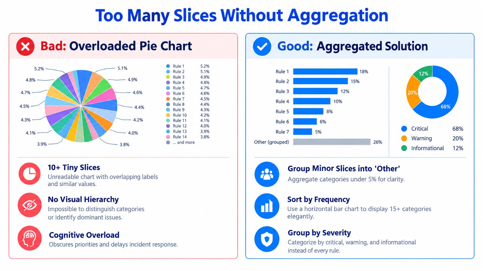
In data quality and observability dashboards, this failure appears when every rule failure, late job, schema event, or anomaly type gets its own wedge. The result looks complete because every category is present, but the chart no longer supports the operational question behind the dashboard. Which issue family is driving risk, and where should the team start remediation?
The decision cost is prioritization error. Thin wedges are hard to compare, labels collide, and the reader has to bounce between slice, color, and legend before making a judgment. Guidance on visualization design notes that pie charts break down when they contain many slices, depend on legends, or force labels into small segments. It also treats a large “other” bucket or heavy color use as a sign that the chart should be reconsidered (guidance on pie chart breakdown and design overload).
A common observability example is incident volume by rule ID. If the chart shows 18 failed rules as 18 slices, the team can see that many things are wrong, but not which class of failure is consuming remediation time. Group the same events into completeness, freshness, validity, schema, and access issues, and a different picture appears. Now the chart supports staffing, escalation, and root-cause review.
Better replacement
Use a sorted bar chart when the job is ranking. Use a donut only when the message is a simple part-to-whole summary and the number of categories stays small after aggregation.
This is also a data-quality issue, not only a design issue. Too many slices often signal that the taxonomy is too granular for the decision surface. If categories are defined at the event level instead of the action level, the dashboard reflects raw logging structure rather than operational meaning.
Practical rule: If the question is “what do we fix first,” use bars. If the question is “how is this whole divided,” reduce categories until the breakdown is immediately readable.
Group by remediation path: Roll up individual failures into categories such as completeness, freshness, validity, and schema.
Collapse only the true long tail: Use “Other” for categories that are low-impact, not for issues that still compete for engineering time.
Split views by monitoring objective: Show timeliness, schema change, and anomaly patterns in separate charts rather than forcing one pie to carry multiple questions.
Define the distribution before charting it: Teams that need a clearer framework can use this guide on how to describe distribution of data.
2. 3D Effects and Perspective Distortion
A 3D pie chart does not add information. It changes perceived magnitude.
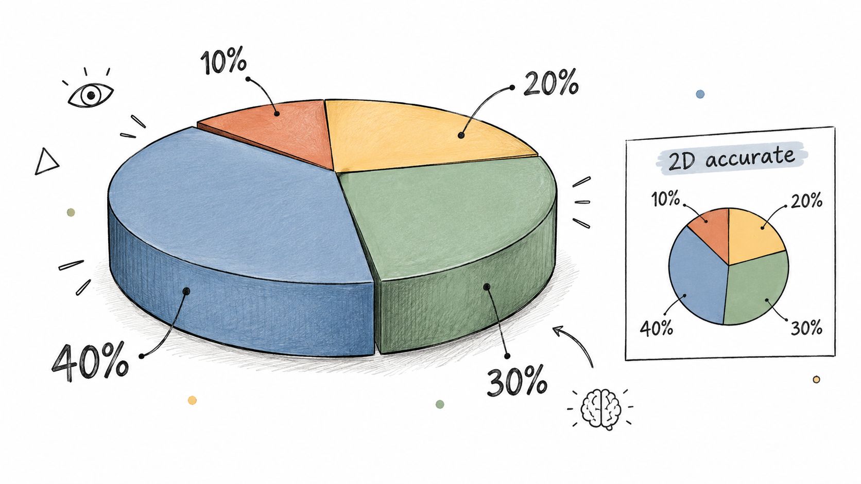
In observability work, that visual bias becomes an operational bias. A front-facing slice can look dominant even if it represents a smaller share of failed jobs, delayed pipelines, or environment-specific incidents. An incident manager scanning the chart may escalate the wrong queue first. A platform team may assign engineers to the category with the strongest visual presence rather than the largest operational cost.
The failure is easy to miss because the chart still looks polished. Yet the decision task in this setting is not decoration. It is comparison under time pressure. Tilted geometry interferes with that task by making area and angle harder to judge, especially when categories are close in size.
Research on chart-reading supports that concern. A 2019 experiment found that pie charts were slower and less accurate than stacked bar charts for comparison tasks, especially when category differences were small (controlled experiment on the cost of pie charts). A 3D effect adds another layer of estimation error to a chart type that already performs poorly for precise comparisons.
A better question is: what decision should the chart support?
If the team needs to compare incident volume across regions, services, or failure classes, use a sorted bar chart. If the team needs a quick composition snapshot for an executive readout, a flat donut can work, but only when the category count stays low and labels are direct. In both cases, the geometry stays honest, which means the remediation conversation starts from the actual distribution rather than a distorted one.
What to change in practice
Turn off 3D by default: Disable perspective and tilt settings in Excel, Power BI, Tableau, or the chart library used in internal dashboards.
Match the chart to the action: Use bars for prioritization, ranking, and cross-team comparison.
Use emphasis that preserves scale: Highlight with ordering, annotation, or selective color, not depth effects.
Audit old dashboards: Review executive and on-call views for legacy 3D pies, especially where teams use them to allocate investigation time or escalation effort.
3D styling usually signals a deeper reporting problem. The dashboard is optimizing for visual novelty while the operator needs measurement accuracy. In data-quality and observability workflows, that tradeoff is expensive because small perception errors can shift triage order, delay root-cause analysis, and weaken confidence in the dashboard itself.
3. Insufficient Contrast and Poor Color Choice
A pie chart can be numerically correct and still fail the decision it was supposed to support.
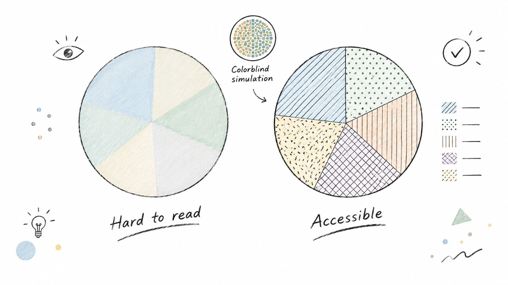
Consider an incident review where a dashboard splits data-quality failures into categories such as missing values, schema drift, freshness delays, and duplicate records. If two adjacent slices share similar saturation or luminance, the chart stops being a summary and becomes a visual inspection task. Under time pressure, that changes behavior. Teams spend effort decoding the display instead of deciding which failure mode needs remediation first.
The problem is not limited to aesthetics or accessibility checklists. In observability work, color often carries operational meaning such as severity, status, or ownership. A low-contrast pie chart removes that signal at the point where an analyst, engineer, or product manager is trying to separate background noise from a real service issue. Small slices are hit twice. Pie geometry already makes them harder to compare, and weak color contrast makes them easier to miss.
Color-only encoding also breaks handoffs. A stakeholder may remember that "the green slice looked bigger" without retaining which category green represented, especially in exported reports or screenshots. That weakens prioritization in exactly the settings where teams need shared interpretation across functions.
A better replacement depends on the task. If the goal is category ranking, use a sorted bar chart with direct labels and a restrained palette. If the goal is a compact composition snapshot, keep the pie or donut only when category count is low, labels sit on the marks, and contrast remains readable for color-vision deficiencies. Teams that rely on visual data inspection to improve product quality need charts that reduce interpretation error, not charts that add it.
Use a simple review standard before publishing:
Check grayscale readability, not just full-color appearance.
Use palettes with clear luminance separation, such as Okabe-Ito or Viridis.
Add a second identifier for important categories, such as direct labels or patterns.
Test the exported version, because slides and PDFs often reduce contrast further.
Poor color choice in a pie chart is a reporting error with downstream cost. It can hide a rising failure class, slow triage, and send remediation effort toward the wrong problem.
4. Missing or Misleading Labels and Legends
A pie chart can survive a small category count. It fails much faster when the viewer cannot identify what each slice represents, how large the incident set is, or what time window the chart covers.
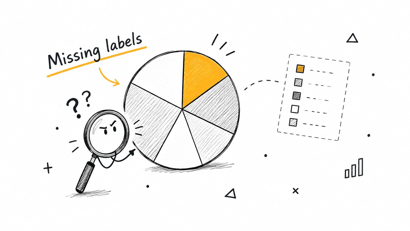
Consider a dashboard used during a data-quality incident. The pie shows one large wedge and several smaller ones, with a legend pushed to the side and labels truncated in the export. An incident manager now has to decode colors, guess category names, and ask for the total count before deciding whether to escalate schema drift, null spikes, or delayed loads. The chart has already failed its job. It added interpretation work at the exact moment the team needed prioritization.
The denominator matters as much as the category names. A slice labeled 40% means very different things if it reflects 4 failed records, 400 failed checks, or 40% of all production tables over the last day. Without the total and the time period, a pie chart cannot support triage, capacity planning, or post-incident review.
Task-based guidance on chart choice makes the limit clear. Pie and donut charts can work for simple part-to-whole reading when the slice count is low and the message is categorical rather than precise, as noted in this assessment of when pie and donut charts are acceptable. Remove direct labels or context, and even that narrow use case breaks down.
A practical review standard helps:
Put the category name on or immediately beside the slice.
Add the total incident count and reporting window in the title or subtitle.
Use callouts for small slices instead of relying on an offset legend.
Replace the pie with a sorted bar chart if labels no longer fit cleanly.
Check the exported PDF or slide version, because observability reviews often happen outside the live dashboard.
For teams building operational reporting, labeling is part of chart design, not finishing polish. This guide on how to build data quality dashboards that actually work is useful because it ties chart structure to remediation workflows rather than decoration.
The practical replacement is usually simple. If the goal is remediation priority, use a sorted bar chart with direct labels, counts, and percentages. If the goal is a compact composition snapshot, keep the pie only when every slice can be named directly and the total remains visible without legend-hunting.
5. Comparing Multiple Pie Charts Side-by-Side
Side-by-side pie charts look like comparison, but they weaken comparison at the exact moment a team needs a decision.
The failure is easy to spot in observability and data-quality reporting. A dashboard shows one pie for this week's validation failures and another for last week's, or one pie each for production, staging, and development. The intended question is operational: where did reliability worsen, and which issue should be fixed first? Separate circles make that question harder to answer because readers must compare angles, arc lengths, and areas across different shapes instead of reading against one shared baseline.
The visual problem becomes a prioritization problem
The Office for National Statistics notes that pie charts are poor for comparison because they do not share a common axis or reference point, and angle-only judgments perform worst while arc length carries important information (ONS analysis of pie chart perception and comparison limits). In practice, that means a team can sense movement without identifying it precisely enough to act.
A reliability lead reviewing incident categories across two pies may conclude that schema failures "look bigger" this week. That still leaves open the questions that matter for remediation: Did schema failures increase in count, rise as a share because another category fell, or stay flat while total incidents dropped? If the chart cannot separate those cases, the review meeting shifts from diagnosis to interpretation.
That ambiguity has operational cost. Teams can mis-rank backlog items, spend time debating whether a pipeline regressed, or miss a small but meaningful increase in a high-severity category because it does not stand out visually.
Use chart types that preserve the decision task
Choose the replacement based on the question.
For trend: use a line chart to show incident counts, failed checks, or delayed loads over time.
For composition across periods or environments: use stacked bars so every category sits on a shared baseline.
For category-by-category comparison: use grouped bars when absolute differences matter more than proportional share.
For mixed operational reviews: separate count and share into two charts if one view cannot carry both cleanly.
This matters in BI implementation as much as in design. BI developer tools for reporting workflows are useful when they make trend, comparison, and drill-down views easier to build than decorative pies.
A good replacement reduces discussion time and improves remediation quality. The team can see whether null-value errors increased, whether one environment is an outlier, and whether the shift is large enough to justify escalation. That is the standard to use. If a chart makes change harder to verify, it is not a summary. It is friction in the decision process.
6. Pie Charts for Composition When Part-to-Whole Relationship Is Unclear
A pie chart can be clean, labeled, and still be wrong for the decision.
The failure happens when teams force unrelated metrics into a part-to-whole display. In observability and data-quality reviews, that often means putting validation failure rate, timeliness delay, and schema change frequency into one circle because they share dashboard space. Those measures do not divide one total. They use different units, answer different questions, and point to different remediation paths.
That design error changes the meeting. Reviewers stop asking, “Which issue got worse?” and start asking, “Which slice is largest?” The chart pushes the team toward ranking unlike measures against each other, even though a rise in delay hours and a rise in failed checks may require separate owners, separate thresholds, and separate escalation rules.
Research on part-to-whole estimation helps clarify the boundary. A study on proportion judgments found that pie charts can perform well when viewers estimate shares of a real whole, especially when visual anchors are available (experiment on part-to-whole estimation and visual anchors). That evidence supports pie charts in the narrow case they were built for. It does not justify using them to combine independent operational metrics into a synthetic composition.
Check the data model before you pick the chart
Ask a stricter question than “Does this fit on one card?” Ask whether every category partitions the same denominator.
If the answer is no, the pie chart is encoding a relationship that does not exist.
Use replacements that match the operational task:
Independent KPIs: show separate cards or compact tables for rates, counts, and delays.
Shared denominator: use bars only when categories split one total, such as incident volume by root cause.
Remediation tracking: use lines or bars when the question is change, backlog growth, or owner-specific concentration.
Reporting workflows: data quality reporting is more reliable when completeness, freshness, accuracy, and schema stability remain separate measures with their own thresholds.
The practical test is simple. If a chart makes unlike metrics look interchangeable, it will distort prioritization. If it preserves units and ownership, it supports faster, more defensible decisions.
7. Exploded Slices Without Logical Hierarchy
Exploded slices look analytical, but they often encode no decision rule at all. In an operations dashboard, that is not a style issue. It is a prioritization failure.
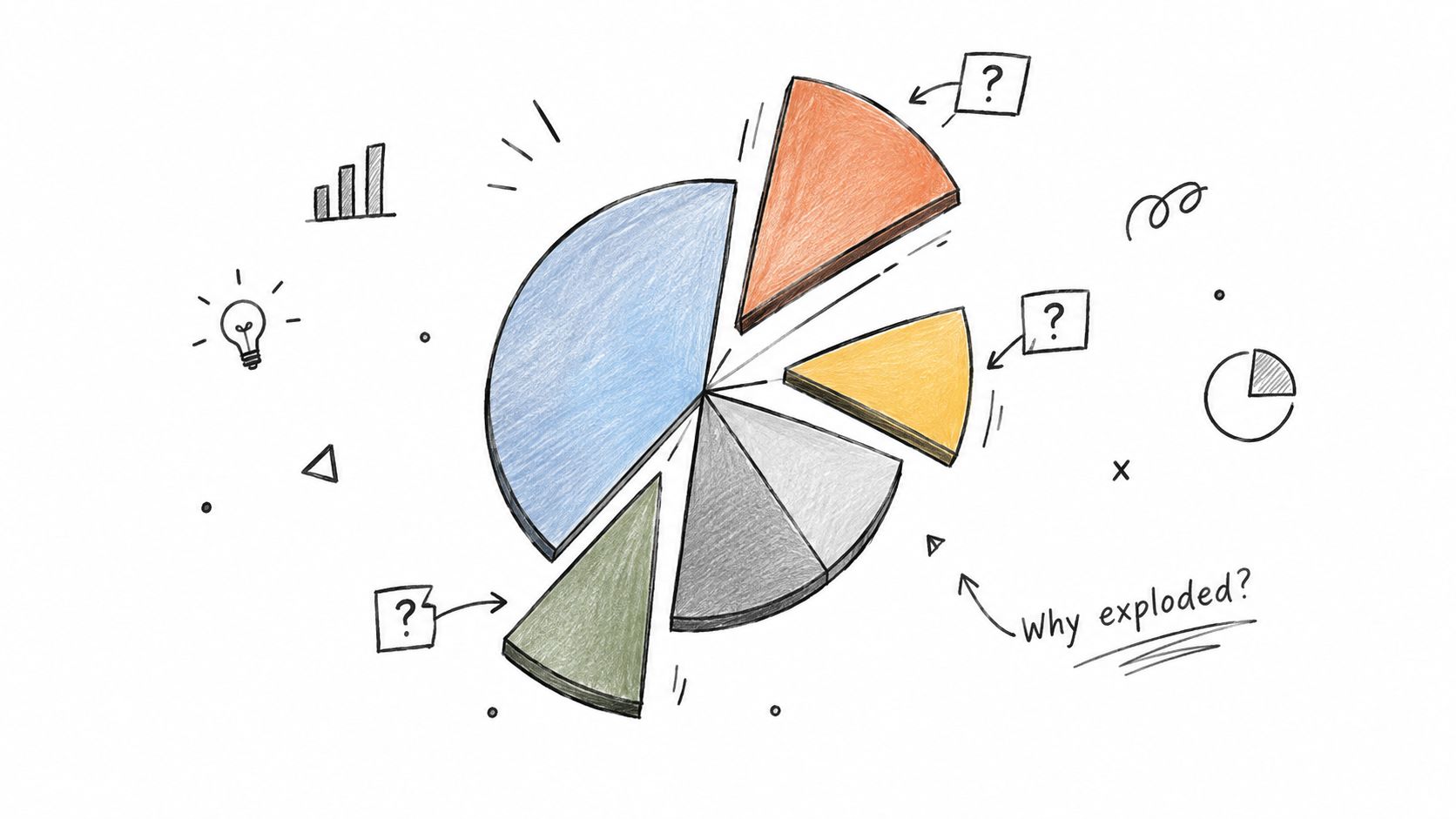
Consider a data-quality review where one wedge is pulled outward for "schema changes." If that slice is detached because it looked crowded, viewers can still read it as the top risk, the current incident, or the team that needs attention first. The chart has added a second signal beyond slice size, but without defining what that signal means.
That ambiguity matters in observability work. Teams use dashboards to decide what to triage, who owns remediation, and which issue types deserve escalation. An exploded slice can pull attention toward a category that is neither the largest nor the most severe. Small categories then get over-inspected, while high-volume failures such as freshness gaps or null spikes stay in the background.
Use emphasis only when the hierarchy is explicit
Pie charts already make fine-grained comparisons harder than ranked position or aligned length. A review of chart-perception research in dissertation work found weaker performance for comparison tasks in pie-based displays than in simpler alternatives such as bars (summary of chart accuracy by task in dissertation research). Adding detachment increases salience without improving measurement, so the visual emphasis can outweigh the actual order of operational importance.
The practical standard is simple. If a slice is exploded, the dashboard should state the rule in plain language.
Good rules include:
highest incident count
highest estimated business impact
breach of an SLA or error-budget threshold
category currently assigned for immediate remediation
If no rule exists, remove the effect.
Better replacements for operational dashboards
Use the chart that matches the decision:
Need priority order: use a sorted bar chart by incident volume, affected assets, or estimated impact.
Need urgent action: keep the composition view flat and place critical categories in a separate incident queue or alert panel.
Need ownership clarity: use a table with category, severity, owner, and status.
Need change over time: use a line or stacked bar chart so recurrence and drift are visible.
A pie chart can summarize share. It should not invent hierarchy. In data-quality and observability workflows, unexplained emphasis turns decoration into false priority, and false priority slows remediation.
Comparison of 7 Common Pie Chart Pitfalls
Title | Implementation Complexity 🔄 | Resource Requirements ⚡ | Expected Outcomes 📊⭐ | Ideal Use Cases 💡 | Key Advantages ⭐ |
|---|---|---|---|---|---|
Too Many Slices Without Aggregation | 🔄 Low–Moderate, simple to build, needs aggregation logic | ⚡ Low, standard charting; minor data grouping required | 📊 Chart becomes illegible; obscures priorities; delays triage | 💡 Use only for ≤5–7 categories or after grouping minor items into "Other" | ⭐ Easy to create but low diagnostic value unless aggregated |
3D Effects and Perspective Distortion | 🔄 Moderate, requires 3D rendering/settings | ⚡ Low, no extra data work but visual tuning needed | 📊 Distorts proportions; introduces perspective bias; misleads decisions | 💡 Avoid in analytical dashboards; only decorative in non‑decision contexts | ⭐ Visual flair only; no accuracy benefit (avoid for observability) |
Insufficient Contrast and Poor Color Choice | 🔄 Low, design/palette decision | ⚡ Moderate, requires accessible palettes and testing tools | 📊 Reduces legibility; excludes color‑blind users; increases errors | 💡 Use colorblind‑friendly palettes, contrast checks, or patterns | ⭐ Improves accessibility and speed of interpretation when corrected |
Missing or Misleading Labels and Legends | 🔄 Low, labeling and metadata placement | ⚡ Low, add labels/units and adjust layout | 📊 Creates ambiguity; forces legend lookups; increases cognitive load | 💡 Label slices ≥5% directly; include totals, units, and clear legends | ⭐ Greatly improves self‑contained readability and trustworthiness |
Comparing Multiple Pie Charts Side-by-Side | 🔄 Moderate, multiple visuals and alignment issues | ⚡ Moderate, better served by time‑series or grouped charts | 📊 Poor cross‑chart comparison; high error rate in interpreting trends | 💡 Replace with line, stacked, or grouped bar charts for comparisons | ⭐ Useful only for isolated snapshots; weak for trend analysis |
Pie Charts for Composition When Part-to-Whole Is Unclear | 🔄 Low, misapplication rather than technical complexity | ⚡ Low, requires choosing appropriate visual types | 📊 Misrepresents relationships; implies false competition among metrics | 💡 Use pie only when parts sum to a meaningful whole; otherwise separate charts | ⭐ None as composition tool; other chart types convey true meaning better |
Exploded Slices Without Logical Hierarchy | 🔄 Low, simple visual tweak but requires justification | ⚡ Low, no extra data processing, just styling | 📊 Implies unjustified importance; disrupts proportion comparison | 💡 Only explode when justified (e.g., top item) and document rationale | ⭐ Can draw attention if data‑driven; otherwise misleading and avoidable |
Turn Every Chart Into a Clear Decision
The fix for bad pie charts isn't “ban circles forever.” It's matching the display to the decision. Aggregate when categories proliferate. Keep styling flat and accessible. Label the denominator and period. Move to bars when the task is ranking or comparing categories. Move to lines when the task is change over time. Reject the pie outright when the data doesn't describe a meaningful whole.
That replacement logic matters most in observability and data quality work because the user isn't admiring the dashboard. They're deciding what to investigate, who to notify, and what to remediate first. A chart that makes those steps slower is an operational failure even if the numbers behind it are correct.
A useful pre-publication screen is short:
Data structure: Do the categories form one real whole?
Readability: Can someone identify every important slice without hunting through a legend?
Accessibility: Will the chart still work with weak contrast or colorblind viewing conditions?
Comparison task: Are you asking the viewer to rank, compare across periods, or compare across environments? If yes, use bars or lines instead.
Intended action: Can the viewer tell what to do next from the chart alone?
More recent work on pie charts is less absolute than the old internet cliché. A case study with over 300 participants found that pie charts didn't significantly change high-level decision outcomes versus bar charts for faculty-profile judgments, though they did affect impressions with a small effect size (case study on pie charts, impressions, and decision outcomes). That's a useful reminder. The risk of bad pie charts often isn't dramatic catastrophe. It's steady friction, softer judgment, and weaker prioritization.
For data teams, that's enough reason to be strict. Keep anomaly, timeliness, validation, and schema concerns separate unless they compose one whole. If you use a platform like digna, that modular separation already fits the way the work gets done. The chart should reinforce that structure, not blur it. For broader dashboard design thinking, The Social Search dashboard guide is a good companion read.
digna provides an enterprise data quality and data observability platform that runs inside your own environment, with modules for anomalies, timeliness, validation, schema tracking, and business or platform monitoring. That modular structure makes it easier to choose charts that support remediation instead of forcing unrelated signals into one misleading view. If you're reworking monitoring dashboards around clearer decisions, visit digna.
The same discipline applies one level up: a chart can only be as clear as the numbers behind it, which is what data quality dashboards are built to expose.
Frequently asked questions
When is a pie chart actually defensible?
When it shows meaningful parts of a clear whole, has very few slices, and the reader only needs a simple part-to-whole impression. Outside those conditions it tends to make a dashboard look finished while making the underlying decision harder.
Why are too many slices a problem?
Because the eye cannot rank similar angles reliably, so a chart with a dozen slices communicates “many things exist” rather than which ones matter. Aggregating the tail into a single grouped category, or switching to a sorted bar chart, restores the comparison the reader actually needs.
What's wrong with 3D pie charts?
Perspective distortion changes the apparent size of slices independently of their values — slices at the front read larger than identical slices at the back. The decoration actively misinforms, which is different from merely being unnecessary.
Why shouldn't you compare pie charts side by side?
Because the visual problem becomes a prioritization problem. Comparing angles across separate circles is far harder than comparing lengths on a shared axis, so readers cannot tell which category moved most. Chart types that preserve the decision task, like grouped or stacked bars, work better.
When do exploded slices help?
Only when the hierarchy is explicit — when one slice genuinely is the subject and the rest are context. Pulling slices out arbitrarily signals emphasis the data does not support, and on operational dashboards a plain sorted bar usually replaces the whole thing.