How to Describe Distribution of Data: A Practical Guide
|
7
min read
A pipeline ran clean all week. The row counts looked normal, freshness checks passed, and no one got paged. Then Monday's dashboard showed nonsense. Revenue by region flipped shape, an ML feature started clustering around a new peak, and latency alerts arrived too late to help. Nothing “broke” in the obvious sense. The data distribution changed.
That's the situation many teams are in when they search for how to describe distribution of data. They don't need a classroom definition. They need a way to explain what changed, why it matters, and how to tell normal variation from the kind of shift that subtly poisons downstream systems.
Table of Contents
Why Describing Data Distribution Is Critical for Data Quality
Applying Distribution Analysis for Continuous Data Monitoring
Why Describing Data Distribution Is Critical for Data Quality
Most data incidents don't start with a dramatic failure. They start with a quiet behavioral change in the data. A feature that used to be unimodal becomes bimodal. A metric that was tightly clustered develops a long right tail. A source system changes types or defaults, and the downstream table still loads, but the meaning of the data has shifted.
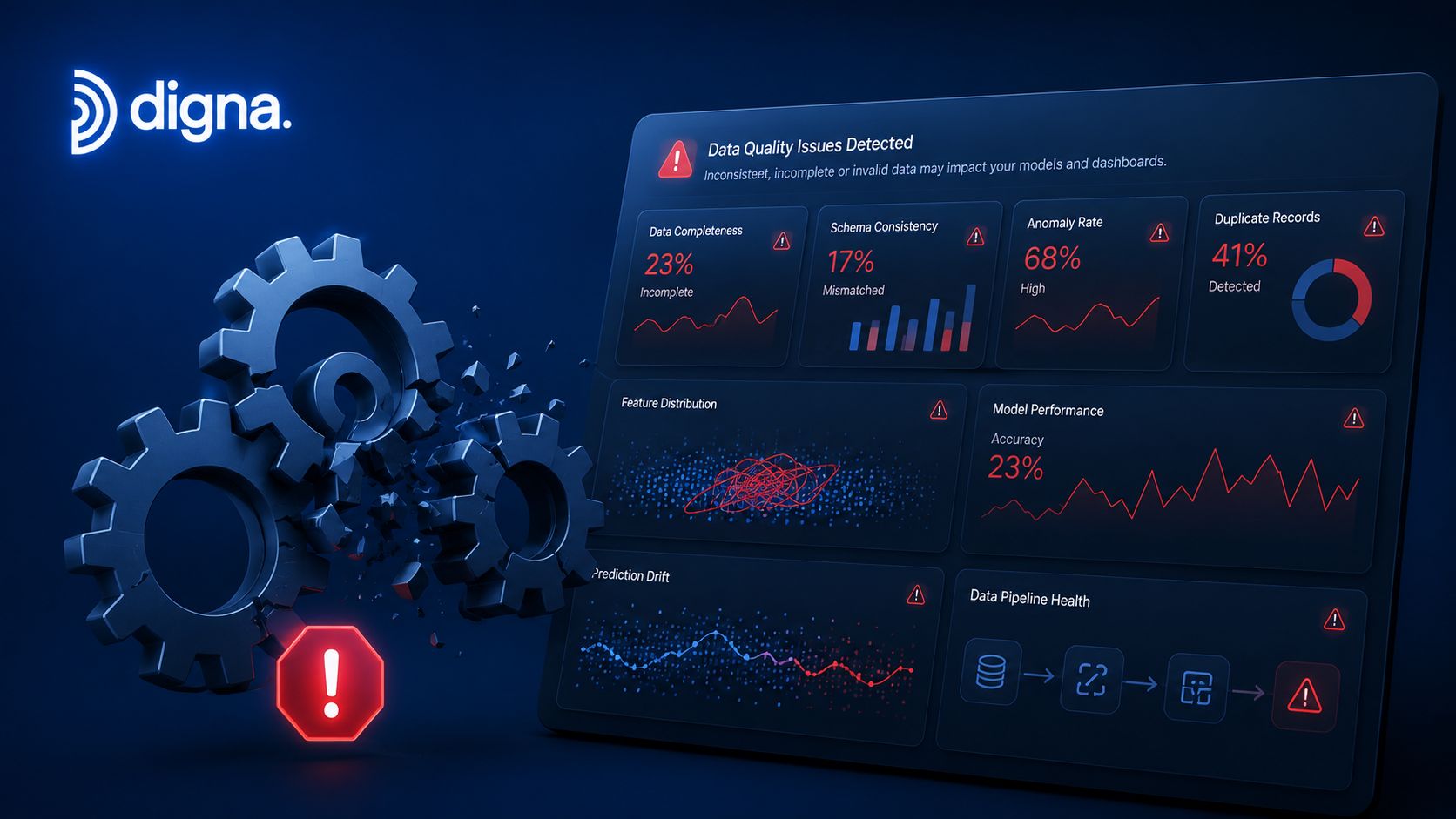
That's why distribution analysis sits at the center of data quality work. It gives teams a vocabulary for saying more than “the numbers look off.” You can say the center moved, spread widened, outliers appeared, or the shape changed from what the pipeline usually produces. Those are operational statements. Engineers can investigate them.
A lot of tutorials miss this operational angle. Existing content overwhelmingly treats describing data distribution as a static, single-dataset exercise, yet fails to address how to describe distributions in time-series observability contexts where the core challenge is detecting shifts. Recent industry pain points in data quality show that 73% of data failures stem from silent schema or distribution drift that static summaries miss (Study.com overview of distribution description).
Practical rule: If your description of a dataset doesn't help someone compare today against yesterday's baseline, it isn't enough for production monitoring.
Teams often discover this the hard way in metrics that looked healthy in isolation. A normalized field can still drift after a source-side change, which is why cleanup and standardization should sit upstream of distribution checks. If you need a quick refresher on that preparation step, a practical guide to data normalization is useful context before you interpret any distribution.
Three examples show why this matters in practice:
Dashboard reliability: A KPI table can keep loading while category mix shifts underneath it.
ML feature stability: A model can receive valid records whose feature distributions no longer match training behavior.
Pipeline operations: Timeliness, row counts, null rates, and value ranges can all drift without triggering a schema error.
For teams building monitoring, this is the difference between static validation and observability. Static checks answer whether the data conforms to a rule. Distribution analysis answers whether the data still behaves like the process that produced it last week. That's the more useful question in live systems, especially when you're defining data quality metrics that need to stay meaningful as pipelines evolve.
The Four Pillars of Describing a Distribution
If you want a reliable way to describe distribution of data, start with SOCS. The acronym stands for Shape, Outliers, Center, and Spread. It's still the most practical framework because it forces you to describe a dataset completely instead of jumping straight to one favorite metric.

The core rule is simple. The foundational framework for describing data distribution relies on four components: Shape, Outliers, Center, and Spread (SOCS). For skewed data, the median is used to represent the center, while the interquartile range (IQR) quantifies spread, as the mean and standard deviation can be misleading (Albert guide on describing distributions).
Shape tells you how the process behaves
Shape is the pattern of the distribution. Is it symmetric or skewed? Does it have one peak, two peaks, many peaks, or no clear peak? That matters because shape often reveals the actual operating condition of a system.
A single peak often suggests one stable process. Two peaks can suggest two populations mixed together, such as weekday and weekend traffic, mobile and web users, or two source systems writing into one table. A long right tail often appears in latency, transaction size, and operational duration data.
When the distribution is positively skewed, the mean exceeds the median. When it is negatively skewed, the mean is lower than the median. That one detail changes how you summarize the data and how you explain “normal.”
Outliers tell you where to investigate
Outliers are observations that sit far from the main mass of the data. Sometimes they're bad records. Sometimes they're the only evidence you have that a pipeline degraded, a partner changed behavior, or a fraud pattern appeared.
Don't treat outliers as automatic noise. In production systems, they're often the first clue.
A useful distribution description doesn't stop at “there are outliers.” It asks whether they are expected tail events, data errors, or signals of a changed process.
A good habit is to record both the existence of outliers and their context. Did they appear suddenly? Are they concentrated in one partition, one tenant, one source feed, or one hour of the day?
Center and spread tell you what is typical and what is stable
Center answers one question: what is a typical value here? Spread answers another: how much does this process vary?
For center, the usual choices are mean, median, and mode:
Mean: best when the data is symmetric and not distorted by extreme values.
Median: better when the data is skewed, because it resists tail distortion.
Mode: useful when the most common value itself is meaningful.
For spread, the common choices are range, IQR, and standard deviation:
Range: quick to compute, rough to interpret.
IQR: strong for skewed data because it focuses on the middle half.
Standard deviation: useful when the data is close to normal and you care about dispersion around the mean.
The choice isn't academic. It changes alert quality. If you summarize skewed latency with mean and standard deviation, you can hide the behavior operators value. Median and IQR usually describe it more accurately.
Choosing the Right Measure Central Tendency vs. Spread
Measure Type | Statistic | Best for This Distribution | Why It's a Good Fit |
|---|---|---|---|
Central Tendency | Mean | Symmetric or approximately normal data | It uses all values and works well when tails are balanced |
Central Tendency | Median | Skewed data | It resists extreme values and better reflects the typical observation |
Central Tendency | Mode | Repeated or frequency-driven patterns | It shows the most common observed value |
Spread | Range | Quick rough inspection | It shows the full span from minimum to maximum |
Spread | IQR | Skewed data | It captures the middle 50% without being dominated by tails |
Spread | Standard deviation | Symmetric or approximately normal data | It measures average distance from the mean and supports normal-based rules |
If you need a compact checklist, use this:
Describe shape first: Don't choose summary statistics before you know whether the data is symmetric or skewed.
Use median for skew: It usually represents “typical” better than mean when tails are long.
Use IQR when tails are messy: It's harder for outliers to distort.
Keep center and spread paired: Mean goes with standard deviation. Median goes with IQR.
Choosing the Right Visualization to See the Story
The fastest way to misunderstand a distribution is to look at the wrong chart. Teams often default to one view for everything, usually a histogram with whatever default settings the tool provides. That's convenient, but it hides important differences between “show me the shape” and “show me the shift.”
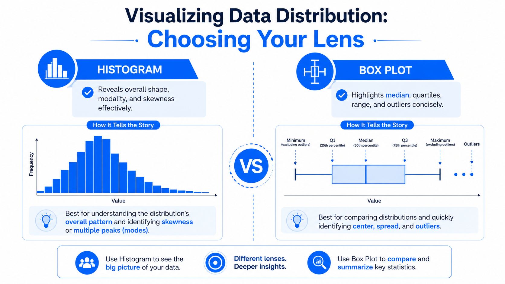
The better approach is to match the chart to the question. For comparing multiple distributions, box plots are superior for depicting differences in spread and identifying extreme values. A common statistical pitfall is misapplying histogram bin widths; the optimal width must be selected experimentally to best communicate the distribution's shape, as improper binning can mask important patterns (Virginia Tech Pressbooks chapter on quantitative distributions).
Histograms show structure, but binning can lie
Histograms are still the workhorse for seeing shape. They're good at revealing skewness, modality, and rough density. If you need to tell whether a process is unimodal or whether two populations have merged into one metric, start here.
But bin width can completely change the story. Too few bins can flatten a bimodal pattern into one hump. Too many bins can make random noise look like meaningful structure. In operational analysis, that leads to bad conclusions fast.
A practical workflow for histograms:
Start with a default view: Get a rough read on symmetry, tails, and peaks.
Adjust the bins manually: See whether the apparent pattern survives different widths.
Compare against a baseline histogram: Current batch versus recent historical data is often more useful than a single chart.
Check sample size context: Sparse data often looks more jagged than it really is.
Box plots are better for comparisons
If the question is “How does today compare with the baseline?” use a box plot. It compresses the distribution into quartiles, median, spread, and likely outliers. It's efficient, especially when you need side-by-side comparisons across tables, partitions, source systems, or time windows.
Box plots are more actionable than histograms in routine monitoring because they support fast scanning:
Median shift: The center moved.
Box expansion: Variability increased.
Whisker stretch: Tails widened.
Isolated points: Extreme values appeared.
When teams compare current versus historical distributions, box plots usually surface the operational difference faster than histograms.
They also scale better when you're comparing many groups. Five histograms in a row are hard to read. Five box plots are easy to scan.
Violin and density views add nuance
Histograms and box plots cover most monitoring cases, but there are times when you need more detail about the shape itself. That's where violin plots and density overlays help.
A violin plot is useful when you want the compact comparison of a box plot but also want to see whether the data has multiple peaks or heavy tails. Kernel density estimates can make modality clearer than a coarse histogram, especially when the dataset is large enough to support smoothing.
Use these carefully:
Choose violin plots when comparing several distributions with possible multimodal behavior.
Use density overlays when you want to compare baseline and current shape directly.
Avoid over-smoothing because it can erase meaningful peaks.
For production monitoring, one chart rarely does the whole job. The practical combination is a histogram for raw shape, a box plot for comparison, and a density or violin view when you suspect hidden structure.
Validating Distribution Assumptions with Statistical Tests
Visual inspection is necessary, but it isn't enough. Two analysts can look at the same histogram and disagree about whether the data is close enough to normal, whether the tail is meaningful, or whether the fit is acceptable for the method they want to use. That's where statistical tests help. They force a decision rule.
Visual checks are necessary but not enough
Start with charts. They help you spot shape problems fast, and they catch things a test can hide, like obvious multimodality or isolated spikes caused by a broken upstream job. But once you move from “describe this data” to “build a threshold, control chart, or model on top of it,” you need quantitative validation.
The practical pattern is to combine visual assessment with a formal goodness-of-fit check. To quantitatively validate a distribution, combine visual assessment with goodness-of-fit statistics like the Anderson-Darling test. A low p-value from this test indicates the assumption that data fits the specified distribution is incorrect, forcing a re-evaluation of the model (SPC for Excel on deciding which distribution fits your data).
If you work in spreadsheet-heavy environments before moving logic into a warehouse or notebook workflow, Breaker's Excel analysis guide is a practical bridge for teams that still validate assumptions in Excel.
Use tests to challenge your assumption
Two tests matter a lot in everyday practice.
Shapiro-Wilk is the standard check for normality when you want to know whether a sample likely comes from a normal distribution. It's a useful gate before you apply methods that assume bell-curve behavior.
Anderson-Darling is stronger when you want to assess fit against a specified distribution and care about tail behavior. That makes it relevant in quality monitoring, where tails often contain the incidents.
A plain-English way to treat the p-value is this: if the p-value is low, the data is not supporting your assumption strongly enough. You should stop forcing the model and choose a better description.
Here's what works in practice:
Use charts first: Histograms, box plots, and probability-style comparisons catch obvious issues.
Use Shapiro-Wilk for normality: Good when your main question is “Can I treat this as normal?”
Use Anderson-Darling for fit: Better when distribution choice drives thresholds or alert logic.
Revisit the summary statistics: If normality fails, median and IQR often become the safer pair.
Statistical testing shouldn't replace judgment. It should stop teams from pretending a convenient assumption is a valid one.
One more trade-off matters. A dataset can fail a formal normality test and still be good enough for some practical uses. The right question isn't “Is this perfectly normal?” It's “Is this distribution close enough to support the threshold or model I'm about to deploy?” That's a production question, not a classroom one.
How to Identify and Interpret Outliers and Skewness
Outliers and skewness are where many monitoring strategies go wrong. Teams know they should watch for anomalies, but they apply one rule everywhere. That usually means they use standard deviation on data that was never close to normal.

Read skewness before you pick a summary statistic
Skewness tells you which side of the distribution has the longer tail. In practice, right-skewed data is common in transaction values, job runtimes, API latency, and many operational metrics. A small number of very large values stretch the distribution.
That matters because averages can become misleading. In right-skewed data, the mean gets pulled upward. In left-skewed data, it gets pulled downward. The median usually holds up better as a description of what's typical.
A quick interpretation guide:
Right skew: Long tail on the high side. Mean is above median.
Left skew: Long tail on the low side. Mean is below median.
Near symmetry: Mean and median are often close enough to tell a similar story.
Choose the outlier rule that matches the data
The effective method for skewed data is the IQR rule. The interquartile range (IQR) is specifically used to identify outliers in skewed distributions where standard deviation is unreliable; outliers are typically defined as values falling below Q1 - 1.5×IQR or above Q3 + 1.5×IQR. This method is more appropriate than the empirical rule (68-95-99.7) which assumes a normal distribution (PMC article on distribution description and outlier detection).
Use the IQR rule when:
The data is skewed: Tails aren't balanced, so standard deviation can mislead.
You expect occasional extreme values: The middle half gives a more stable reference point.
You care about reliable alerting: It reduces false positives caused by tail-heavy data.
The better-known alternative is the 3-sigma rule, which fits normal data. In monitoring, that means flagging values beyond three standard deviations from the expected center. It's useful, but only when the bell-curve assumption is defensible.
Don't ask whether an outlier is “real” before you ask whether your outlier rule matches the shape of the data.
In live systems, interpretation matters as much as detection. An outlier can mean a malformed record, a rare but legitimate business event, or the start of a broader drift. That's why anomaly work should connect distribution logic with root-cause workflows. Teams that need that operational layer usually end up building or using tools focused on data anomalies, not just static descriptive reports.
Applying Distribution Analysis for Continuous Data Monitoring
Describing one dataset is useful. Describing how a distribution changes over time is what keeps pipelines trustworthy.
In production, the question isn't “What is the center and spread of this column?” It's “Did the center move this morning, did spread widen this week, and did the shape break compared with the learned baseline?” That shift in mindset turns descriptive statistics into observability signals.
Turn descriptive statistics into monitoring signals
The practical way to operationalize distribution analysis is to track summary behavior over time. Instead of one histogram, keep a time series of metrics such as center, spread, counts, and selected quantiles. That lets you detect shifts instead of just describing snapshots.
For normally behaved metrics, one common rule is straightforward. In time-series data monitoring, a common rule is to flag values exceeding 3 standard deviations (±3σ) from the moving average. This captures approximately 99.7% of normal data points under a Gaussian distribution, making deviations beyond this range statistically significant outliers that signal an anomaly (digna overview of anomaly monitoring).
That works well for metrics that are close to Gaussian. It works poorly when the metric is skewed, sparse, or multimodal. In those cases, resilient summaries and distribution-aware baselines perform better than one generic threshold.
Baseline first, then alerting
The strong pattern for continuous monitoring looks like this:
Learn the baseline: Understand what normal variability looks like for each metric and table.
Track drift over time: Watch changes in center, spread, shape, and count behavior.
Apply the right rule: Use normal-based thresholds only where the fit makes sense.
Review changes in context: Partition, source system, ingestion window, and schema history all matter.
At this stage, static distribution analysis grows into a monitoring discipline. The same ideas behind SOCS still apply, but now they're repeated continuously across batches, streams, and business cycles. You're not just describing data anymore. You're describing the health of the process that produces it.
If you want to move from one-off analysis to continuous monitoring, digna - own website is built for that operational layer. It helps teams detect distribution shifts, anomalies, schema changes, and timeliness issues inside their own environment, so they can investigate data behavior before broken dashboards, stale reports, or unstable models force the issue.
Frequently asked questions
How do you describe the distribution of a dataset?
Describe four things: shape, which shows how the process behaves; centre, which shows what is typical; spread, which shows how stable it is; and outliers, which show where to investigate. Reporting only a mean discards three of the four.
When should you use the median instead of the mean?
Use the median when the distribution is skewed or contains extreme values, because the mean is pulled toward them. Revenue per customer and response times are classic cases where the mean describes a customer that does not exist.
Which visualisation is best for showing a distribution?
Histograms reveal structure but the chosen bin width can hide or invent modes, so vary it before trusting the shape. Box plots are better for comparing groups. Violin and density plots add nuance where the distribution is multimodal and a box plot would flatten it.
Why does distribution monitoring matter for data quality?
Because a pipeline can pass every row-level check while its distribution quietly changes. Row counts look normal and freshness passes, yet revenue by region flips shape because an upstream category was remapped. Only distribution monitoring catches that class of failure.
What is the difference between an outlier and a distribution shift?
An outlier is a single value far from the rest and may be legitimate. A distribution shift is a change in the overall pattern, where individual values still look plausible. Outliers warrant inspection; shifts usually indicate something upstream changed.


