What Is the Distribution of Data: A 2026 Guide
|
7
min read

Your dashboard lights up before your coffee gets cold. Overnight, a revenue metric that usually sits in a familiar range starts behaving differently, and the alert isn't about the average at all, it's about the shape of the data. That's the moment many teams realize they've been watching the wrong thing, because a stable mean can hide a distribution that has drifted, skewed, or picked up outliers.
Understanding what is the distribution of data means understanding how values are spread, where they cluster, and how they change over time. For data engineers, that's not abstract theory, it's the difference between a model that keeps working and a pipeline that gradually degrades. In practice, distribution shape helps you decide whether to transform a metric, use a stable estimator, tighten anomaly thresholds, or investigate a broken source.
Table of Contents
Introduction to Data Distribution
A distribution is the pattern behind your values, not just the pile of rows in a table. For numeric data, statisticians usually describe that pattern through center, spread, modality, shape, and outliers. For categorical data, the key question is simpler, how often does each category appear relative to the others? ScienceDirect's overview of data distribution treats this as a basic summary step, and that matters because downstream decisions depend on it.
Why pipeline teams should care
A histogram is often the first place a data engineer should look when a metric shifts. It shows whether values are concentrated near a center, skewed to one side, split into multiple clusters, or contaminated by outliers. Those patterns affect transformation choices, estimation, and anomaly thresholds, so a visual check can surface trouble before a single average gives the wrong impression.
A pipeline can look healthy in a dashboard and still be drifting underneath. One source may start sending late records, an ingestion step may duplicate events, or a customer segment may change in a way that shifts the metric's shape. This is why understanding data distribution keeps coming up in production work.
A simple example helps. If request latency keeps the same average but the tail grows longer, the workload is behaving differently even if the summary number looks stable. The same kind of shift can show up in order values, feature inputs, or error counts, and it often points to an operational change rather than random noise.
Practical rule: if the average looks fine but the histogram looks different, treat that as a real incident until proven otherwise.
That habit becomes easier to keep when distribution checks stay close to the data. Tools like digna help teams inspect those patterns in the database itself, which shortens the path from a strange shape to a likely root cause.
Understanding Distribution Shapes
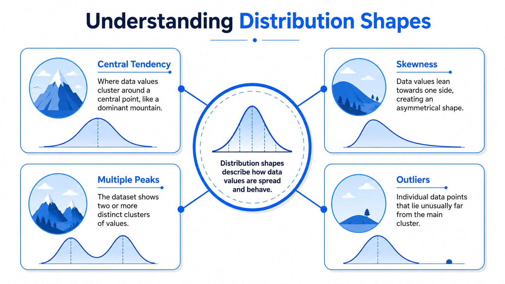
A distribution shape shows how values are arranged, not just where they land. Picture the dataset as a terrain map. A unimodal pattern rises into one main hill, bimodal data splits into two peaks, uniform data stays relatively flat, and skewed data leans to one side with a stretched tail. The infographic on distribution shapes is a useful visual reminder that central tendency, skewness, multiple peaks, and outliers all change how the same metric should be read.
A single chart can reveal a lot about a pipeline. A latency metric that looks centered around one cluster behaves very differently from one that splits into two groups after a deployment, even if the averages look similar. That difference often points to mixed traffic, a new code path, or an upstream join that changed the population being measured.
The main shapes you'll run into
Unimodal means one main cluster. Request latency often looks this way when most traffic follows one operating pattern, even if a few slower requests stretch the tail. Bimodal means two distinct clusters, which often appears when two groups are mixed together, such as mobile and desktop traffic inside one metric. Uniform means values are spread fairly evenly, so no single region dominates the chart.
Skewness changes how you read the center. In a right-skewed distribution, a few large values pull the tail to the right. In a left-skewed distribution, the tail stretches left. A mean can still look acceptable while the shape has shifted enough to change how the metric should be modeled or monitored.
Why outliers change the story
Outliers are not only “bad points.” They may reflect a rare but valid process, or they may show that a source system is sending noisy records. Either way, they can distort thresholds and hide what the rest of the distribution is doing. If a payment amount column suddenly contains a handful of extreme values, a simple mean may move far enough to make a healthy table look suspicious.
When a metric changes shape, do not ask only whether total volume changed. Ask whether the data are now coming from a different process.
A production example makes that easier to see. Suppose an events table has usually looked unimodal, then starts looking bimodal after a deployment. That can mean a new code path is producing a second population of values, or an upstream join is duplicating one segment of traffic. In that case, the histogram becomes a debugging tool, not just a chart, and a close look using digna's statistical methods guide can help teams connect the shape change to the next investigation step.
What to remember when you inspect shape
Center tells you where the main cluster sits.
Spread tells you how wide that cluster is.
Modality tells you how many clusters may be hidden inside the data.
Shape tells you whether symmetry holds.
Outliers tell you whether rare points deserve investigation.
These five cues are usually enough to turn a chart into a working hypothesis. Read them together, and you will catch issues that a summary table can miss.
Exploring Statistical Representations
Different plots answer different distribution questions. A histogram shows frequency in bins. A probability density function gives a smooth view of where values are likely to occur. A cumulative distribution function shows how much mass falls below a point. A kernel density estimate smooths noisy observations into a continuous curve. The right choice depends on whether you want shape, quantiles, or a smoothed comparison between groups.
Start with the plot that matches your question
If you need to know whether response times bunch around a few values or spread across several clusters, start with a histogram. If you need to compare two service versions and estimate where one crosses a latency threshold, a CDF is often clearer because it makes quantiles easy to read. If the sample is sparse and the histogram looks jagged, a KDE can make the structure easier to see, though too much smoothing can hide meaningful spikes.
The key trade-off is always interpretability versus noise sensitivity. Histograms are easy to explain in reviews and incident meetings, but they depend on bin width. KDEs reduce visual noise, but they can smooth away edge cases that matter in operational data. CDFs are excellent for percentile thinking, especially when you care about SLO-style comparisons or cohort separation.
The technical overview of statistical methods for data analysis in digna's guide to statistical methods is useful if you want to connect these plots to the metrics behind them.
A quick way to choose among the four
Histogram: use it first when you want a raw look at concentration, skew, or multimodality.
PDF: use it when you want a conceptual view of relative likelihood across values.
CDF: use it when quantiles, thresholds, and “what percentage is below this value” matter.
KDE: use it when sparse data need smoothing, but verify that you're not hiding rare but important structure.
Response-time logs are a good example. If most requests are fast and a few are slow, the histogram might show a long tail. A CDF will tell you how quickly the fast region accumulates, which helps when you're defining a latency boundary. A KDE gives you a smoother sense of the same story, which is helpful in stakeholder reviews where jaggedness distracts from the trend.
Using Summary Statistics and Estimation
A response-time table or a feature store snapshot can look manageable once you reduce it to a few summary numbers, but those numbers only help if you know what they hide. The mean shifts when extreme values appear, the median stays steadier, the mode can surface the most common value, and variance or other spread measures show how far the values wander from the center. Quantiles are often more useful than the average in production systems, because they show where the tails begin to matter.
Use the summaries as a diagnostic set, not a single answer
A symmetric, bell-shaped dataset behaves differently from a skewed one, and that difference changes how you read the summary statistics. Many inferential procedures assume approximate normality, so analysts need to check whether that assumption fits the data before treating the mean as representative. When the shape does not match that assumption, statisticians often inspect a histogram and then move to nonparametric methods, transformations, or distribution-specific models as noted in the clinical statistics review. In applied work, probability plots and quartile checks help verify whether observed data match an expected distribution before you compare cohorts, set control limits, or monitor drift.
Estimation should fit the data, not the other way around
Parametric fitting works well when the distribution follows a known family closely enough to justify the assumption. That is useful in stable pipelines where you want compact thresholds and limits that are easy to explain in incident reviews. Nonparametric approaches are safer when the data are irregular, when the tail matters more than the center, or when you do not trust the shape enough to commit to a formula.
Bootstrapping helps when you need uncertainty around a summary without assuming the sample came from a perfect theoretical curve. In practice, that lets you estimate a median or a quantile band even when the underlying distribution is messy. If you are using SQL or Python, set the rules for missing values and outliers before you compute the summary, because those choices affect every downstream threshold.
Practical rule: calculate the median and a few quantiles before you trust the mean. In skewed data, the average can make a healthy table look abnormal, or make a real shift look harmless.
For pipeline monitoring, the summary set should be operational, not decorative. A control limit based on one percentile can be more useful than a single average if your job is to catch extremes early. A median with quartiles can tell you whether the center moved or whether the tails did. That difference helps analysts separate a normal seasonal change from a shape shift that points to an upstream issue, and it keeps alerts meaningful instead of noisy.
Comparing Distributions in Practice
Comparing two distributions is where theory becomes a decision. You're asking whether a new sample still looks like the baseline, whether two cohorts are behaving differently, or whether a categorical mix has shifted enough to matter. There isn't a single universal test, because different comparisons care about different parts of the distribution.
Pick the metric that matches the failure mode
The Kolmogorov–Smirnov test is a non-parametric way to check whether two continuous samples could come from the same distribution. It's useful when you care about the overall shape, not just the mean. Kullback–Leibler divergence asks how one probability distribution differs from a reference distribution, so it fits baseline-versus-current comparisons where asymmetry matters. Wasserstein distance measures the cost of turning one distribution into another, which makes it intuitive when you want a sense of how far values have moved in practical terms.
For categorical comparisons, the chi-square test is the familiar option when you want to know whether two variables are associated. The population stability index, or PSI, is often used to evaluate whether a population's distribution is stable across time periods or segments. That makes it especially relevant for drift checks, especially when you want a compact score for monitoring dashboards.
Use caution around tails, encoding, and sample size
Each metric has blind spots. KS can be sensitive to shifts in the middle, but less interpretable when you need a business explanation. Divergence measures depend on how probabilities are estimated, which means sparse tails can make them unstable. Categorical tests can be distorted by how labels are encoded or grouped, so the input schema matters as much as the test itself.
A good production rule is to choose the metric based on the question you want to answer, not the one that appears most complex. If you're comparing a baseline and a live stream for drift, a shape-sensitive method is a better first pass than a raw average comparison. If you're checking bias in a categorical field, a frequency-based test is more appropriate than a continuous distance.

Visualization Best Practices and Common Pitfalls
A distribution chart only helps if the chart itself is honest. Bin width, axis scaling, color contrast, and annotation all affect what people think they're seeing. The goal is not to make the graph look polished, it's to make the shape readable without distorting the underlying pattern.
Build the chart so shape stays visible
Use bin widths that reveal structure without over-smoothing the data. Too many bins make random variation look like a story. Too few bins flatten real clusters into something bland. If your metric has a long tail, an axis that starts at zero may be appropriate in one chart and misleading in another, so the baseline should match the question being asked.
Color should separate groups clearly, not decorate the chart. If you're comparing cohorts, use tones that remain legible in a dashboard and accessible in a team review. Outliers deserve annotation, but not dramatic treatment. Label them with context so reviewers know whether they're rare but valid or broken records.
The internal guide on outlier identification methods is worth keeping close when a point looks strange but you're not ready to call it an error.
Watch for the traps that hide real coverage problems
A uniform-looking chart can still be misleading if the data collection is uneven. The Frontiers public health paper on incomplete coverage and missing fields is a strong reminder that underserved groups can disappear from the picture when the source data are incomplete, and that a dataset can look balanced overall while still being biased at the edges Frontiers public health article. That idea matters outside healthcare too, because missingness and collection patterns can shape every distribution you inspect.
A flat chart is not proof of fairness. It can also be a sign that the edges were never observed well enough to show up.
For practical dashboard work, facet by subgroup when you can, and add missing-data indicators when you can't. That lets you separate a broad distribution from a distorted one. If a metric looks stable only after aggregation, you probably need to inspect its parts before trusting the whole.
A short checklist for reviewers
Check binning carefully: bin choice should expose shape, not manufacture it.
Inspect the axes: scaling should match the story you're trying to tell.
Annotate exceptions: outliers need explanation, not silence.
Split by subgroup: aggregation can hide important differences.
Mark missingness: incomplete data can imitate a healthy distribution.
The best visualization habit is skepticism. If a chart feels too clean, ask what was averaged away, what was omitted, and which subgroup never made it into the plot.
Monitoring Distribution Shifts in Production with digna
The practical reason to learn distributions is to catch drift before it turns into a customer-facing problem. A revenue metric might keep the same average while the shape changes underneath it, and that's exactly the kind of issue that gets missed when teams only watch totals. The data distribution tutorial from Utrecht makes the point well, when a metric's distribution changes suddenly, that can signal a data quality problem even if the average looks stable Utrecht distribution tutorial.
Why shape-based monitoring beats average-only monitoring
If a pipeline starts sending more records into the high end of a metric, the mean may move slowly, or not at all, while the tail keeps expanding. That creates false confidence. Shape-based monitoring looks for the change in the full pattern, which is exactly what production systems need when the problem could be a source-table change, a schema mismatch, or a late transformation bug.
That's where in-database observability matters. digna runs metric computation inside the customer's environment, so teams can monitor data behavior where the data already lives. Its Data Anomalies module learns baselines and flags unusual behavior, while Schema Tracker watches for structural changes and Timeliness monitors late, missing, or early arrivals. Because the checks happen in-database, teams spend less time moving data around and more time interpreting the signal.
A concrete incident path
Say a revenue table starts drifting after a deployment. The dashboard shows that the average still looks normal, but the distribution has become visibly skewed and the tail has widened. A digna alert can flag that shift, and the team can then trace it through the source table, the transformation layer, and the downstream metric without leaving the observability workflow.
That root-cause path matters because shape changes rarely arrive alone. They often travel with schema drift, record duplication, or a delayed upstream feed. When the monitoring stack keeps the anomaly, the timing, and the schema change in one place, engineers can triangulate the problem much faster than they can from a single chart in a BI tool.
How to keep alerts useful
Baseline updates should be deliberate, not automatic after every minor wobble. Thresholds should reflect the metric's natural volatility instead of forcing one rule across every dataset. Alerts should land where the team already works, whether that's a shared dashboard or an incident channel, so the distribution shift becomes an action item instead of a silent signal.
If you're building production monitoring now, the main habit to adopt is simple. Watch the shape, not just the level. Once you do that, tools like digna's drift detection workflow can support continuous checks on the metric itself, instead of waiting for downstream complaints to reveal the problem.
Conclusion and Next Steps
The short answer to what is the distribution of data is that it's the pattern of how values spread, cluster, and change. The useful answer is that distribution shape drives real decisions. It tells you when to transform, when to use stable estimates, when to compare cohorts differently, and when a production alert is probably signaling a deeper issue than a simple shift in the average.
The most valuable habit is to treat distribution shape as a monitoring signal. Start with histograms, add the right statistical representation for the question, compare baselines with a metric that matches the failure mode, and keep the visualization honest. From there, continuous monitoring becomes much easier to trust.
If you want to make this concrete, begin with one critical table in your pipeline. Inspect its histogram, check a few quantiles, compare the current distribution against a baseline, and wire alerts for shape changes as well as volume changes. Then expand the same discipline to the rest of the data flow.
If you're ready to monitor distribution shifts before they turn into broken reports or model errors, visit digna and see how its in-database observability features can keep shape, drift, timeliness, and schema changes in the same workflow. It's a practical way to move from reactive debugging to continuous data control.
Frequently asked questions
What is the distribution of data?
The pattern behind your values, not just the pile of rows in a table. Understanding a distribution means understanding how values are spread, where they cluster and how that shape changes over time.
Why should pipeline teams care about distributions?
Because a pipeline can look healthy in a dashboard and still be drifting underneath. A histogram is often the first place a data engineer should look when a metric shifts, since the shape moves before the total does.
What does a distribution reveal that an average hides?
Where the values actually sit. An unchanged mean can conceal a population splitting into two clusters, a normally populated field thinning out, or a legitimate category quietly becoming dominant.
How do you compare two distributions?
With a comparison test rather than an eyeball. Statistical comparison tells you whether today's shape differs from the baseline by more than ordinary variation, which is the question a visual check can only suggest.
When does distribution monitoring beat a threshold rule?
When the failure has no fixed boundary to cross. A threshold catches a value going out of range, while distribution monitoring catches the same values rearranging themselves into a shape that no longer describes the business.