Quality Data Analysis a Practical Guide for Modern Teams
|
8
min read

You open a Monday dashboard, and the number in the top-right doesn't match what finance expected. No one can say whether the problem started last night, last week, or two pipeline changes ago. That's the moment quality data analysis stops being an abstract best practice and becomes a practical survival skill, because the job isn't just to clean data after it breaks. It's to make silent data problems visible early, measure them with statistical discipline, and keep them from reaching decisions in the first place.
Table of Contents
When Your Dashboard Stops Telling the Truth
A broken dashboard usually does not look broken. It still loads, the charts still render, and the KPI names still sound familiar. The problem is deeper: the underlying records may be stale, duplicated, incomplete, or inconsistent, so the report becomes a polished version of the wrong story.
That is why quality data analysis matters. Poor data quality is not a cosmetic issue, it is an operational risk that can distort decisions before anyone notices the chart looks off. Gartner-reported estimates cited in 2023 put the average annual cost of poor data quality at $12.9 million per organization, and IBM's 2022 Cost of Poor Data Quality work found that inaccuracy can drive about 25% of revenue loss for large enterprises through flawed decision-making. Those figures changed the conversation from “please clean the data” to “this needs continuous observation and control” (Gitnux data quality statistics).
A lot of teams still treat data quality like last-mile housekeeping. They run a cleanup job before a report goes out, then hope the issue will not return. That model fails because the failure usually starts upstream, in ingestion, transformations, schema drift, or delayed feeds, long before anyone sees the chart. A field-level rule in a form, such as the checks shown in the Formcarry form validation guide, only catches one layer of the problem. The larger discipline watches how those inputs behave after they enter the pipeline, the same way a mechanic listens for a new noise after an engine is already running.
Practical rule: if a metric can change without a visible error, it needs continuous monitoring, not a one-time audit.
The modern discipline combines classical descriptive statistics with automated anomaly detection and baseline learning, so teams can spot unusual behavior across large datasets continuously instead of relying on periodic manual review. It also works best when the checks stay close to the data, for example in-database profiling that avoids pulling massive tables into a separate tool. That is the promise here, turning invisible failure into measurable drift, then into action, and keeping a close eye on equity-sensitive data flows with a practical framework like the one described in this guide to data quality dimensions.
Defining Quality Data Analysis Without the Jargon
A good analogy is food safety. A kitchen doesn't earn trust because it passed inspection once. It earns trust because temperature, sourcing, hygiene, and freshness are checked again and again, so the meal stays safe even when the staff changes or the volume spikes.
Quality data analysis works the same way. It's not a single audit, and it's not a cleanup checklist. It's the ongoing process of measuring whether data still deserves trust as it moves through systems, changes shape, and feeds decisions.
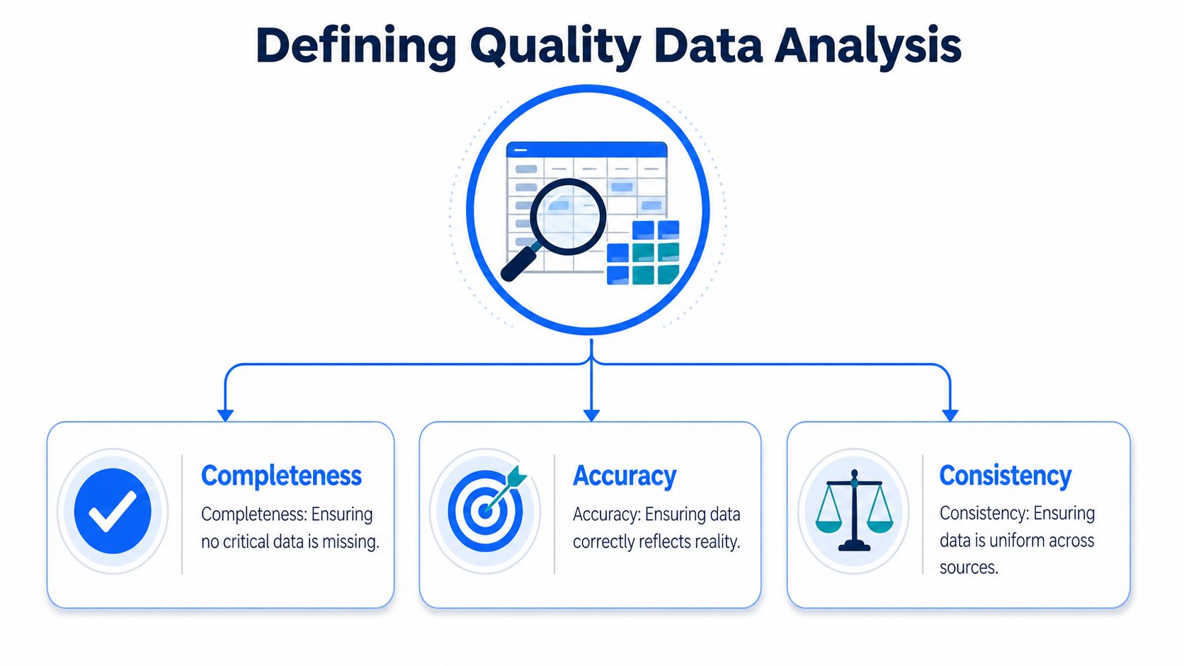
The formal side of this is broader than many people expect. The IMF's statistical quality framework identifies six dimensions, relevance, accuracy, timeliness, accessibility, interpretability, and coherence (IMF statistical quality framework). IBM's operational definition expands the picture with accuracy, completeness, validity, consistency, uniqueness, timeliness, and fitness for purpose (IBM data quality). The key idea is simple, a dataset can be technically present and still not be fit for the question you're asking.
What it is not
It's not just data cleansing, because cleaning removes known defects but doesn't tell you when the defect rate is changing. It's not a dashboard, because dashboards summarize state but don't explain whether the input is trustworthy. It's not a single “quality score,” because one score can hide a lot of different failure modes.
Think of a table that has no nulls, but its timestamps are three days late. Or a dataset that is fresh, but one business unit uses a different category code than the rest of the company. In both cases, the numbers may look tidy, but the analysis is still unreliable.
Coursera's data-analysis workflow places cleaning, outlier review, and interpretation inside the broader analysis process, not as an afterthought (Coursera data analysis guide). That sequencing matters, because quality checks belong where data is collected, transformed, and interpreted, not only where it's displayed.
The Core Dimensions That Make Data Trustworthy
The dimensions are easier to remember if you tie them to concrete failure modes. Each one answers a different question, and each one can fail while the others look fine. That's why a single completeness percentage doesn't tell the full story.
A practical comparison
Dimension | What it means | Example failure | Metric to monitor |
|---|---|---|---|
Accuracy | Values match reality | A customer status is marked active after cancellation | Error rate against a trusted reference |
Completeness | Expected data is present | Required address fields are blank | Null rate or missing-field rate |
Consistency | The same fact agrees across tables | Revenue differs between finance and BI models | Cross-table mismatch rate |
Uniqueness | Records aren't duplicated | The same order appears twice after reprocessing | Duplicate rate |
Validity | Values follow rules and formats | A date field contains text | Rule-violation rate |
Timeliness | Data arrives when needed | A daily feed lands after the report closes | Ingestion delay or hours since refresh |
Fitness for purpose | Data answers the business question | The dataset omits the region the team needs | Coverage against the decision scope |
Accuracy is easiest to explain, but often hardest to verify. A number can be formatted correctly and still be wrong in the business sense. That's why quality teams compare against source systems, reference tables, or reconciliation logic instead of assuming syntactic validity equals truth.
Completeness is the one that stands out immediately, yet it can be misleading on its own. A table with no nulls still might exclude a whole customer segment if the load logic dropped a column or filtered a region. Timeliness has the same trap, because fresh data can still be useless if it arrived with the wrong content.
Consistency and uniqueness usually show up when systems are stitched together. If a finance warehouse and a reporting mart disagree, someone has to decide which source is authoritative. If duplicates creep in, the chart may still look smooth while totals drift upward without any obvious error.
Validity is where business rules matter. Formcarry's field validations guide is a useful external example of how systems can enforce required formats and inputs before bad records spread downstream. In analytics, the same logic applies to postal codes, status values, ranges, and date constraints.
A useful habit: monitor the dimension that matters most to the decision, then keep the others on the radar so you don't optimize one kind of trust while breaking another.
Fitness for purpose is the final check, and it's the one many teams skip. A dataset can be accurate, complete, and consistent, yet still fail if it doesn't contain the business slice the question depends on. That's where the internal framework in digna's data quality dimensions overview fits well with governance thinking.
Methods and Workflows for Performing the Analysis
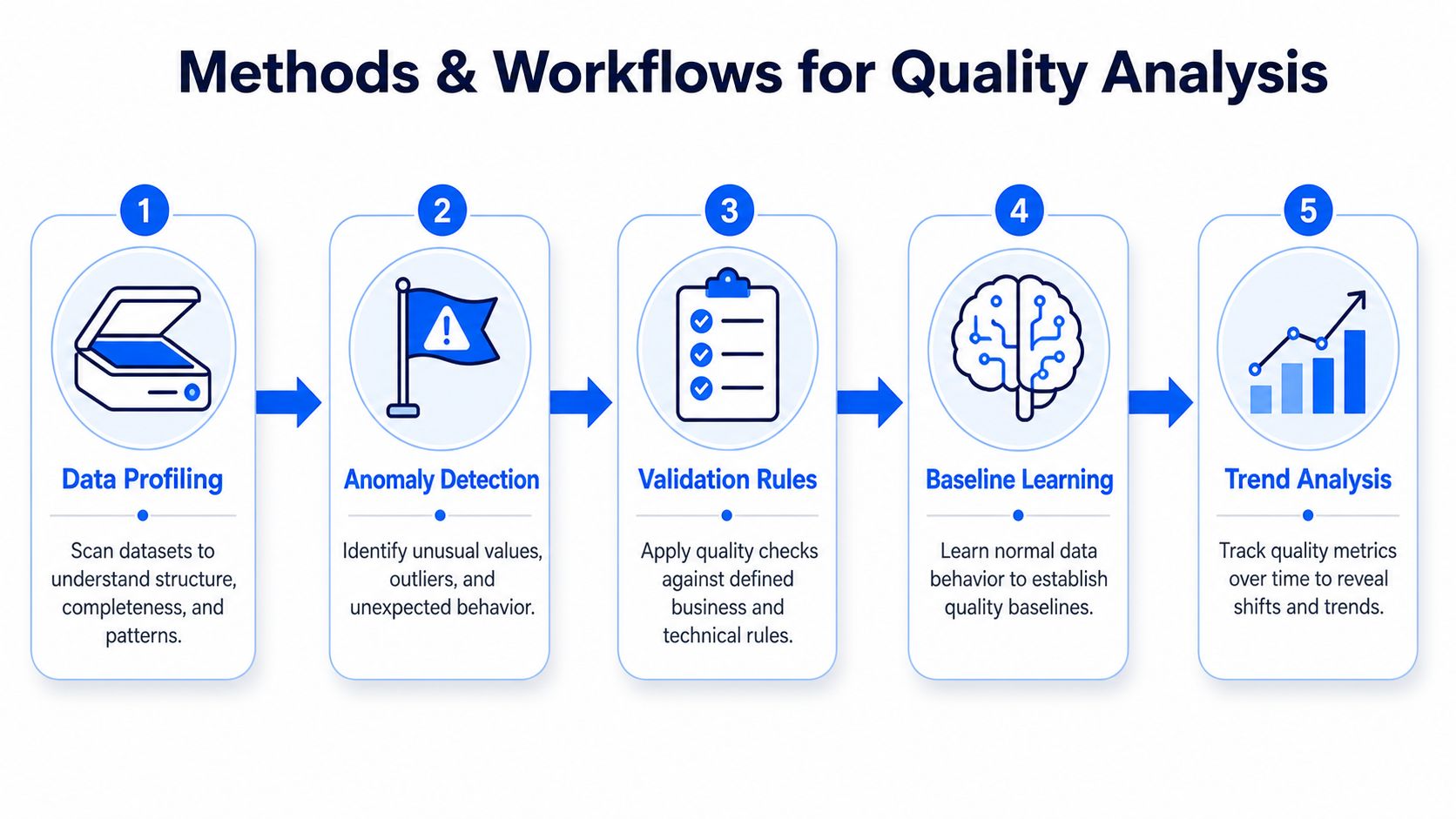
A quality review usually starts the moment data lands, not after the dashboard breaks. One method catches missingness, another catches drift, and a third catches values that pass a rule but still look wrong in context. The work is closer to medical triage than to a one-time cleanup, because each check answers a different question about the same dataset.
Start with profiling
Profiling answers a simple question, what does normal look like here? Teams use mean, median, mode, standard deviation, variance, and range to summarize distributions, spot skew, and understand spread, which gives them a baseline before they decide what deserves attention. A good starting point is data profiling techniques, because the point is to learn the shape of the data before writing assumptions into checks.
A new teammate often expects profiling to be a one-time report. It works more like checking the instrument panel before each shift. If order values have been steady for weeks and then a column suddenly fills with zeros, that change deserves review even when no explicit rule has failed.
Add anomaly detection and rules
Anomaly detection works best when it compares current records with the dataset's own history. Z-scores and interquartile range rules help flag values that sit far outside the normal envelope, which is useful for outliers, unusual spikes, and records that deserve manual review.
Deterministic validation plays a different role. It checks row-level logic, such as required fields, allowed values, and cross-field dependencies. If the rule is violated, the record fails, and the decision is immediate.
Quality analytics guidance also recommends pairing trend analysis with validation so teams can catch missing fields, out-of-range values, and delivery delays early in the pipeline (Skymes quality analytics). That pairing matters because a defect that repeats slowly can pass hard rules while still changing the shape of the data. A reporting table can stay technically valid while steadily drifting away from the values people think they are reading.
Learn the baseline, then watch the trend
Baseline learning replaces static thresholds with behavioral models that adapt to each dataset. Instead of asking whether a count sits above an arbitrary line, the system asks whether today's behavior departs from that table's own normal pattern. That fits operational data well, because one feed may swing naturally while another stays narrow and predictable.
Trend analysis catches what a single alert misses. A field may never cross a hard limit, yet if missingness climbs for a week, the downstream dashboard will still drift. Historical trend analysis is also a core part of digna's Data Analytics module, which calculates higher-level statistics like trend and volatility from core data metrics, so teams can keep monitoring inside their own environment without moving the data elsewhere.
Implementation Patterns That Scale
The first deployment question is usually about location. Where should the checks run, and how much data should move to make them run? That choice affects latency, governance, cost, and how fast a team can react when something changes. It also shapes whether quality data analysis stays a living control inside the pipeline or turns into a separate task that people inspect too late.
Four patterns teams use
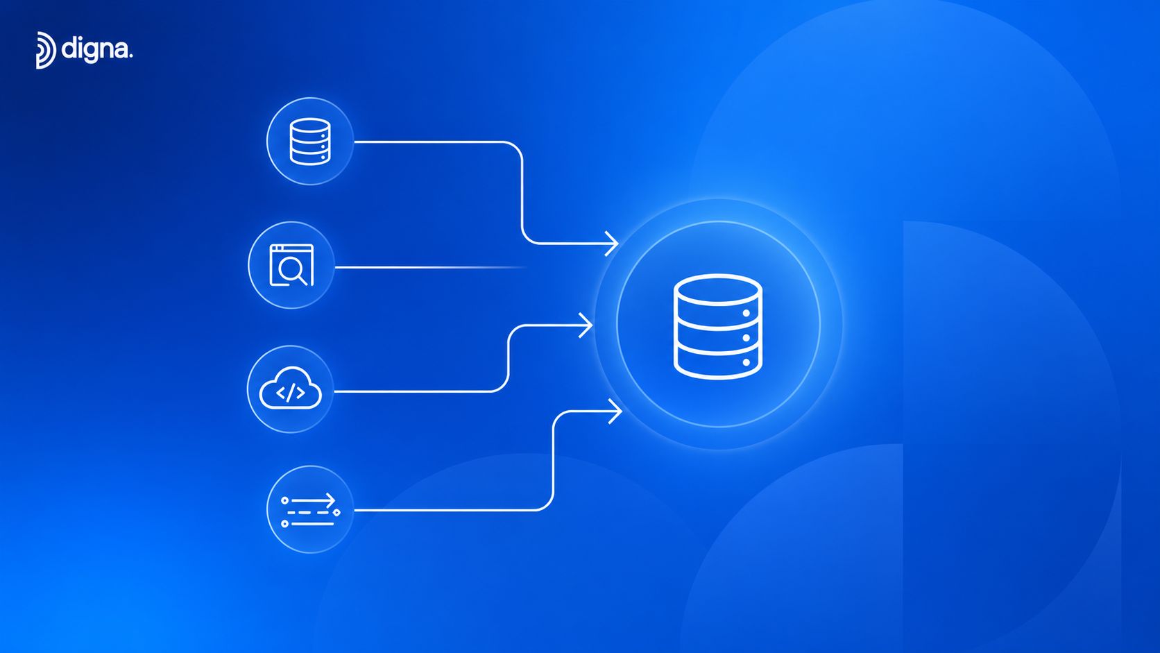
In-database analysis runs checks where the data already lives. That keeps movement low and fits security requirements, because the data stays in place while metrics are computed. It also works well for statistical profiling, where you want to measure distributions, missingness, and drift against the actual table rather than a copied sample.
External scanning services copy or stream samples into a separate environment. That can be useful for quick inspection, but it adds movement, duplication, and another place where sensitive data can travel. A copied sample can help a team spot obvious issues, yet it can also hide subtle shifts that only show up at the source.
Pipeline-native checks live inside ETL or transformation code. They are easy to attach to a specific job, which makes the failure path clear, but they can become brittle if each team writes its own rules without shared baselines. In practice, this pattern works best when the checks are small, explicit, and tied to the exact transformation they protect.
Observability platforms combine validation, anomaly detection, schema tracking, and alerting in one layer. They are the closest fit for continuous monitoring because they tie together rules, baselines, and incident handling. For teams building that path, the implementation approach described in Digna's data quality implementation guide shows how those pieces can stay inside the customer environment instead of spreading across separate tools.
How to choose
If your priority is low latency and tight governance, in-database execution usually wins. If your team needs lightweight inspection for a small slice of data, external scanning can be enough. If you want enforcement close to transformation logic, pipeline-native checks make sense. If you need one place to see incidents, trends, and status across many datasets, an observability platform is easier to operate.
Operational advice: pick the pattern that matches your highest constraint first, not the one that looks easiest in a demo.
Alerting matters too. Schema change watchers should flag added or removed columns, baseline drift alerts should surface unusual movement, and escalation paths should define who fixes what. Audit-ready evidence becomes much easier to produce when the system records time to detection, time to resolution, and the exact rule or anomaly that triggered the incident. That record also helps teams review whether the issue was random noise, a recurring pipeline fault, or a wider shift that needs a different threshold.
digna is one example of a platform built around those ideas, with in-database execution, AI-driven baseline learning, schema tracking, and timeliness monitoring inside the customer's own environment. That setup suits teams that want continuous checks without pulling production data into a separate scanning layer.
How Different Industries Apply Quality Data Analysis
The same mechanics play out differently depending on the stakes. A finance team cares about broken regulatory feeds and transaction integrity. A healthcare team worries about claims structure, clinical records, and timeliness. A telecom team needs to protect high-volume operational feeds without drowning in noise. A public sector team needs traceability and evidence that can survive audit.
What changes by industry
Financial services usually monitor risk data, transactional data, and regulatory data first. The practical priority is catching late feeds, mismatched totals, and schema changes before reporting or downstream controls rely on them. Time to detection and time to resolution become central KPIs because a delay can affect multiple processes at once.
Healthcare leans hard on completeness, freshness, and structural stability in clinical and operational workflows. A schema shift in claims data or a missing load in a patient feed can distort both care analytics and compliance reporting, so teams tend to watch rule-violation rates and delivery timing closely.
Telecommunications deals with large operational streams where the problem is often not one bad row, but a subtle shift in volume or format. Threshold breaches in call-detail records and unexpected field changes are the kind of issues that slip through if monitoring is too static.
Public sector needs consistency, traceability, and audit-ready evidence more than anything else. A report may be technically correct, but if the data lineage or validation history can't be shown, the work still falls short of public trust expectations.
The Federal Committee on Statistical Methodology defines data quality as “the degree to which data capture the desired information using appropriate methodology in a manner that sustains public trust” (FCSM framework). That framing fits every one of these sectors, because the point is not just accuracy, it's dependable use in context.
Across those industries, the same control set keeps showing up, freshness checks, record-level validation, schema tracking, and anomaly detection. The business question changes, but the discipline doesn't.
Pitfalls and the Angles Most Guides Miss
A single global quality score sounds tidy, but it hides too much. One group can have clean, recent data while another group is missing records, underrepresented, or affected by a silent schema change. The average looks fine, and the decision still becomes inequitable.
Why subgroup checks matter
Public-health and policy guidance stresses subgroup-by-subgroup missing-data checks, separate imputation when missingness differs across groups, and explicit documentation of who can't be represented accurately with the available data (ASPE equity analysis guidance). That's a sharp reminder that whole-dataset completeness can conceal exclusion. If one region is thin, or a historically excluded group is systematically smaller in the data, the model can still be biased even when the table is “mostly complete.”
Why AI systems are fragile here
The other missed angle is AI and near-real-time monitoring. Traditional quality work often stops at periodic profiling, but recent statistical guidance emphasizes ongoing review of record volume, missingness in critical fields, value feasibility, and out-of-range trends to catch pipeline problems early (NISS technical report). That matters because schema drift, missing loads, and distribution shifts can break downstream models without producing a loud failure.
A model doesn't need a dramatic outage to go wrong. If one upstream field changes type, if a feed arrives late, or if the distribution shifts subtly over time, the model input can degrade long before anyone notices the output. That's why continuous observability beats periodic audits in operational settings.
Continuous checks don't just protect dashboards, they protect the assumptions the dashboard depends on.
A platform approach helps here when it combines baseline learning, record-level validation, timeliness monitoring, and continuous schema tracking inside the customer's own environment. That keeps the analysis close to the data, which is where these issues are easiest to catch.
Putting It All Together on Your Next Dataset
The fastest way to judge a dataset is to ask three questions. First, what does good mean for this business question? Second, which methods will expose the failures that matter most? Third, where should those checks run so they don't add friction or risk?
If the answer to the first question is fuzzy, start with the dimensions, not the tool. Accuracy, completeness, consistency, uniqueness, validity, timeliness, and fitness for purpose give you a shared vocabulary for deciding what's acceptable. If the answer to the second question includes drift, not just defects, bring in profiling, baseline learning, and trend analysis. If the answer to the third question involves sensitive data or high volume, in-database execution usually deserves a serious look.
A simple mental model helps here. Treat quality data analysis as a loop, define the trust criteria, measure the behavior, alert on deviations, and keep the checks where the data lives. That loop is strongest when it's continuous, statistical, and aligned to the business use case rather than a generic hygiene checklist.
The two gaps most teams still leave open are equity and AI readiness. If you skip subgroup checks, you can miss who the data leaves out. If you skip continuous observability, you can miss the slow changes that break analytics and model inputs.
If you want to put this discipline into practice, digna provides in-database monitoring for anomalies, timeliness, validation, and schema changes inside the customer's own environment. Visit it to see how continuous quality data analysis can stay close to the warehouse, the pipeline, and the decisions that depend on them.
Frequently asked questions
What does quality data analysis add to ordinary analysis?
A check on whether the inputs deserve the conclusion. A broken dashboard usually does not look broken, so analysis without a quality layer produces findings whose confidence comes from presentation rather than evidence.
When does a metric need continuous monitoring?
When it can change without a visible error. That single test separates the datasets that need standing controls from the ones a periodic audit can still cover adequately.
What does poor quality cost at the decision level?
Gartner-reported estimates cited in 2023 put the average annual cost at $12.9 million per organization, and IBM's 2022 Cost of Poor Data Quality work found inaccuracy can drive about 25% of revenue loss for large enterprises through flawed decision-making.
What does the modern discipline combine?
Classical descriptive statistics with automated anomaly detection and baseline learning. The combination is what lets a team watch unusual behavior across large datasets continuously rather than relying on periodic manual review.
Why is treating quality as last-mile housekeeping a mistake?
Because the damage happens upstream of the last mile. By the time a number reaches a report, the defect has already been inherited by every calculation between the source and the screen.