Fact and Dimension Tables: The Core of Reliable Analytics
|
5
min read

You're probably dealing with this right now. A dashboard takes too long to load, finance and growth report different totals for the same metric, and someone in a review meeting asks the worst possible question: “Which number should we trust?”
That usually gets blamed on the BI tool, the warehouse, or the latest pipeline change. Most of the time, the actual problem sits lower in the stack. The data model doesn't clearly separate business events from business context, so every report rebuilds logic slightly differently.
That's why fact and dimension tables still matter. They aren't old warehouse theory for certification exams. They're the practical structure that helps teams answer the same question the same way, at speed, without rebuilding joins and assumptions in every dashboard.
Table of Contents
Why Your Analytics Reports Are Slow and Inconsistent
A common pattern goes like this. A BI analyst builds a revenue dashboard from transaction data. Another analyst creates a campaign report using exported order records. Both are competent. Both are careful. The numbers still disagree because each person had to decide, on their own, what counts as an order, what counts as a customer, and how to join time, product, and region.
The warehouse then gets blamed for being slow because every dashboard query scans large operational tables full of mixed-purpose columns. Some fields describe customers. Others describe transactions. A few are status flags with changing meanings. Nothing is shaped for analytics, so every query works too hard.
Slow reports and conflicting totals usually mean your team is querying data that was stored for operations, not modeled for analysis.
Dimensional modeling proves its value. A fact table captures the measurable business event. A dimension table provides the descriptive context around that event. Once those jobs are separated, reporting gets simpler. Analysts stop inventing joins from scratch. Stakeholders stop hearing three definitions of the same KPI.
You can see the pressure for clearer reporting in broader dashboard practice too. Teams designing executive and channel reporting often focus on layout, metrics, and visibility, but those choices only work when the underlying model is stable. A useful example is this roundup of 2026 marketing dashboard insights, which highlights how many teams depend on dashboards as decision surfaces rather than static charts.
Why structure beats tool switching
If your model is weak, changing BI tools won't fix much. You'll get prettier disagreement, faster. Good dimensional design removes ambiguity before the dashboard layer ever sees the data.
Three practical outcomes usually follow:
Queries become simpler: Analysts join a central event table to a small set of descriptive tables instead of decoding raw source systems.
Definitions become reusable: “Revenue by product by month” and “orders by region by week” can use the same core structures.
Trust grows: People stop arguing over whether the dashboard is wrong and start discussing the business result.
The Building Blocks of Dimensional Modeling
A receipt is the simplest mental model
If you want a simple analogy, use a store receipt.
The lines on the receipt are the facts. They tell you what happened. One item sold, at one price, in one quantity, at one moment. The surrounding details are the dimensions. Which customer bought it, which store sold it, which product category it belongs to, and what date the purchase happened.
A warehouse model works the same way. Fact tables serve as the quantitative core of dimensional data models, storing numerical measurements of business events such as sales revenue, units sold, or transaction counts at a defined grain, typically comprising millions of rows where each row contains only foreign keys to dimensions and numeric metrics according to Monte Carlo's explanation of fact and dimension tables.
That “only foreign keys and numeric metrics” part matters more than many junior engineers expect. It keeps the fact table narrow, easier to aggregate, and less likely to become a junk drawer.
For teams dealing with messy upstream inputs, especially documents and free-form records, it helps to first understand how unstructured information becomes structured fields. This overview of AI for data extraction is useful context because dimensional models only work well when raw source data has already been turned into stable, queryable columns.
Why grain comes first
The most important design decision is grain. Grain means the exact level of detail represented by one row in the fact table.
Examples:
One order line
One invoice payment
One website session
One daily inventory snapshot
If you don't declare grain first, everything downstream gets blurry. Engineers won't know whether to store one row per order or one row per product within the order. Analysts won't know whether summing a metric creates duplicates. Data quality checks won't know what “normal” even means.
Practical rule: Write the grain as a sentence before you create the table. “One row represents one shipped order line” is clear. “Sales data” is not.
Keys are the connective tissue. The fact table stores foreign keys that point to dimension primary keys. That link lets you ask business questions in plain terms. “Show total revenue by region and month” becomes one aggregation across a numeric measure, grouped by descriptive attributes in the related dimensions.
If you're defining a warehouse from business language rather than source-system table names, this guide to warehouse data modeling is a practical way to think about grain, naming, and table boundaries before implementation.
Fact vs Dimension Table At a Glance
Characteristic | Fact Table | Dimension Table |
|---|---|---|
Main purpose | Stores measurable business events | Stores descriptive business context |
Typical contents | Numeric measures and foreign keys | Attributes such as names, categories, statuses, dates |
Row meaning | One event at a declared grain | One business entity or descriptive member |
Size | Usually much larger | Usually smaller |
Query role | Aggregated and filtered | Used for grouping, filtering, and labeling |
Change pattern | Often appended as new events occur | Updated less frequently as context changes |
A good test is simple. If the column answers “how much,” “how many,” or “how long,” it probably belongs near the fact. If it answers “who,” “what,” “where,” or “which type,” it usually belongs in a dimension.
Exploring Key Fact and Dimension Types
Some models fail because the team learns the words “fact table” and “dimension table” but never learns the variations. Those variations decide whether your historical reporting stays accurate.
Fact types change how analysis works
Kimball-style dimensional modeling treats fact tables as mostly keys and numbers. The numbers themselves aren't all the same, though. Some can be summed freely. Others can't.
Additive facts work across all dimensions. Sales revenue and units sold are classic examples. You can sum them by day, region, product, or customer.
Semi-additive facts work across some dimensions but not all. Inventory balance is the standard case. You can sum inventory across warehouses, but summing it across time usually gives nonsense.
Non-additive facts don't behave well when summed. Ratios and averages belong here. They often need to be recomputed from underlying additive measures.
Fact tables also differ by event pattern:
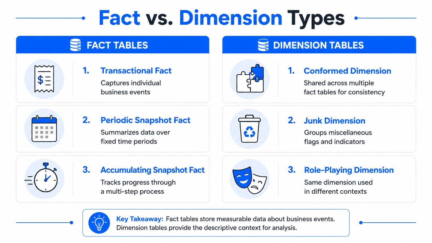
Transactional fact tables capture individual events, such as one order line or one payment.
Periodic snapshot fact tables store measurements at fixed intervals. A daily inventory balance is a common example.
Accumulating snapshot fact tables track progress across a process, such as order creation, picking, shipping, and delivery.
Those last two matter for operations teams. A periodic snapshot helps you monitor trends over intervals. An accumulating snapshot helps you monitor elapsed time and bottlenecks across a workflow.
Dimension types handle business messiness
Dimensions look simpler, but they carry a different kind of complexity. Business descriptions change. Products get recategorized. Customers move segments. Sales regions get reorganized.
That's why engineers use slowly changing dimensions.
SCD type | What happens | Best fit |
|---|---|---|
Type 1 | Overwrite the old value | When you only care about current truth |
Type 2 | Add a new row for the changed version | When historical reporting must preserve past context |
Type 3 | Add a new column for prior value | When you need limited before-and-after comparison |
If a product changed category this quarter, Type 1 would rewrite history. A report on last year's sales by category would show the new category, not the one that existed at the time of sale. That may be acceptable, or it may be disastrous. The model has to choose on purpose.
Other dimension patterns also show up often:
Conformed dimensions: Shared across multiple fact tables so reports use the same definition of customer, product, or date.
Degenerate dimensions: Operational identifiers stored in the fact table, such as an order number, when no separate dimension table adds value.
Role-playing dimensions: The same dimension used in multiple roles, such as order date and ship date both referencing the date dimension.
Historical accuracy isn't a reporting feature you add later. It starts with how you model changing dimensions today.
Arranging Your Tables in Star and Snowflake Schemas
Once you know what belongs in facts and dimensions, the next question is how to arrange them.

Why the star schema is easier to query
A star schema puts one fact table in the center and connects it directly to surrounding dimensions. Analysts like it because the join path is obvious. BI tools like it because filtering and grouping are straightforward.
Here's the kind of query it enables:
The design is simple on purpose. The fact stores the measurements and keys. The dimensions store labels and hierarchies. That separation helps performance when implemented well. Empirical benchmark data from Microsoft Fabric and Kusto shows that fact tables optimized with partitioning on time-based keys and clustering on high-cardinality foreign keys reduce query response times by 40–60% compared to non-partitioned designs under 10TB+ datasets, as summarized in IBM's overview of fact and dimension table schemas.
That's one reason star schemas remain a default choice for analytics workloads. They are easier to reason about and usually easier to tune.
A practical reference for implementation patterns is this walkthrough on data warehouse star schema design, especially if you're translating business questions into join paths and dimension boundaries.
When snowflake designs help and when they hurt
A snowflake schema normalizes some dimensions into related sub-dimensions. Instead of storing all product attributes in one dimension, you might split product, brand, and category into separate tables.
That can reduce duplication in dimension storage. It can also make maintenance cleaner when shared hierarchies are managed centrally. But it creates more joins, more cognitive load, and more opportunities for reporting teams to misunderstand the model.
Use a snowflake carefully when:
Hierarchies are complex: Product structures or geographic rollups may justify separate tables.
Dimension reuse is strong: Multiple models may rely on the same normalized reference structure.
Governance is strict: Centralized management of shared descriptive entities may matter more than analyst convenience.
Stay with a star when your main goal is fast, understandable analytics. Most junior analysts can read a star schema quickly. Fewer can debug a highly normalized snowflake during an incident.
Common Design Mistakes and Performance Pitfalls
Teams rarely break trust with one spectacular modeling error. They usually do it through a series of small shortcuts.
Mistakes that quietly break trust
The first mistake is putting descriptive text in the fact table. Product names, customer emails, campaign labels, and free-form statuses don't belong there. They widen the hottest table in the model and create duplication every time the event repeats.
The second mistake is choosing the wrong grain. If one row sometimes means an order and sometimes means an order line, no aggregation is safe. The warehouse may still load. The dashboard may still render. The totals will drift the moment someone groups the data differently.
The third mistake is skipping a clear approach for dimension changes. If customer tier, territory, or product category changes and you overwrite old values casually, historical reports stop reflecting the business reality that existed when the event happened.
A model can be technically valid and still be analytically wrong.
Performance patterns that are actually design choices
A lot of performance “issues” are simply the warehouse behaving exactly as the model forced it to behave.
Fact tables are engineered for high-volume, immutable, append-only ingestion and typically dominate storage, often 90%+ of warehouse volume, while dimension tables remain small and are updated infrequently, according to Microsoft Fabric's explanation of fact and dimension architecture. That pattern isn't accidental. It's a deliberate design for scale.
Here's why that matters:
Append-only loading scales well: New events get inserted without heavy contention from frequent updates.
Small dimensions keep joins practical: Lookups remain efficient when context tables stay compact.
Monitoring gets simpler: Stable event history is easier to baseline than constantly rewritten transactional records.
When teams fight this pattern, they usually make the warehouse harder to run. Updating fact rows in place, storing mutable context beside measures, or packing every business flag into the central event table all create pain later.
A simple checklist helps avoid most of it:
Declare the grain in a sentence.
Keep facts narrow.
Put descriptive context in dimensions.
Decide how dimension history will work before the first production load.
Tune storage and partitioning for event growth, not for this week's dashboard only.
Ensuring Trust with Modern Data Observability
A well-designed model can still fail in production. Pipelines arrive late. A source system starts sending nulls. Someone adds a column to a customer dimension on Friday afternoon and breaks a Monday report without realizing it.
That's where modeling and observability meet. Good structure makes reliable monitoring possible.

How fact tables fail in production
Fact tables usually fail in operationally visible ways.
A daily sales fact might suddenly receive fewer rows than normal. A session fact may show a changed value distribution because an upstream parser broke. A payment fact could arrive late, causing an executive dashboard to look calm when the business had a busy day.
These failures are dangerous because the table still exists and the SQL still runs. Nothing throws a syntax error. The report is plainly wrong.
For fact-like event data, I care about five classes of checks:
Volume behavior: Did row counts change unexpectedly?
Missing values: Did important metric fields or keys start arriving null?
Value distributions: Did the shape of the data shift?
Ranges: Did numeric values move outside expected behavior?
Uniqueness: Did duplicates appear where the grain should prevent them?
How dimension tables drift without anyone noticing
Dimension failures are often quieter.
A new column gets added to dim_customer. A data type changes in dim_product. A shared lookup stops matching source values cleanly, so joins begin dropping context from reports. The fact still loads, but business users start seeing “unknown” categories or blank attributes.
In this context, schema stability matters. Dimensions carry the meaning around the numbers. If that meaning drifts subtly, downstream analytics and ML features lose consistency.
The warehouse can stay online while the business logic goes off the rails.
Where observability closes the gap
Modern observability tools monitor these patterns continuously instead of waiting for a human to notice a strange chart. One example is digna, where digna Data Anomalies eliminates manual threshold definitions by using AI to learn normal behavior across record volume, value distributions, and more, while digna Schema Tracker specifically flags structural changes like added columns or data type modifications in dimension tables, protecting downstream analytics from silent data drift, as described on digna Data Anomalies.
That matters because manual thresholds don't age well. Teams set them once, the business changes, and alerts become noisy or useless. Learned baselines are better suited to event-heavy fact tables and slow-changing dimensions with different operational patterns.
In practice, a reliable observability routine for fact and dimension tables includes:
Behavior monitoring for facts: Focus on event counts, metric distributions, null rates, and delivery timing.
Schema monitoring for dimensions: Watch added columns, removed columns, and data type changes.
Relationship checks: Validate that foreign keys still resolve to the expected dimensions.
Timeliness tracking: Confirm data arrives when analysts and downstream jobs expect it.
Dimensional modeling gives you the structure. Observability keeps that structure trustworthy after the model leaves the whiteboard and enters production.
Building Your Foundation for Data-Driven Decisions
Fact and dimension tables aren't just a modeling convention. They're the operating system for dependable analytics. Facts capture what happened. Dimensions explain what those events mean. Grain keeps everyone honest about row-level meaning. Schema patterns determine how easily people can query, tune, and maintain the model.
Teams usually learn this lesson in the wrong order. First the dashboard breaks. Then the KPI definitions drift. Then the root cause points back to a model that never made event data and descriptive context explicit enough.
The fix isn't only better table design, and it isn't only better monitoring. You need both. A clean star schema without observability will still drift in production. A monitoring tool watching a messy model will still produce confusing alerts because the underlying data shape is ambiguous.
The most practical mindset is this: design for clarity, then monitor for reality. That's how you build analytics people will trust in planning meetings, audits, and day-to-day operational work.
If your team is cleaning up warehouse structures, validating grain choices, or trying to catch silent drift before it reaches dashboards, digna is worth evaluating. It focuses on data quality and observability for warehouse and pipeline environments, including anomaly detection, schema tracking, validation, and timeliness monitoring in customer-controlled environments.
Frequently asked questions
What is the difference between a fact table and a dimension table?
A fact table stores the measurable events of a business process, such as a sale or a shipment, with numeric measures and foreign keys. A dimension table stores the descriptive context you filter and group by, such as customer, product, store or date.
What is grain in dimensional modelling?
Grain is the precise meaning of one row in a fact table, for example one line item on one order. Fixing the grain before anything else prevents the most common modelling failure, which is mixing different levels of detail in the same table and double counting.
What are the main types of fact tables?
Transaction facts record individual events at the moment they happen. Periodic snapshot facts record the state of a process at regular intervals. Accumulating snapshot facts track a process with a defined lifecycle, updating the same row as milestones are reached.
What is the difference between a star and a snowflake schema?
A star schema keeps dimensions denormalised in single tables around the fact table, which makes queries simpler and faster. A snowflake schema normalises dimensions into related tables, saving storage and easing maintenance at the cost of extra joins and query complexity.
Why do finance and growth teams report different totals?
Usually because they query different tables at different grains, or apply filters to a dimension that has changed over time without being versioned. Agreeing the grain and handling slowly changing dimensions explicitly resolves most of these reconciliation disputes.