Business Tracking Dashboard: KPIs That Drive Growth
|
0
minuto de lectura

Only about 25% of employees actively used the business-intelligence tools their companies had purchased in a 2022 survey of 214 data and analytics leaders, and adoption had barely moved over seven years of tracking (elevatedsignal.com). That number changes the conversation. A business tracking dashboard is not valuable because it exists, it's valuable when people open it, trust it, and use it to decide what happens next.
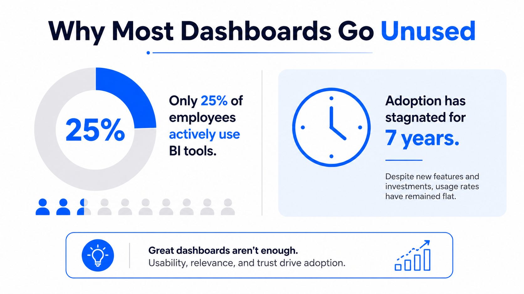
The gap is simple to describe and hard to close. Teams buy visualization software, but a monitoring capability only emerges when the dashboard connects to recurring operational decisions, shows trusted metrics, and makes exceptions visible to the people responsible for acting on them. That's why the rest of this guide treats the dashboard as a trust surface, not a chart gallery, and why adoption depends on shared ownership, alert relevance, and evidence about the data feeding each KPI. For a deeper note on why dashboards fail when they become static reporting screens, see Data Rich and Information Poor.
Table of Contents
Why Most Business Tracking Dashboards Go Unused
The first mistake is treating a dashboard like a finished artifact. Many teams spend weeks polishing the visuals, then discover that people still ignore the screen because it doesn't answer the question they really have, which is, “Can I trust this number enough to act on it?”
Adoption fails when trust is missing
A KPI can be correct and still unusable if the user can't tell whether it's fresh, complete, or affected by a broken pipeline. That's the central lesson behind the adoption gap from the BARC and Eckerson tracking, because software purchase does not automatically create organization-wide monitoring. The dashboard has to earn its place in daily work.
Practical rule: If a metric doesn't tell the owner what to do next, it's decoration, not monitoring.
That's why the best dashboards don't stop at “up” or “down.” They show whether the number is healthy, degraded, or unusable, and they make the reason visible fast enough for a business user to decide whether to rely on it.
The trust layer is the real product
A business tracking dashboard differs from a generic BI screen in that it connects business KPIs with data-quality, timeliness, anomaly, and schema signals so a team can tell the difference between a real business movement and a reporting failure. Without those controls, the dashboard can look polished and still mislead people at scale.
A useful way to think about the problem is ownership. If no one owns the metric, no one owns the explanation when it changes. If the alert is irrelevant, people stop opening it. If the data feed is stale, the screen trains users to distrust what they see.
The internal question every team should ask is simple, and it's the one that turns a dashboard from passive to operational: how to make data-rich teams less information-poor.
What a Business Tracking Dashboard Actually Is
A business tracking dashboard is closer to a car dashboard than a spreadsheet. The driver doesn't need every engine detail on the screen. They need a small set of indicators that show whether the vehicle is safe to keep moving, what needs attention, and whether the underlying systems are behaving normally.
Reporting view, analytical workbook, and tracking dashboard
A reporting view tells you what happened. An analytical workbook helps you explore why it happened. A business tracking dashboard sits between those two ideas, but it's built for ongoing use, not occasional review. It needs continuous signals because the business state changes all day, not once at month-end.
That's why the dashboard belongs in the operational path, not just the presentation layer. Source systems create events, pipelines move them, warehouses or lakes store them, and the dashboard turns those stored events into something people can act on. Data engineers, analytics engineers, business analysts, and executives all use the same system, but they don't use it for the same reason.
Who uses it and what they need
An engineer needs to know whether the data arrived on time and whether the schema changed. An analyst wants to know whether a shift in the KPI is real or introduced by a load problem. An executive wants a readable status that supports a decision without forcing a technical investigation.
A dashboard that serves everyone equally usually serves no one well.
The difference is not cosmetic. A static snapshot may be enough for a board deck, but a tracking dashboard has to behave like a control panel. It needs recurring refreshes, explicit ownership, and a clear path from a metric card to the dataset behind it.
For teams comparing interface patterns, this practical guide to product dashboards is a useful design reference because it shows how layout and decision context shape usability.
Core KPIs and the Quality Signals That Protect Them
A trustworthy business tracking dashboard starts with the KPI itself, but it becomes useful only when that KPI is paired with the signals that protect it. Operational, financial, customer, and platform metrics all need the same basic question answered, “Can I trust this number right now?”
KPI Category | Example Metrics | Required Trust Signals |
|---|---|---|
Operational | volume, throughput, backlog, SLA adherence | Freshness, anomaly status, last successful load, validation pass rate |
Financial | revenue, margin, cash movement, spend | Completeness, schema version, business-rule pass rate, owner, expected delivery time |
Customer | retention, churn, adoption, activity | Consistency, anomaly score, timestamp, source lineage, escalation owner |
Platform | availability, workload, latency, consumption | Timeliness, query status, validation state, affected dataset, incident link |
The quality dimensions behind those signals are accuracy, completeness, consistency, timeliness, and relevance (PMC article). A number can look right while still failing one of those tests, and that's enough to make the dashboard unsafe to use.
Every KPI needs technical context
The practical design pattern is straightforward. Give every card a source table, validation status, last successful load, expected delivery time, schema version, anomaly score, and business-rule pass rate. That turns a metric from “just a number” into a decision-ready object.
Key takeaway: A metric card without a freshness signal is a guess dressed up as a chart.
That's also why teams should define a freshness service-level objective for each KPI. If a revenue metric is late, structurally changed, or inconsistent with business rules, the dashboard should say so plainly instead of displaying a polished chart that hides the problem.
The trust layer should be visible, not buried
A common failure mode is to hide quality metadata behind a click. That forces users to trust the most important part of the system without seeing evidence. A better pattern is to show confidence state directly on the card, then allow drill-down to the records, columns, or upstream loads behind any warning.
For teams thinking about how to make metric governance practical, KPI quality control is a helpful internal reference point because it frames quality as part of the KPI itself, not an afterthought.
Design and UX Patterns That Drive Real Use
A dashboard gets used when it helps people decide quickly, not when it looks elaborate. The layout should make the most important thing obvious first, then let users drill deeper only when they need evidence or root cause.

Layout should match urgency
Put the highest-impact KPIs at the top left, use consistent card sizes, and avoid mixing too many chart types on the same screen. People scan dashboards fast, so visual hierarchy matters more than decoration. If an executive and an analyst need different levels of detail, use progressive disclosure rather than forcing one layout to do both jobs.
Alerting follows the same logic. A good alert is specific, owned, and actionable. A noisy alert is ignored, and once people stop opening alerts, the dashboard loses one of its main reasons to exist.
Ownership has to be visible
Every KPI card should show who owns the number and who gets paged when the value turns suspicious. That may sound small, but it changes behavior. Shared ownership builds trust because users can see that the metric belongs to a real process and a real team.
Design rule: If the dashboard can't explain who owns the metric, it can't explain who should act on it.
Drill-down paths matter too. A business user doesn't need the same level of detail as an analyst, but both should be able to move from the KPI to the evidence behind it without losing context. That's where a card becomes operational, because the same screen can support quick review and deeper diagnosis.
A useful external reference for layout decisions is this practical guide to product dashboards, especially for teams that want to keep the screen clean without stripping away the context people need.
For teams that tend to over-chart, bad pie charts is a reminder that the visual choice itself can reduce clarity before the metric logic even comes into play.
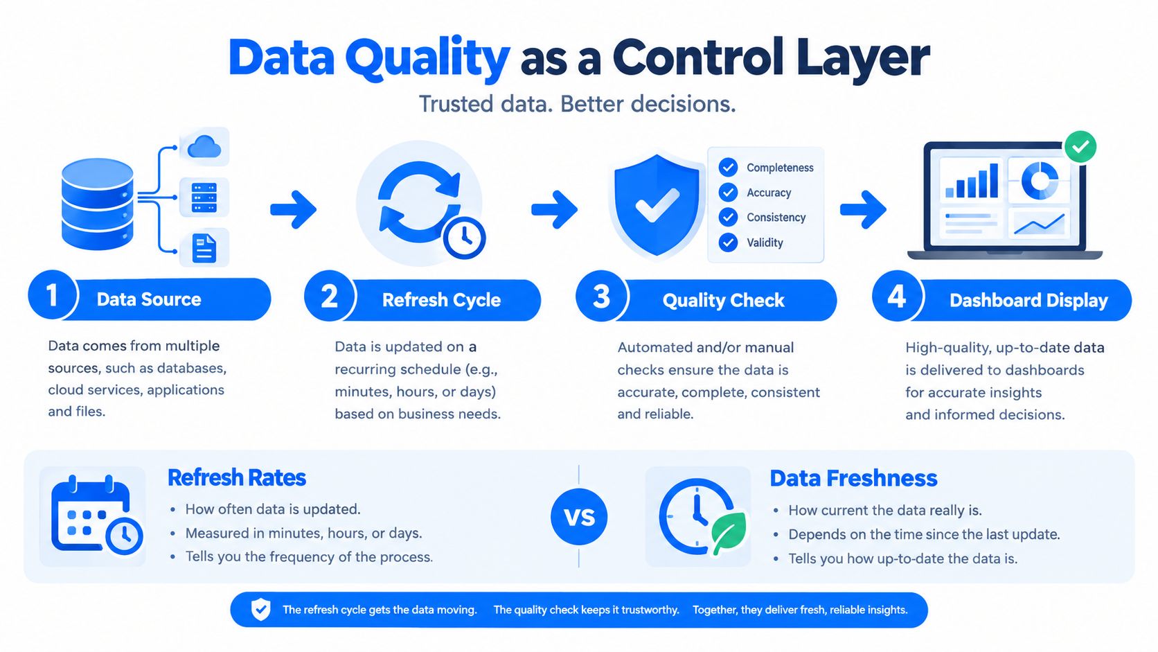
Data Quality and Timeliness as a Control Layer
Refresh frequency and information latency are not the same thing. A dashboard can update every fifteen minutes and still be wrong if a load failed, a schema changed, or the source data arrived incomplete. The core design goal is trustworthy availability, not just fast redraws.
Freshness is a business control, not a technical luxury
A useful dashboard card should show when the metric last updated, how long since the last successful load, and when the next arrival is expected. That gives both engineers and business users the same shared picture, but for different reasons. Engineers use it to debug pipelines, while business users use it to decide whether the metric is safe to act on.
Percentile latency matters because averages hide slow paths. If most queries are fast but a few are painfully slow, the average can still look fine while decision-makers wait on the outliers. That's why teams should watch P95, not just mean response time.
Separate the service levels
A freshness target doesn't solve a correctness failure. A query response target doesn't solve a validation failure. The dashboard should treat freshness, query speed, and correctness as separate service-level objectives so one passing check doesn't hide another broken one.
The card should answer three questions at once, is the data here, is it valid, and should I trust it?
In-database metric computation helps here because it reduces data movement and keeps sensitive data closer to the source. That approach also makes it easier to expose expected delivery time, late-load duration, anomaly status, and validation results on the same card without building a maze of disconnected tools.
For a deeper treatment of timing semantics and monitoring design, data timeliness definition, metrics, and how to monitor it is a good companion piece.
Dashboard Examples Powered by Trusted Observability Data
A business tracking dashboard earns trust when the screen makes cause and confidence visible at the same time. The layout can change depending on whether the team is watching business performance, platform behavior, or data quality, but the logic should stay consistent: show the KPI, show whether it is dependable, then show the path to the underlying detail.

Business Monitoring and platform observability
In a Business Monitoring setup, a revenue or customer-activity card can place the metric, anomaly state, and owner side by side. That helps a team separate normal growth from a change that needs review. A Data Platform Observability view applies the same pattern to workload, consumption, availability, and performance, with the audience shifting toward engineering and operations.
Consistency is what makes the interface learnable. If every screen uses the same trust language, users only have to learn the meaning once, then apply it across the rest of the dashboard. The result feels like one system, not a pile of disconnected charts.
Quality management and regulated data
A Data Quality Management screen can bring anomaly detection, deterministic validation, timeliness monitoring, and schema tracking into one place. That matters for financial services, healthcare, telecommunications, and public-sector teams, where traceability is part of the work, not a nice extra. When a metric affects compliance or operational planning, a trend line alone leaves too many questions unanswered.
Video walkthroughs can help teams understand how the cards behave in practice, especially when they are comparing statuses across datasets and owners.
Across every view, the pattern holds. The dashboard shows what changed, whether that change is trustworthy, who owns the answer, and where to look next.
A Practical Trust Checklist and First Steps
A business tracking dashboard earns trust through five signals, freshness, validation, anomaly, schema, and ownership. If any one of those is missing, the user has to guess, and guessing is not a decision strategy.
Start with the two KPIs people care about most, not the twenty they could care about. Attach the trust signals, name an owner, define a freshness service-level objective, and run a one-week pilot with the people who will use it. If the dashboard is valuable, they'll notice faster decisions and fewer arguments about whether the number is real.
For teams that need implementation help, Hire Developers can be useful when you need extra engineering capacity to build the underlying checks and dashboard logic cleanly. For a broader reliability baseline, the ultimate data reliability checklist for data teams is a practical companion.
Pick the brightest two KPIs: Choose the metrics that drive the most decisions.
Attach the trust layer: Show freshness, validation, anomaly, schema, and ownership on every card.
Name the escalation path: Make it obvious who fixes the problem when the card turns red.
Set one freshness target: Define how old the data can be before it stops being safe to use.
Pilot with real users: Watch what they do, then simplify the screen.
A dashboard matters when people rely on it without second-guessing the data. That's the standard digna is built for, combining business metrics with observability signals so teams can act on what's real. Visit digna to see how a trust-first dashboard approach fits your data, your workflows, and your decisions.


