Data Rich and Information Poor: A Practical Guide
|
7
min di lettura

You can be sitting in a Monday review with a clean dashboard on the screen and still not know whether the number moved because the campaign worked, the source table broke, or someone changed the definition last week. The charts look polished. The meeting still ends with the same uneasy question, what do we trust?
That gap is data rich and information poor, and it shows up when teams collect plenty of rows, events, and logs, but still can't turn them into decision-ready information fast enough. The issue isn't just volume. It's the time and trust required to convert raw signals into something a manager can act on without second-guessing the source.
Table of Contents
The Dashboard Trap and the DRIP Problem
A revenue dashboard can look healthy and still fail the only test that matters, can the team explain why pipeline changed? Marketing says the campaign drove demand, sales says the lead mix shifted, finance sees a number that doesn't match last week's forecast, and the analyst is left stitching together warehouse tables, SaaS exports, and spreadsheet overrides. That's the dashboard trap, plenty of display, not enough decision.
DRIP means data rich, information poor. It describes the widening gap between the amount of data a company collects and the amount of decision-ready information it can trust. Raw data is a row in a table, an event in a stream, or a log line in a file. Information is the same signal after it has context, freshness, ownership, and enough explanation to support action.
The distinction matters because teams often treat more data as the answer to missing insight. In practice, that can make the gap wider. More tables mean more joins, more tools mean more handoffs, and more handoffs mean more chances for someone to ask a question no one can answer confidently. If you want a practical place to see how dashboarding fits into this problem, the internal guide on data quality dashboards shows why surface-level visibility often stops short of real control.
Practical rule: if a metric takes a meeting to explain, it isn't information yet.
The right mental model is latency, not volume. A company can own plenty of data and still be slow to decide because the data arrives late, lacks context, or hasn't been checked against the business rules that make it trustworthy. That's why DRIP is less about storage and more about the path from signal to action.
Where the Phrase Comes From and Why It Still Matters
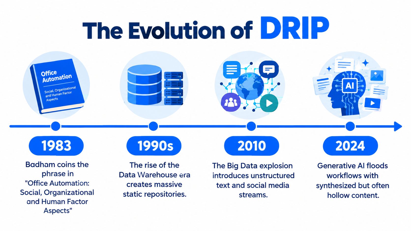
The phrase “data rich and information poor” has been around for decades because the failure mode keeps coming back in new clothing. It was popularized in the 1983 business book In Search of Excellence, where it captured a simple management problem, organizations can accumulate data without converting it into usable information. Later commentary on the same idea tied it to a 2010 estimate that the U.S. economy lost $997 billion annually to information overload, using 78.6 million full-time knowledge workers as the base for that estimate, which is why the phrase still lands in boardrooms and analytics teams today (historical overview of the phrase and the 2010 estimate).
Why the wording survives every tooling cycle
The wording survived BI, big data, and now AI because the tooling changed faster than the underlying problem. A warehouse can centralize data, a dashboard can summarize it, and a model can score it, but none of those steps guarantee that the result is timely, explainable, or trusted enough for action. That's why the phrase still belongs in any serious 2025 analytics discussion, especially when teams keep adding systems faster than they improve the decision path.
The phrase endures because the symptom keeps changing shape, not because the diagnosis is outdated.
The modern twist is AI. Generative tools can produce more summaries, more forecasts, and more prose, but if the underlying data is stale or untrusted, the output is still hollow. DRIP is still the right shorthand because it points to the actual failure: information doesn't arrive in a form humans can safely use.
What Causes the Gap Between Data and Information
The most common cause is fragmentation. A single business question often depends on data spread across warehouses, SaaS apps, operational stores, and spreadsheets, which means the answer has to cross multiple ownership boundaries before anyone can trust it. In that situation, the delay isn't just technical, it's interpretive, because each handoff adds another chance for definitions to diverge.
Four structural causes that show up in real teams
The gap usually comes from a mix of fragmentation, tool sprawl, overload, and latency. A helpful way to scan the problem is to compare the structural cause with the symptom it creates.
Cause | Typical Scale in 2025 | Operational Symptom |
|---|---|---|
Data fragmentation | Many systems, each holding part of the answer | Teams argue about which table is authoritative |
Tool sprawl | Multiple analytics and observability tools in parallel | No shared view of quality, freshness, or lineage |
Information overload | Too many dashboards and metrics competing for attention | Meetings fill with numbers, but no decision gets made |
Processing latency | Data arrives after the decision window has passed | Leaders act on stale numbers or wait for a manual refresh |
The overload problem is not abstract. Modern workplace reporting says knowledge workers get interrupted constantly, and many teams spend time searching across apps instead of acting on the result (workplace overload summary). In other words, the business doesn't just have more data, it has more friction between the question and the answer.
A useful related read is the Artul.ai blog analysis of why earnings-call summaries fail, because it shows the same pattern in a different setting, the raw material exists, but the usable narrative doesn't surface cleanly.
Why latency matters more than data volume
Batch pipelines still dominate many environments, so the decision often happens before the freshest data arrives. That creates a time mismatch. A manager sees a KPI, assumes it reflects the present, and makes a call on data that may already be outdated. The issue is not that the company lacks signals. It's that the signal reaches the decision too late, stripped of the context needed to interpret it.
If you want to reduce that gap, the internal overview of disparate sources of data is a useful lens, because it makes the cost of scattered inputs easier to see.
The Real Business Cost of Being Data Rich and Information Poor
Poor data quality doesn't just annoy analysts. It creates a cost ladder that gets steeper every time bad data moves downstream. A widely cited industry estimate says poor data quality costs organizations an average of $12.9 million per year, and the same source's cited D&B study describes a $1, $10, $100 escalation, where prevention costs about $1 per record, identifying and resolving an issue costs about $10 per record, and correcting an error after an event costs about $100 per record (cost escalation and enterprise impact).
Cost starts small, then compounds fast
That escalation is why late detection hurts so much. A bad value caught during validation is cheap. The same bad value used in a dashboard is more expensive. Once it reaches a pricing engine, a compliance report, or a customer-facing workflow, the repair bill jumps because people have to trace the issue, explain the business impact, and undo the downstream decisions.
Stage | Cost per Record | Typical Trigger | Example |
|---|---|---|---|
Prevention | $1 | Validation before bad data enters the pipeline | A rule blocks an invalid code at ingest |
Identification and remediation | $10 | Analysts find and fix the issue after it appears | A failed load gets traced to a malformed file |
Correction after impact | $100 | The error reaches a report, workflow, or regulatory process | A wrong value changes a pricing or compliance decision |
A cheap fix is one you catch before it spreads.
The hidden cost is opportunity loss. If a team spends days reconciling the truth, they miss the chance to act while the market is still moving. A retailer with a pricing engine tied to a six-month-old cost table may not notice the mistake until margins drift or a competitor forces the issue. By then, the damage isn't just the wrong price. It's the trust the executive team loses in the numbers.
That's why DRIP is a decision-latency tax. You pay it in slower reactions, more reconciliation work, and more meetings spent proving the data is real instead of deciding what to do next. The internal data quality business case is relevant here because the economics only improve when teams reduce propagation, not just cleanup.
How to Diagnose Your Own DRIP State
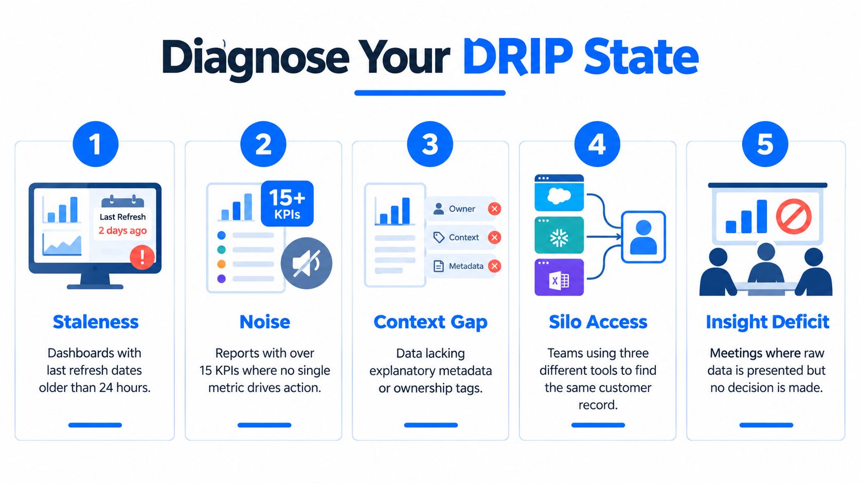
You don't need a survey to know whether your team is in DRIP territory. You need to look for symptoms that show up in daily work. The clearest one is staleness, which is easy to spot when a dashboard's refresh slips past its service level without anyone noticing or a report timestamp hasn't moved in weeks. If the number looks current but the load behind it isn't, the dashboard is decorative.
Five signals that usually appear together
Staleness: the refresh is late, the timestamp hasn't changed, or the latest run didn't land on time.
Silent distribution shifts: a KPI changes shape without an obvious business reason.
Schema drift: a source table adds, removes, or renames fields and downstream logic keeps running.
Delivery failures that get patched by hand: someone reloads the file, edits the extract, or reruns the job without fixing the root cause.
Unexplained KPI moves: meetings keep circling around the same number because nobody trusts the jump or drop.
The quickest checks are also the most useful. Freshness checks tell you whether the data arrived when expected. Statistical anomaly scoring tells you whether the pattern changed in a way humans should review. Schema diffing shows structural change before it breaks downstream consumers. Lineage-based triage tells you where the break started instead of letting teams guess. The internal reference on data observability metrics is a good companion if you want to map those checks to operational signals.
A small retail example that exposes the pattern
A retail analytics team sees a revenue dip, a late warehouse feed, and a column rename in the upstream product table. None of those signs alone proves the pipeline is broken. Together, they point to one failed ETL job that nobody flagged because the report still rendered and the error was hidden behind a manual patch.
If more than two of those five signals are true, you're already in DRIP territory. At that point, the problem isn't whether the data exists. The problem is whether the organization can trust it quickly enough to act.
Five Operational Controls That Close the Gap
A dashboard can look healthy while the underlying pipeline is already drifting. Controls are what catch that drift before people start arguing about which number is real. Each one covers a different failure mode. Governance clarifies ownership and lineage. Observability surfaces unexpected behavior. Timeliness keeps latency visible. Validation blocks bad records before they spread. Schema tracking catches structural change before downstream systems misread it.
Control | DRIP Symptom It Solves | Minimum Viable Implementation | Failure Mode If Skipped |
|---|---|---|---|
Governance | Confusion over ownership and lineage | Assign owners, define critical data elements, maintain lineage | Paperwork theater with no operational accountability |
Observability | Silent anomalies and missing loads | Continuous anomaly and freshness checks on critical tables | Teams notice problems only after dashboards go wrong |
Timeliness | Stale outputs | Set freshness SLAs for key pipelines and alerts for missed windows | Accurate data still arrives too late to matter |
Validation | Bad records propagating downstream | Business-rule checks at ingest and before transformation | Errors spread into reporting, compliance, and AI inputs |
Schema tracking | Structural drift | Compare incoming schema to expected structure on every load | Downstream jobs fail quietly or misread the data |
The controls work together, not in a ladder
Governance without observability turns into process paperwork. Observability without validation spots a symptom and still lets bad data through. Validation without timeliness produces clean data that arrives after the decision window has closed. Schema tracking without ownership raises an alert, but nobody is clearly responsible for the fix.
That is why teams need a control set, not a single fix. One practical pattern is digna, which runs data quality and observability checks inside the customer's environment across anomalies, timeliness, validation, schema tracking, and business monitoring.
The objective is to shorten the gap between a change in the data and a safe decision about what to do next. A slow pipeline, a hidden schema shift, or a failed load should surface as a trust problem, not as a surprise in the weekly review. When these controls work together, the dashboard stops acting like an alarm bell and starts acting like a trust surface for the business.
From Rule Factories to AI-Driven Observability in Practice
A multinational manufacturer can spend Fridays hand-writing threshold checks for sensor feeds, then discover on Monday that the rules were already out of date. That model does not scale when the environment contains millions of signals, especially when recent manufacturing commentary argues that less than 1% of daily factory data is used for decisions (manufacturing DRIP and context problem). Manual rule factories turn engineers into maintenance staff, and they still miss the moments that matter.
What changes when observability learns the baseline
AI-driven observability replaces rigid thresholds with learned baselines, so a monitor can flag a new break when cardinality, freshness, or schema behavior moves outside normal patterns. That matters when the failure is novel. A rule written for last month's pipeline will not catch a new field arrangement or an unexpected delay pattern, but an adaptive monitor can still call attention to it, as covered in this guide on how AI detects data anomalies in data pipelines.
A useful contrast is this:
Capability | Rule Factory | AI-Driven Observability |
|---|---|---|
Threshold setup | Hand-authored by engineers | Learns normal behavior from data |
Change detection | Catches only known failure modes | Flags novel shifts in volume, freshness, or schema |
Maintenance burden | High, because rules age quickly | Lower, because baselines update with the dataset |
Alert quality | Often noisy or brittle | More focused on high-signal deviations |
Team usage | Centralized in engineering | Modular enough for domain teams to use |
The trade-off is real. AI reduces alert fatigue and catches unfamiliar patterns, but it still needs oversight. Baselines can drift, models can age, and a smart system still needs humans to review exceptions, confirm root cause, and feed the outcome back into governance. That feedback loop matters more than the alert itself.
Better automation does not remove accountability, it makes accountability earlier.
The strongest setups combine model-driven detection with lineage-aware freshness scoring and modular monitors that domain teams can compose without filing a ticket for every new rule. That is practical at scale, because the cost of manual checking has already passed the value of the manual check.
Your First Steps Toward Becoming Information Rich
Adding another dashboard usually deepens DRIP if the new chart doesn't have validation, lineage, or a freshness contract behind it. Each extra view can add another place to argue about the number instead of another way to trust it. The first move is not to report more, it's to shorten the feedback loop.
A practical 90-day sequence
Name the owners: assign a human owner to each critical dataset and each business KPI.
Write the contract: define what “good” means for the key tables, including freshness and accepted values.
Instrument the highest-risk pipeline: add anomaly detection and freshness checks to the revenue or operations feed that matters most.
Add validation at the edge: check records in CI or ingest before bad values spread.
Track schema changes: alert on new, missing, or renamed fields before consumers break.
Pick one end-to-end KPI: follow it from source to dashboard so every step is visible.
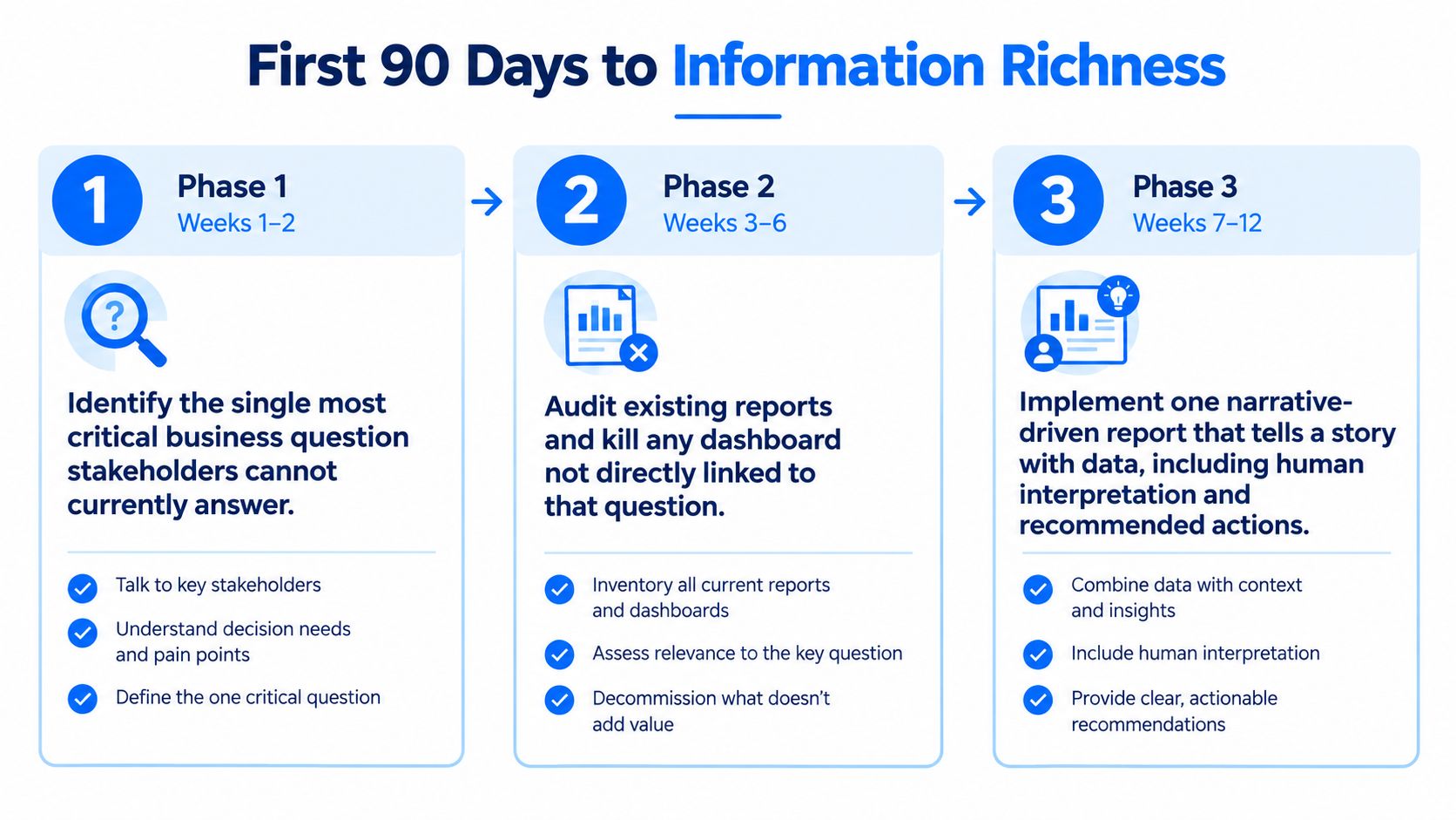
The easiest place to start is one weekly decision the team already makes. Instrument the data behind it so the answer can be defended without a scramble. If the team can explain the number, trust it, and act on it in the same meeting, you're moving out of DRIP and into information richness.
If you're trying to turn data into something the business can trust, digna gives you the controls to do it, anomaly detection, timeliness monitoring, validation, schema tracking, and business monitoring inside your own environment. Visit digna to see how those controls can help close the gap between raw data and the next decision.
To make freshness windows and missed loads visible before a stale KPI reaches the weekly review, see how digna Timeliness learns when each dataset is expected to arrive.
Frequently asked questions
What does data rich and information poor mean?
Data rich and information poor, or DRIP, describes the gap between how much data a company collects and how much decision-ready information it can trust. Raw data is a row, event or log line; information is that signal with context, freshness, ownership and enough explanation to support action.
Where does the phrase data rich, information poor come from?
It was popularized by the 1983 business book In Search of Excellence. Later commentary linked it to a 2010 estimate that information overload cost the U.S. economy $997 billion a year, based on 78.6 million full-time knowledge workers, which is why the phrase still resonates with analytics teams.
What causes organizations to be data rich and information poor?
Four structural causes usually combine: data fragmentation across warehouses, SaaS apps and spreadsheets; tool sprawl with no shared view of quality or lineage; information overload from too many dashboards; and processing latency, where batch pipelines deliver data after the decision window has already passed.
How much does poor data quality cost a business?
A widely cited estimate puts the average at $12.9 million per year. The cost also escalates with time: roughly $1 per record to prevent an error, $10 to identify and fix it, and $100 to correct it after it reaches a report, pricing engine or compliance process.
How can I tell if my team is data rich and information poor?
Look for five signals: stale dashboards, silent distribution shifts, schema drift, delivery failures patched by hand, and KPI moves nobody can explain. The article's rule is that if more than two of these are true, your team is already in DRIP territory and cannot trust its data quickly enough.