What Is Data Quality Control and How Does It Actually Work
|
6
min read

Data quality control is the operational layer that runs continuous checks against 97% complete, 92% valid, and other defined criteria to flag, quarantine, or block records that violate accuracy, completeness, consistency, timeliness, validity, or uniqueness. It's different from governance or assurance because it lives in the pipeline, not just in policy documents or cleanup reviews.
You know the problem already. A dashboard looks fine at 9 a.m., then someone notices the revenue number is off because a feed arrived late, a column changed type, or a hidden drift slipped through overnight. That's the moment when what is data quality control stops sounding abstract and starts looking like an operational safeguard.
Table of Contents
The Real Problem Behind Bad Data and What Quality Control Actually Means
Where the Discipline Came From and Why Statistical Thinking Still Applies
How Data Quality Control Differs From Assurance Management and Observability
Translating Quality Dimensions Into KPIs You Can Actually Measure
Implementation Checklist Roles and the Controls That Hold the Loop Together
Why Treating Quality Control as a Continuous Loop Changes Everything
The Real Problem Behind Bad Data and What Quality Control Actually Means
A broken dashboard rarely announces itself. More often, a late load, a schema change, or a small drift in a source table makes the numbers look plausible until a human notices that the story doesn't add up.
What quality control actually does
Data quality control is the operational layer that applies continuous checks against explicit criteria, then flags, quarantines, or blocks records that fail accuracy, completeness, consistency, timeliness, validity, or uniqueness checks. IBM describes quality control in terms of measurable dimensions and operational metrics such as error rate, percentage of missing values, record completeness ratio, data freshness score, and percentage of records failing validation rules (IBM on data quality).
That matters because quality control isn't a one-time cleanup task. It's a control loop, define the rule, set the threshold, measure the signal, and react when the signal moves outside the acceptable band. The U.S. Geological Survey frames QC as applying methods or processes that determine whether data meet explicit quality goals and criteria for individual values (USGS QC practices).
Practical rule: if a check can't tell you what “good” looks like, it isn't quality control yet.
Why teams get tripped up
The confusion usually comes from treating bad data as a cleanup problem instead of a control problem. Teams patch obvious errors after a report breaks, but they don't measure the process closely enough to catch the drift before it reaches the dashboard.
A better mental model is simple. The pipeline produces data, the control layer tests that data against standards, and the results feed alerts, quarantines, or blocks. That sits below governance, which defines the standards, and above ad hoc scripting, which usually only solves the current incident.
A table can be “mostly fine” and still be unfit for use if the missing rows or late arrivals land in the wrong part of the workflow.
The operational payoff is clarity. Once teams stop calling every cleanup task “quality,” they can decide what belongs in the pipeline, what belongs in review, and what needs recurring monitoring. That separation is where control becomes useful instead of vague.
Where the Discipline Came From and Why Statistical Thinking Still Applies
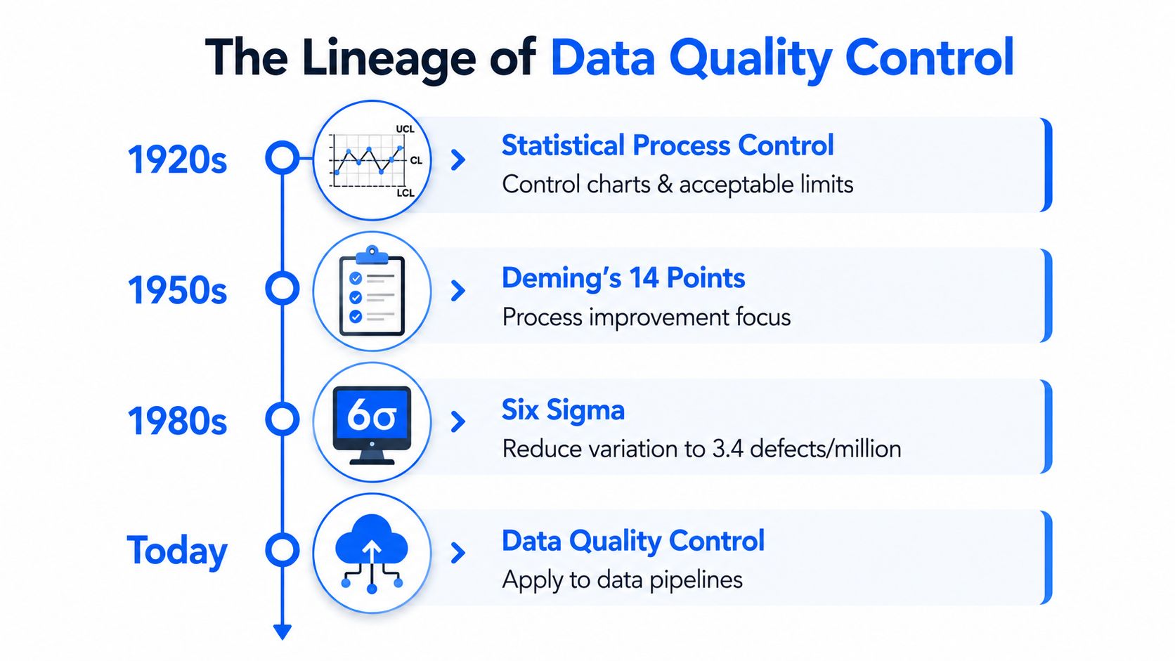
A bad dashboard row often starts much earlier than the dashboard. Data quality control grew out of statistical quality control, which uses repeated measurement and control charts to decide whether a process is staying within limits or needs intervention (statistical quality control history).
From production lines to data pipelines
The historical shift matters because the same logic carries into data systems. On a production line, quality control depends on acceptable limits, repeated sampling, and rejection rules. In laboratory medicine, QC is still described as a statistical process for monitoring the analytical process that produces patient results, which shows the discipline long predates modern data platforms.
That idea maps cleanly to pipelines because pipelines behave like production processes. Input distributions change, schemas drift, delivery windows slip, and record patterns move in ways that are easy to miss if you only inspect the latest output once.
A pipeline that looks fine on one run can still be drifting. The process needs repeated checks, not one-off inspection.
Why metrics are the point
The key insight is that quality control turns “something feels wrong” into a measurable signal. IBM's framing makes that explicit, since quality is judged through dimensions that can be tracked over time, compared across tables, and monitored for drift (IBM on data quality).
What matters is repeatability. A single failed run may be noise. Repeated signals outside a limit tell you the process itself has changed.
That statistical heritage also explains why thresholds matter so much. Rejection rules are usually fixed, not intuitive. In analytical practice, one result beyond an action limit, two successive results beyond the same warning limit, or ten successive results on the same side of the mean can all trigger rejection (FAO QC rules).
The same discipline still works for data teams. Freshness checks, volume checks, schema tracking, and business-rule validation all depend on the same habit, measure the signal, compare it to a limit, and act when the pattern changes. For teams that want that control layer to sit close to the pipeline, data observability practices can help surface the signals before they become user-facing problems.
How Data Quality Control Differs From Assurance Management and Observability
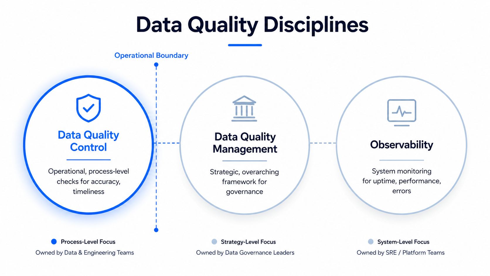
The easiest way to understand the stack is to separate intent from execution. Data quality assurance is the planning side, data quality management is the broader program, observability is the telemetry layer, and data quality control is the technical layer that runs the checks and acts on the result.
The boundary that matters
Quality assurance defines what should be true. Management owns the standards, governance, and operating model that support that goal. Observability watches the system for health, performance, and error signals. Quality control enforces the actual criteria on the data itself, often at record level and often close to the pipeline.
That boundary matters because many teams mix these terms as if they were interchangeable. They aren't. A governance team can define acceptable country codes, but the control layer still has to block a bad code from entering the warehouse. A monitoring tool can show a freshness delay, but QC decides whether that delay violates a rule and should trigger action.
Where each check belongs
Validation belongs in pipelines. It catches wrong values, nulls in mandatory fields, and mismatched formats before they spread.
Timeliness belongs in delivery monitoring. It checks whether a feed arrived inside its expected window.
Schema tracking belongs near ingestion. It catches type changes, added columns, and removals before downstream code fails.
Anomaly detection belongs wherever drift can hide. It watches volume, distribution, and behavior for silent change.
The practical question isn't whether a team needs all four. It's which layer owns each control, and whether the action is automated or reviewed. A missing load may need an alert and a hold. A new field may need review before promotion. A business-rule violation may need quarantine.
For a broader monitoring layer, digna's data observability page fits the kind of operational visibility that sits alongside control rather than replacing it.
The clean mental map is simple. Assurance defines the target, management sets the program, observability watches the system, and control enforces the rules. Once you see those boundaries, the tool choices get easier.
The Four Core Mechanisms That Make Quality Control Operate
The abstract definition becomes real through four mechanisms. Each one catches a different kind of failure, and each one maps back to the core dimensions of quality.
Validation rules and timeliness monitoring
Validation rules enforce business logic. If age can't be negative or a country code must come from an allowed list, the rule should reject records that violate that standard. This is the most familiar form of control because it looks like a gate, and that's exactly what it is.
Timeliness monitoring protects freshness. If a daily feed is expected by 8 a.m. and shows up four hours late, the problem isn't just operational inconvenience. The delayed data can distort reporting, freeze downstream decisions, and make every metric look stale until the load completes.
Late data is still data, but it's often unusable data.
Anomaly detection and schema tracking
Anomaly detection watches for silent drift. A sudden drop in row counts, or a sharp shift in the distribution of a key metric, may not violate any single rule, but it can still signal a broken source, a changed upstream process, or a partial extraction. digna's platform description places anomaly detection in this category, using AI and statistical methods to detect unexpected change without manual rule maintenance.
Schema tracking catches structure changes. If a column changes from string to integer, or a field disappears entirely, downstream models and dashboards can fail even if every row passes basic validation. Schema checks keep the structure of the data contract visible.
Why close-to-data execution changes the game
These controls work best when they run where the data lives. That's because in-database execution reduces movement, shortens detection time, and keeps the data resident during inspection. The Ocean Observatories QC guidance makes the broader point clearly, control is strongest when it acts before defects propagate into downstream systems (QA/QC protocols).
The six dimensions show up here in practical form. Validation supports validity and completeness. Timeliness monitoring handles freshness. Anomaly detection watches consistency over time. Schema tracking protects structural consistency and downstream reliability.

Translating Quality Dimensions Into KPIs You Can Actually Measure
Teams usually understand the dimensions faster once they see the KPI behind them. The trick is to turn an idea like “good quality” into a number that can be tracked over time and tied to an action.
Dimension to KPI mapping
Dimension | KPI | Example Threshold | Enforced By |
|---|---|---|---|
Accuracy | Error rate on a sampled reference set | Investigate when error rate breaks the agreed tolerance | Validation and review |
Completeness | Percentage of non-null values in mandatory fields | Alert when required fields fall below the defined floor | Validation rules |
Consistency | Cross-system reconciliation pass rate | Escalate when source and target no longer match | Reconciliation checks |
Timeliness | Gap between expected and actual arrival | Flag when a feed misses its scheduled window | Timeliness monitoring |
Validity | Percentage of records passing business rules | Quarantine rows that fail rule checks | Record-level validation |
Uniqueness | Duplicate record count per primary key | Reject duplicate keys immediately or queue them for review | Duplicate detection |
The key is not the exact formula, it's the fact that the formula is explicit. Collibra's list of common checks maps neatly to these dimensions, including duplicate detection for uniqueness, null-value checks for completeness, formatting checks for consistency, business-rule checks for validity, and recency checks for freshness or timeliness (Collibra on six dimensions).
How thresholds work in practice
Thresholds can come from fixed rules, learned baselines, or a mix of both. A fixed rule is useful when the business requirement is strict, such as a mandatory field or an allowed code list. A learned baseline is better when normal behavior varies by season, volume, or source.
That's where the statistical heritage comes back in. Rejection can be triggered by one result beyond an action limit, two successive results beyond the same warning limit, or ten results on the same side of the mean (FAO QC rules).
Good KPI design does two things at once. It measures the problem and tells someone what to do next.
For teams building these metrics into a platform workflow, digna's dimension mapping page is a useful reference for aligning checks with operating definitions.
A Day in the Life of a Controlled Pipeline With digna
At 7:10 a.m., a finance team opens its warehouse dashboard and sees that a critical feed is still missing. The numbers are technically empty, but the pipeline has already told the story, timeliness monitoring has flagged the arrival delay before the business starts trusting stale totals.
What the control loop surfaces
By the time the vendor load finally lands, schema tracking catches a type change in one column. A field that was stored as text now arrives as an integer, which would have broken a downstream transformation later in the day. Then anomaly detection surfaces a sudden drop in transaction volume, which points to a partial source issue rather than a simple lateness problem.
Validation finishes the job. Rows that violate business logic get quarantined before they reach the reporting layer, so the analysts don't spend the afternoon explaining a metric that shouldn't have been published in the first place.
digna is built for that kind of workflow. Its platform description centers on data anomalies, timeliness, data validation, and a schema tracker, with execution inside the customer's database so the data stays resident and the checks run close to the source. It also presents the results through a unified interface for engineers, analysts, and stakeholders, which matters when one team owns the pipeline and another owns the decision.
The practical difference is speed and containment. If the check runs where the data already lives, there's less movement, less duplication, and less chance that a bad record travels into a dashboard, model, or compliance report.
Why the in-database model matters here
In regulated environments, that containment isn't a nice-to-have. It's the difference between detecting an issue early and explaining it after the fact. The control layer needs to be visible enough for operations and strict enough for audit, without making everyone stitch separate tools together.
A controlled pipeline doesn't make data perfect. It makes defects visible before they become decisions.
Implementation Checklist Roles and the Controls That Hold the Loop Together
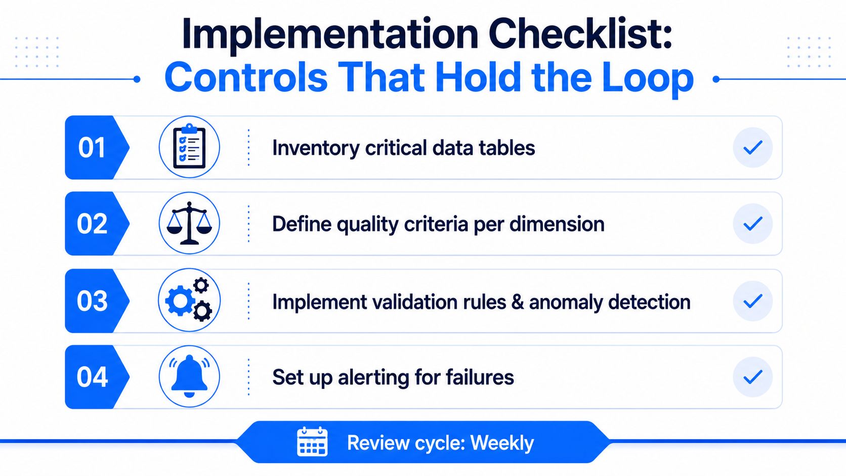
Start with the tables that matter most. If a dataset feeds finance, operations, or a model, it belongs on the first pass list. Then define the criteria per dimension, set thresholds using fixed rules or learned baselines, and wire each alert to a named owner who knows what the signal means.
A simple operating checklist
Inventory critical tables. Focus on the datasets that drive decisions, reports, or regulated outputs.
Define quality criteria per dimension. Write down what valid, complete, timely, and unique mean for each table.
Implement technical checks. Put validation, anomaly detection, timeliness, and schema tracking where the data is produced or ingested.
Document every control. Keep the rule, owner, threshold, and escalation path together so knowledge survives turnover.
A recurring review cadence matters just as much as the checks themselves. Without it, teams end up with monitors nobody owns, alerts nobody trusts, and thresholds nobody remembers how to tune.
Who owns what
Data engineers own the technical checks and pipeline wiring.
Analytics engineers own the business rules and metric definitions.
Heads of data quality own standards, thresholds, and operating consistency.
Governance teams own auditability and policy alignment.
Business analysts interpret what each signal means for decisions.
That split keeps the loop from collapsing into a single overloaded inbox. It also makes it easier to decide whether a signal needs an automated hold, a human review, or a governance escalation.
Platforms such as digna bring anomaly detection, validation, timeliness, and schema tracking into one operational loop, so teams don't have to stitch four separate tools together just to watch a handful of critical tables. The point isn't more tooling, it's a cleaner control path.
Why Treating Quality Control as a Continuous Loop Changes Everything
The dashboard in the opening scene went wrong because nobody was continuously watching the process. Once quality control becomes an ongoing loop, validation enforces rules, timeliness watches arrivals, anomaly detection catches drift, and schema tracking flags structural change before executives, models, or regulators see the bad version.
That's the shift. Data stops being treated like a pile of records that needs periodic cleanup and starts behaving like a managed production system with measurable controls. The distinction between control, assurance, and management gives teams the vocabulary to choose the right tool and assign the right owner.
Modern platforms like digna execute those checks inside the customer's database, which keeps data private while still giving teams operational visibility. That's the practical shape of a mature control layer, visible, measurable, and close enough to the data to matter.
If you're building or cleaning up a control layer, visit digna to see how in-database anomaly detection, validation, timeliness monitoring, and schema tracking can fit into the same workflow. It's a practical way to keep critical data under continuous watch without pushing everything through separate tools or exposing the data outside your environment.


