Outlier Detection: Master Methods & Avoid Pitfalls
|
7
min read

Your dashboard looked fine on Friday. By Monday morning, revenue appears to have fallen off a cliff, the weekly ops report is full of blanks, and somebody in Slack is asking whether the data warehouse is “having a moment”. Nobody knows yet whether you've found a real business problem or a completely invented one.
That's the daily reality behind outlier detection. Organizations typically encounter it first as a panic, not a theory. A sales spike that isn't real. A model that starts recommending nonsense. A pipeline that ran, but loaded the wrong shape of data. The painful part isn't just spotting the weird value. It's figuring out whether the number is wrong, why it's wrong, who needs to act, and how fast.
A lot of writing on this topic stops at algorithms. Useful, but incomplete. In production, the hard bit starts after the alert.
Why Your Data Is Lying to You
Monday-morning data failures rarely arrive with a polite label. They arrive as confusion. Finance thinks bookings dropped. Marketing says campaign spend is normal. Product sees traffic holding steady. The dashboard says one thing, the business says another, and the data team gets drafted as referee.

What makes this dangerous is that anomalies travel. One odd batch can poison a KPI, trigger a bad executive decision, distort a forecast, or retrain a model on junk. In operational systems, the effect compounds because downstream jobs trust upstream tables far more than they should.
Small blips, large consequences
A single outlier might be a genuine signal. Maybe sales really did collapse in one region. Maybe a payment flow genuinely broke. But the boring explanation is often the right one: a late load, a duplicated ingest, a broken join, a changed schema, or a unit mismatch.
That's why teams need a discipline, not just a detector.
Dashboards break trust: Once a reporting layer shows absurd numbers, stakeholders remember the absurdity longer than the fix.
Models inherit rubbish: ML systems don't care whether a value is silly. If it's in the feature set, they'll happily learn from it.
Humans overreact fast: One strange chart can trigger freezes, escalations, and unnecessary incident calls.
If you've seen this in operational environments, the same pattern shows up outside BI. Spreadsheet-heavy workflows are especially vulnerable because hidden transformations and manual edits make anomalies harder to trace. This piece on commercial fleet data management insight captures that problem well in a very practical setting.
Outliers aren't just a stats problem
Outlier detection matters because data quality failures rarely announce themselves as “quality failures”. They masquerade as business events. That's what makes them expensive.
Practical rule: Treat every surprising number as untrusted until you can explain both the data path and the business context.
Teams that handle this well usually stop arguing about whether the number is “real” and start asking better questions. Did the source change? Did the pipeline arrive on time? Did row counts move with the metric? Did the shape of the data shift before the value did? That's the difference between firefighting and diagnosis.
For a deeper look at how bad data distorts decision-making, this guide on the impact of poor data quality on business decisions is worth keeping handy.
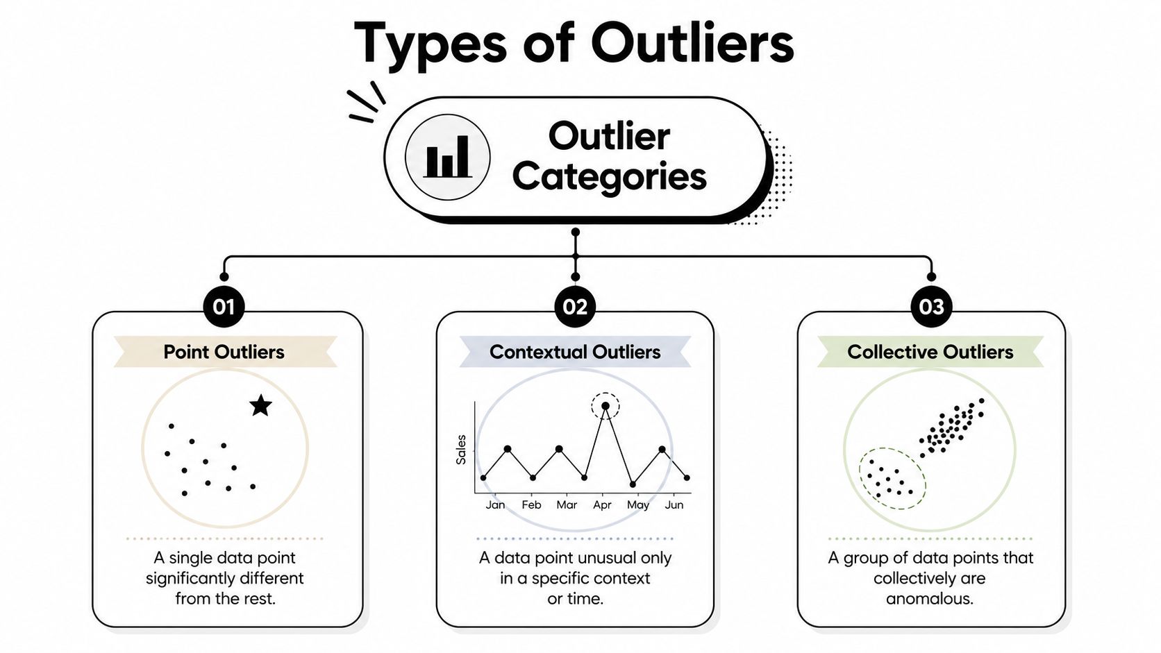
Understanding the Different Flavors of Outliers
Not every outlier is the same beast. If you treat all anomalies as “a weird number”, you'll choose the wrong method and annoy everyone with noisy alerts.
Point outliers
This is the classic one. A single value sits far away from the rest, like a customer age of 200 or a negative quantity in a table that should never contain returns. You don't need much imagination to spot these.
They're the easiest to explain and often the easiest to catch with simple statistical checks. They're also the easiest to over-focus on, because they look dramatic in charts and make people feel productive.
Contextual outliers
A value can be perfectly normal in isolation and still be wrong in context. Selling winter coats in July might be fine somewhere. In southern Spain, less so. A traffic surge at noon could be expected. The same surge at 03:00 on a service that should be quiet is suspicious.
Many simple rules often fail. They don't understand seasonality, timing, geography, source system quirks, or known business cycles. They know only that a number crossed a line.
A penguin in the Sahara is unusual. A penguin in Antarctica is just Tuesday.
Collective outliers
These are the sneaky ones. Each point on its own looks harmless, but the group forms an abnormal pattern. Think of a cluster of slightly delayed events that together reveal a stuck upstream system, or a run of values that are individually plausible but collectively impossible given normal behaviour.
Collective outliers matter a lot in time-series and operational monitoring because production systems often fail as patterns, not as fireworks.
Why classification matters
The kind of outlier changes the tooling.
Outlier type | What it looks like | What usually works |
|---|---|---|
Point | One obviously odd value | Simple rules, robust statistics, validation checks |
Contextual | Normal value, wrong time or setting | Time-aware baselines, segmentation, clustering |
Collective | A strange pattern across many records | Sequence analysis, density methods, group-level checks |
A mid-level team can save itself a lot of pain by asking three questions before building anything:
Is the anomaly single-point or pattern-based?
Does context define “normal”?
Will the responder need record-level evidence or trend-level evidence?
Those answers shape everything from thresholds to dashboard design. If your anomalies live in time-series data, detecting anomalies in time series is the right rabbit hole to go down next.
Choosing Your Weapon Statistical vs Machine Learning Methods
Some teams treat this like a holy war. It isn't. Statistical methods and machine learning methods both work. They just fail in different ways.
When old-school statistics still earns its keep
Start with the boring tools because boring tools are predictable. Z-score, IQR, and MAD are still useful when your data is reasonably stable and you need something interpretable. You can explain them to auditors, analysts, and the manager who only wants to know why the alert fired.
The catch is distribution shape. The European Central Bank's methodology for automated outlier detection in high-dimensional datasets explicitly avoids relying on traditional Z-score thresholds for skewed or non-Gaussian data, and instead standardises using outlier-resistant estimates with median absolute deviation to avoid distortion from extremes in the first two moments of distributions, described in ECB Working Paper No. 2171. That's the practical lesson. If your data is ugly, your assumptions need to be tougher than your dashboard theme.
A separate healthcare study found that 42% of EU-based institutions used 95% confidence intervals for provider-level outlier classification, while 37% relied on funnel plot limits from internal benchmarks and provider volumes, according to the PMC study on European healthcare provider data. That tells you something important about production reality. Teams often choose methods that are understandable and operationally acceptable, even when they aren't the most advanced.
Where machine learning earns the extra complexity
Machine learning methods start paying off when normal behaviour is messy. High dimensional data, mixed signals, seasonal shifts, and subtle interactions are where simple thresholds begin to look silly.
In the European Statistical System, time-series outlier detection uses a metadata-driven clustering step before applying DBSCAN with dynamic time warping, which reduced false positives by 37% compared to static threshold methods in pilot validations, as described in the UNECE paper on ESS outlier detection. That's a production-grade example of contextual detection done properly. The system doesn't ask whether a point is globally weird. It asks whether it's weird for its cluster.
For wide enterprise datasets, dimensionality becomes the villain. In benchmark tests at the German Space Operations Center, OPVID achieved an F1-score of 0.89, compared with Isolation Forest at 0.76 and LOF at 0.72, reported in the DLR analysis of anomaly algorithms. The so-what is clear. Distance-based intuition weakens badly in wide feature spaces, and some methods cope with that much better than others.
Outlier detection methods at a glance
Method Type | Examples | Pros | Cons |
|---|---|---|---|
Statistical | Z-score, IQR, MAD, confidence intervals, funnel plots | Easy to explain, fast to run, good for narrow and stable datasets | Brittle on skewed distributions, weak on context, lots of manual tuning |
Density and clustering | DBSCAN, LOF | Good for local structure and collective anomalies | Sensitive to parameter choices, can struggle at scale |
Tree and isolation methods | Isolation Forest | Useful for multivariate anomalies without labels | Less interpretable, may produce awkward alerts for business users |
Intrinsic-dimension methods | OPVID | Strong on high-dimensional data, robust without heavy post-processing | More specialised, less familiar to many engineering teams |
The decision most teams should actually make
Don't ask, “Which algorithm is best?” Ask, “What failure are we trying to catch, and who has to trust the result?”
Use statistical methods when you need:
Clear auditability: regulated reporting, healthcare metrics, executive KPIs
Fast implementation: known distributions, narrow tables, stable processes
Simple remediation: record-level validation and obvious business rules
Use machine learning when you need:
Adaptive baselines: changing traffic, seasonality, evolving product usage
Contextual awareness: peer groups, clustered series, behaviour by segment
Coverage on wide data: lots of features, subtle interactions, hidden drift
If your responder can't explain why the alert matters, the detector isn't finished.
If you want a more hands-on view of the ML side, AI anomaly detection techniques is a useful companion.
Putting Outlier Detection to Work in Production
The algorithm is not the product. The product is a workflow that catches bad data early, routes it to the right person, and gives them enough evidence to fix the issue without opening six tabs and a mild existential crisis.

Start with baseline learning, not alerting
The first production mistake is wiring alerts before you've established normal behaviour. If you skip baseline learning, every holiday, month-end close, promotion, and source-system wobble turns into noise.
In the European data observability market, AI-driven anomaly detection systems that learn baselines internally without manual rule maintenance reduced false positive rates by 40–60% compared to static threshold methods, according to a 2024 European Data Governance Institute study referenced by digna. That's why modern observability setups focus on learned behaviour rather than brittle hand-built rules for every metric.
Keep the computation where the data lives
Moving large volumes of operational data out of the warehouse just to inspect anomalies is usually a bad trade. It creates latency, privacy concerns, and another system to maintain. In-database execution avoids that mess.
A practical production pattern looks like this:
Compute metrics in-database so baselines and checks run close to source tables.
Detect anomalies continuously across value distributions, timeliness, and schema changes.
Attach context to alerts such as recent history, affected dimensions, and upstream dependency hints.
Route by ownership so the engineer who can act gets the issue first, not the whole company.
Track disposition so you learn which alerts were real, noisy, or business-expected.
This is similar to how physical infrastructure teams handle leaks or pressure anomalies. They don't just want a siren. They want localised evidence and fast triage. The same operational thinking shows up in utility leak detection services, where identifying the issue is only useful if the team can isolate and resolve it quickly.
Tools should shorten the path from alert to action
One option in this space is digna, which runs anomaly detection and related observability checks inside the customer's database environment, with coverage for trend inspection, timeliness, schema changes, and record-level validation. In enterprise settings, that combination matters because the issue is rarely just “this number is odd”. It's often “this table arrived late, the shape changed, and one downstream dashboard now lies confidently”.
Operational advice: An alert without ownership, evidence, and a likely next step is just a notification.
A good implementation also separates concerns. Statistical checks are useful for hard guardrails. Learned anomaly detection helps with subtle changes. Validation rules handle business logic. Timeliness monitoring catches stale loads. Put them together and you get an observability workflow instead of a bag of disconnected sensors.
For teams designing that workflow, automating anomaly detection with a practical guide is a sensible next read.
Avoiding Common Traps in Anomaly Detection
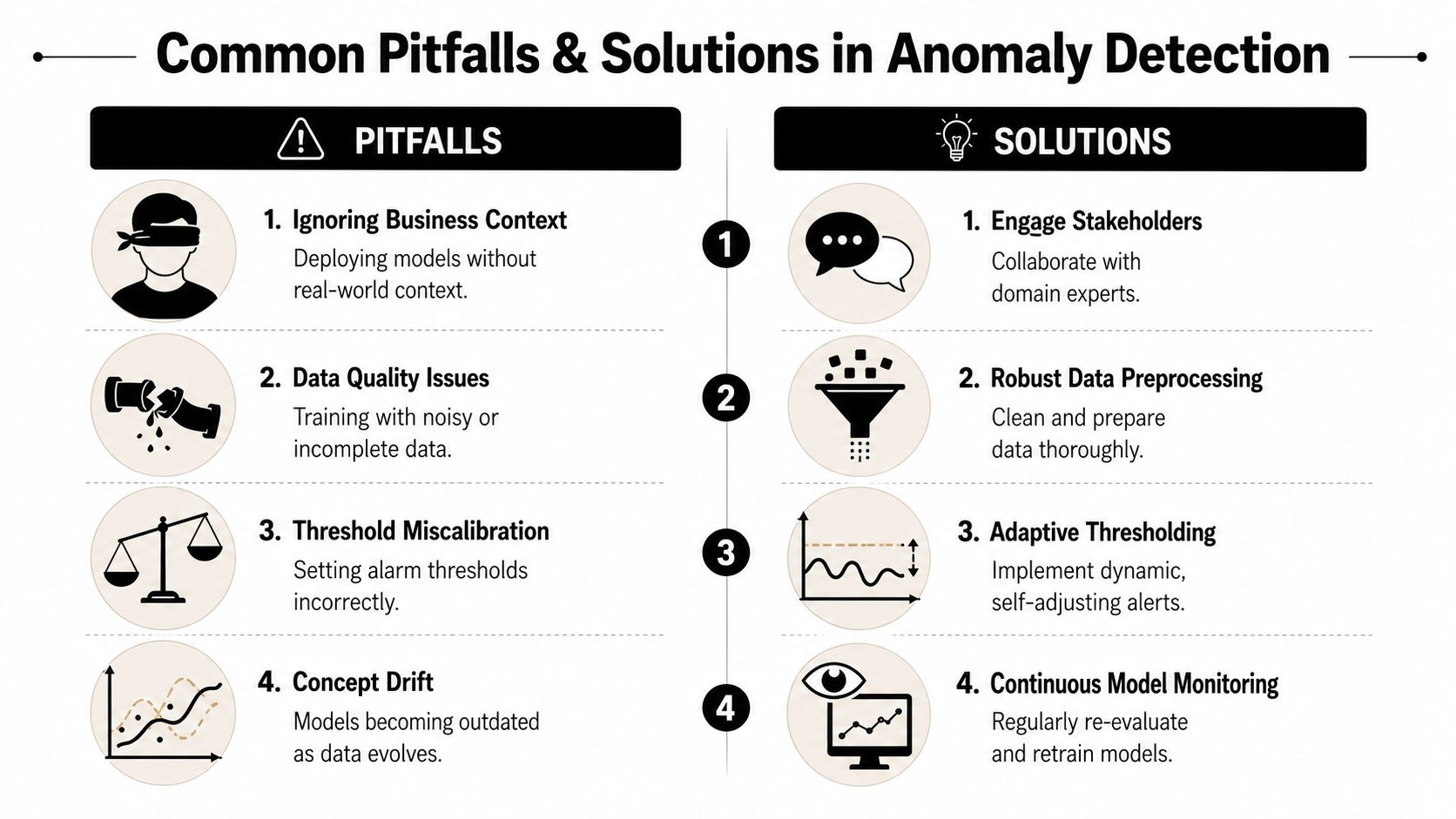
Most failed anomaly detection projects don't fail because the maths is weak. They fail because the operating model is weak. Teams either drown in alerts, trust the wrong baseline, or stop at detection and never build a reliable way to investigate.
Alert fatigue is self-inflicted
If every deviation becomes an incident, people stop caring. This usually starts with thresholds that were copied from a notebook into production and never revisited. It gets worse when all anomalies are treated as equally important.
A better approach is to rank alerts by likely impact and confidence. The sales dashboard being blank should outrank a small wobble in a low-use internal metric. That sounds obvious, but plenty of stacks still notify on raw deviation alone.
Wide data punishes simplistic methods
The curse of dimensionality is not an academic phrase engineers use to look dramatic. It describes a real production pain. In wide feature spaces, distance-based intuition falls apart, and methods that looked fine on narrow examples start flagging nonsense or missing subtle failures.
That's why high-dimensional strategies need more than generic thresholds. They need stable scaling, feature-aware methods, or algorithms designed for intrinsic structure rather than naïve distance.
Detection without attribution wastes time
Finding an anomaly is useful. Explaining it is what saves the week.
A 2024 Eurostat-supervised study on Euro-area banks' data found that ML-guided feature ranking correctly identifies root causes for 74% of outliers, but only 12% of EU data engineering blogs describe how to integrate this into observability dashboards, contributing to 3.2x longer mean-time-to-resolution in some sectors, according to the arXiv paper on error attribution workflows. That gap is a critical frontier. Teams can detect issues, but many still can't triage them efficiently.
The traps worth designing around
Ignoring business context: A spike during a launch might be good news, not a fault.
Conflating source and symptom: The broken metric may be downstream from the underlying issue.
Treating all anomalies as incidents: Some should be logged, some escalated, some suppressed.
Skipping feedback loops: If responders can't mark alerts as useful or useless, the system never improves.
The question after an alert shouldn't be “Is this statistically unusual?” It should be “What changed, where, and who can verify it?”
What actually helps in practice
Pitfall | Better move |
|---|---|
Noisy thresholding | Use adaptive baselines and severity tiers |
Weak context | Segment by business unit, source, time, or peer group |
Slow triage | Add feature ranking, lineage hints, and recent change history |
Drift over time | Re-evaluate baselines and review suppressed alert classes |
Often, many teams build a detector and call the job done. It isn't done until a responder can move from “something's odd” to “here's the likely cause” quickly and repeatedly.
Building a Culture of Data Reliability
Reliable outlier detection isn't a single model or dashboard. It's a habit shared across engineering, analytics, operations, and the people who consume the numbers. When that habit exists, anomalies become manageable signals. When it doesn't, every strange chart turns into a debate club.
Reliability is a team sport
Data engineers own pipelines and computation. Analytics engineers shape models and semantics. Business users provide the context that decides whether a spike is a bug or a campaign effect. If any one of those groups works in isolation, anomaly handling gets slower and noisier.
That's why the strongest teams agree on a few operational basics:
Define normal together: engineering can measure patterns, but domain teams explain whether they make sense.
Separate detection from decision: not every anomaly deserves the same response.
Make resolution observable: learn which alerts were genuine, which were expected, and which tooling gaps caused delay.
Trust grows from repeatable responses
A mature setup doesn't just catch weirdness. It teaches the organisation how to respond to weirdness. People trust data when anomalies are surfaced clearly, investigated quickly, and resolved with evidence instead of improvisation.
That requires more than algorithms. It needs ownership, baseline review, root-cause workflows, and tooling that fits the architecture you already have instead of forcing awkward data movement or manual babysitting.
For teams trying to build that broader practice, a guide to building a culture of data quality connects the technical controls to the cultural side of trust.
Outlier detection is most valuable when it stops being a special project and becomes part of how the platform runs every day. That's when dashboards stay credible, models stay useful, and fewer Monday mornings start with panic.
If your team needs anomaly detection that fits enterprise reality, digna is worth a look. It focuses on in-database detection, validation, timeliness, schema monitoring, and investigation workflows so teams can move from “that number looks wrong” to a fix without dragging production data into yet another tool.
For anomaly detection that learns baselines instead of relying on hand-tuned thresholds, see how digna Data Anomalies monitors data inside your own database.
Frequently asked questions
What are the main types of outliers?
There are three types. Point outliers are single values far from the rest, like a customer age of 200. Contextual outliers look normal alone but are wrong for their time or setting, such as a traffic surge at 03:00. Collective outliers are harmless points that together form an abnormal pattern.
Should I use statistical or machine learning methods for outlier detection?
Pick based on the failure you need to catch and who must trust the result. Z-score, IQR, and MAD suit stable, narrow data that needs clear auditability. Machine learning earns its complexity with seasonality and wide data: in German Space Operations Center benchmarks, OPVID scored an F1 of 0.89 versus 0.76 for Isolation Forest.
Why use median absolute deviation instead of Z-score for outliers?
Z-score thresholds get distorted by extreme values in skewed or non-Gaussian data. For that reason, the European Central Bank's automated outlier detection methodology, described in ECB Working Paper No. 2171, standardises using outlier-resistant estimates based on median absolute deviation instead of relying on traditional Z-score thresholds.
How do you reduce false positives in anomaly detection?
Learn baselines before wiring alerts, so holidays, month-end closes, and promotions are not flagged as noise. According to a 2024 European Data Governance Institute study referenced by digna, AI-driven systems that learn baselines cut false positive rates by 40-60% versus static thresholds. Ranking alerts by likely impact and confidence helps further.
How do you implement outlier detection in production?
Treat it as a workflow rather than an algorithm: compute metrics in-database, detect anomalies continuously across distributions, timeliness, and schema changes, attach context such as recent history, route alerts by ownership, and track disposition. Add feature ranking for triage, since ML-guided ranking identified root causes for 74% of outliers in one study.